Rate your website in seconds – get instant feedback.
I will rate your website's design and give recommendations to enhance its visual appeal and user experience. See how your site ranks on the leaderboard!
🌿 Nature data for your value chain 🌳 | Lemu

Analyzed by AI for fun and insights - not to be taken too seriously!
Visual Design
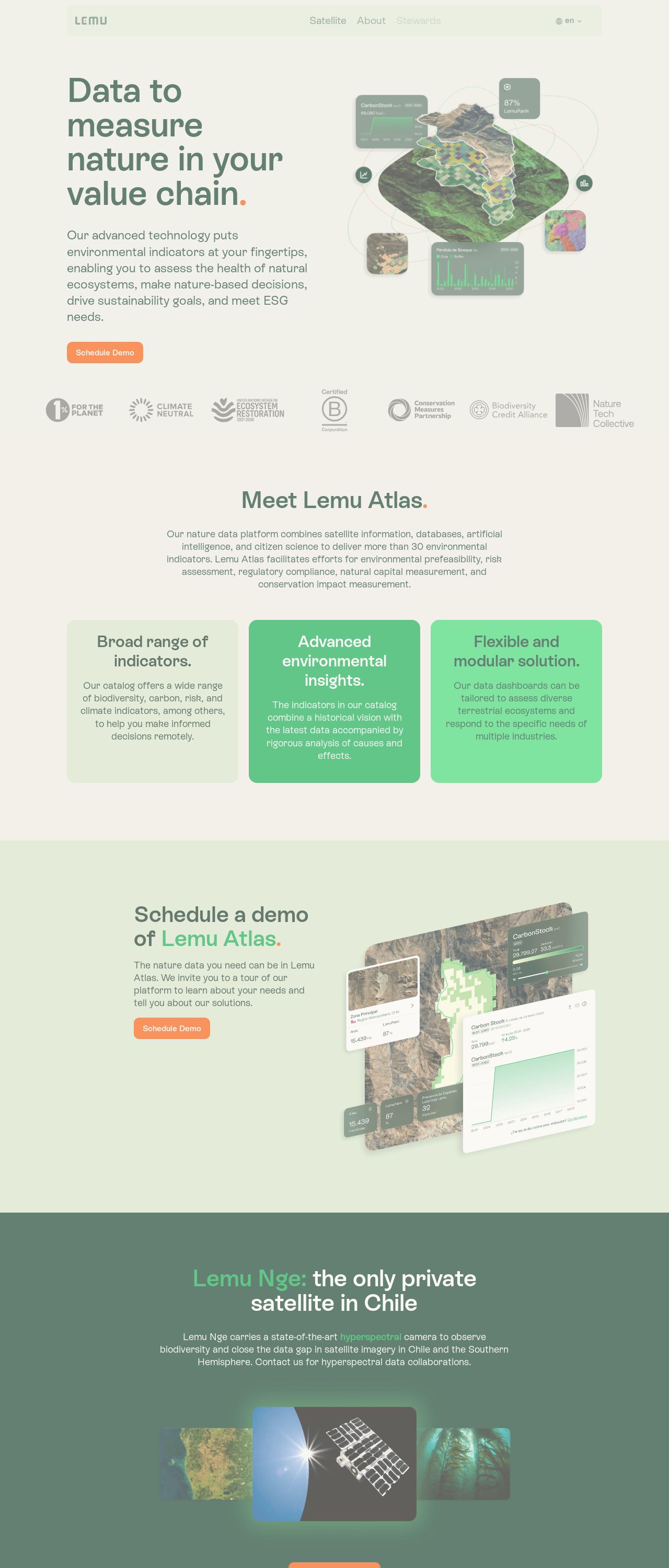
Wow, the visual design of this website is a real treat for the eyes. The color palette is a breath of fresh air, with shades of green and blue that evoke feelings of nature and tranquility. The use of earthy tones creates a sense of warmth and approachability, making the website feel inviting and engaging. The typography is clean and modern, with a clear hierarchy of fonts that guides the user's attention through the page. The imagery is stunning, with high-quality images of natural landscapes and wildlife that showcase the beauty of the natural world. The overall design is cohesive and well-executed, with a clear visual language that ties everything together.
Recommendation:
Consider adding more visual interest with icons or graphics to break up the text and enhance the visual flow.
Layout and Clarity
The layout of this website is clear and easy to navigate, with a logical structure that makes it simple for users to find what they're looking for. The use of whitespace is effective, creating a sense of breathing room and making the content feel uncluttered. The navigation menu is intuitive and easy to use, with clear labels and a logical hierarchy of pages. The content is well-organized, with a clear structure that guides the user through the page. The only area for improvement is the footer, which feels a bit cluttered and could benefit from some additional whitespace to make it easier to read.
Recommendation:
Consider adding more whitespace to the footer to improve readability.
Content
The content on this website is informative and engaging, with a clear and concise writing style that makes it easy to understand. The language is accessible, avoiding jargon and technical terms that might confuse non-experts. The tone is friendly and approachable, making the website feel welcoming and inclusive. The content is well-organized, with a clear structure that guides the user through the page. The only area for improvement is the length of some of the paragraphs, which could be broken up for easier reading.
Recommendation:
Consider breaking up long paragraphs to improve readability.
This website was last rated on Dec. 3, 2024, 7:16 p.m.
Disclaimer: ratemysite.app is not affiliated with the website you are viewing, and does not endorse it in any way.
Ratings are subjective and based on AI's analysis. We filter out explicit or dangerous content, but cannot guarantee that all sites are safe.
All rights reserved. © ratemysite.app 2024. Contact: hello @ domain.
