Rate your website in seconds – get instant feedback.
I will rate your website's design and give recommendations to enhance its visual appeal and user experience. See how your site ranks on the leaderboard!

Leogalli
Analyzed by AI for fun and insights - not to be taken too seriously!
Visual Design
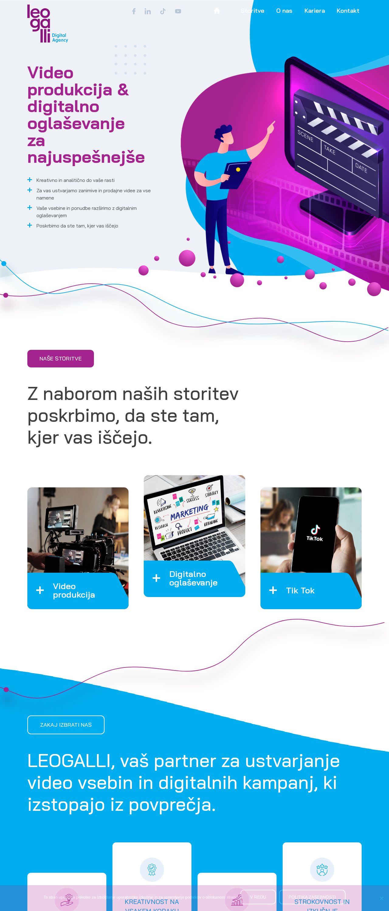
The website's visual design is a vibrant and engaging mix of colors, graphics, and illustrations. The dominant colors are shades of purple, blue, and pink, which are used consistently throughout the website. The logo, located in the top-left corner, features a stylized "Leogalli" in purple and blue, accompanied by a small graphic. The overall aesthetic is modern, youthful, and creative, effectively conveying the company's focus on video production and digital marketing. The use of illustrations, such as the cartoon character holding a laptop and pointing at a large film clapboard, adds a playful touch. The graphics and icons are well-designed and visually appealing. However, the design could benefit from a more cohesive and subtle use of colors. Some sections feel a bit overwhelming, with too many elements competing for attention. The typography is clear and readable, with a clean sans-serif font used throughout. The headings are bold and prominent, making it easy to scan the content. Overall, the visual design effectively communicates the company's brand and services, but could be refined to achieve a more balanced look.
Recommendation:
Refine the color palette to achieve a more cohesive look, and balance the use of graphics and illustrations to avoid overwhelming the user.
Layout and Clarity
The website's layout is well-structured and easy to navigate. The content is organized into clear sections, with a prominent call-to-action (CTA) button "NAŠE STORITVE" that stands out. The use of white space is effective, making it easy to scan the content. The website features a clear hierarchy of information, with headings and subheadings that help users understand the content. The sections are clearly separated, and the use of graphics and illustrations helps to break up the text. However, some sections feel a bit dense, with too much information presented at once. The navigation menu at the top is simple and easy to use, with clear labels and a minimalistic design. The website also features a clear and prominent CTA, encouraging users to explore the services offered.
Recommendation:
Consider adding more white space to separate sections and reduce the density of information, making it even easier to scan and understand.
Content
The website's content is clear, concise, and effectively communicates the company's services and values. The language is straightforward, and the tone is engaging and professional. The website clearly explains the company's services, including video production, digital marketing, and TikTok management. The benefits of working with Leogalli are also highlighted, such as their creative approach, expertise, and focus on growth. However, the content could benefit from a stronger emphasis on storytelling and showcasing the company's success stories. The use of statistics, such as "more than 100 successful projects," is a good start, but more specific examples and testimonials would help to build trust and credibility.
Recommendation:
Add more specific examples and testimonials to build trust and credibility, and consider incorporating storytelling techniques to make the content more engaging.
This website was last rated on April 19, 2025, 11:25 a.m.
Re-rate available on April 26, 2025, 11:25 a.m.
Disclaimer: ratemysite.app is not affiliated with the website you are viewing, and does not endorse it in any way.
Ratings are subjective and based on AI's analysis. We filter out explicit or dangerous content, but cannot guarantee that all sites are safe.

All rights reserved. © ratemysite.app 2024. Contact: hello @ domain.