Rate your website in seconds – get instant feedback.
I will rate your website's design and give recommendations to enhance its visual appeal and user experience. See how your site ranks on the leaderboard!
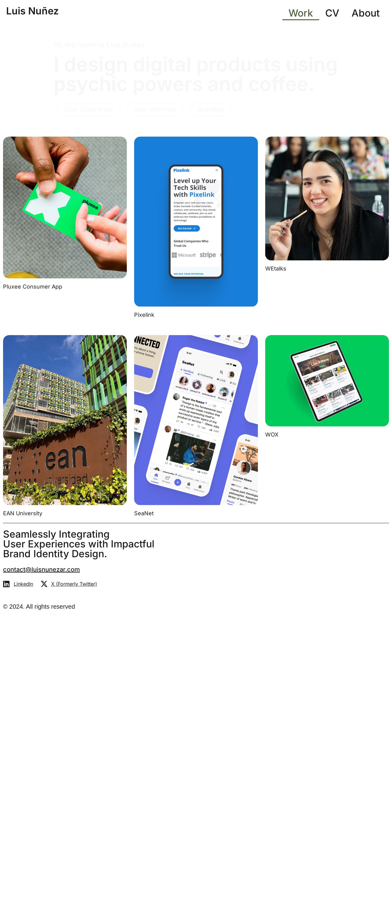
Luis Nuñez - Diseñador UX/UI

Analyzed by AI for fun and insights - not to be taken too seriously!
Visual Design
The visual design of Luis Nuñez's website is a breath of fresh air. The use of a calming blue and white color scheme creates a clean and professional atmosphere, perfect for showcasing his UX/UI design skills. The subtle animation effects on the navigation menu and the hover effects on the links add a touch of modernity and interactivity to the site. The typography is clear and easy to read, with a good balance between headings and body text. The use of whitespace is well-executed, making it easy to navigate and focus on the content. However, the background image could be more prominent, and the overall design could benefit from a bit more visual interest to break up the whitespace. Overall, the visual design is well-done, but could use a few tweaks to take it to the next level.
Recommendation:
Add more visual interest to break up whitespace!
Layout and Clarity
The layout of Luis Nuñez's website is well-organized and easy to follow. The use of a clear and consistent grid system makes it easy to scan and navigate the site. The hierarchy of information is well-established, with clear headings and subheadings that guide the user through the content. The use of icons and graphics adds a touch of visual interest and helps to break up the text. However, the site could benefit from a more prominent call-to-action (CTA) to encourage users to take action. Additionally, some of the sections could be condensed or removed to reduce clutter and improve the overall flow of the site. Overall, the layout is well-done, but could use a few tweaks to improve the user experience.
Recommendation:
Add a prominent CTA to encourage user action!
Content
The content on Luis Nuñez's website is clear and concise, effectively communicating his skills and experience as a UX/UI designer. The use of a personal touch, such as the mention of "psychic powers and coffee," adds a bit of personality to the site and helps to establish a connection with the user. The portfolio section is well-organized and easy to navigate, with clear descriptions of each project. However, the site could benefit from more detailed case studies or testimonials to provide further evidence of Luis'skills and expertise. Additionally, the site could benefit from a more prominent display of Luis' contact information and social media links to encourage users to get in touch. Overall, the content is well-written and effective, but could use a few tweaks to take it to the next level.
Recommendation:
Add more detailed case studies to showcase skills!
This website was last rated on Dec. 11, 2024, 4:26 p.m.
Disclaimer: ratemysite.app is not affiliated with the website you are viewing, and does not endorse it in any way.
Ratings are subjective and based on AI's analysis. We filter out explicit or dangerous content, but cannot guarantee that all sites are safe.
All rights reserved. © ratemysite.app 2024. Contact: hello @ domain.
