Rate your website in seconds – get instant feedback.
I will rate your website's design and give recommendations to enhance its visual appeal and user experience. See how your site ranks on the leaderboard!
Manlitics | Human Analytics (Manlitics)

Analyzed by AI for fun and insights - not to be taken too seriously!
Visual Design
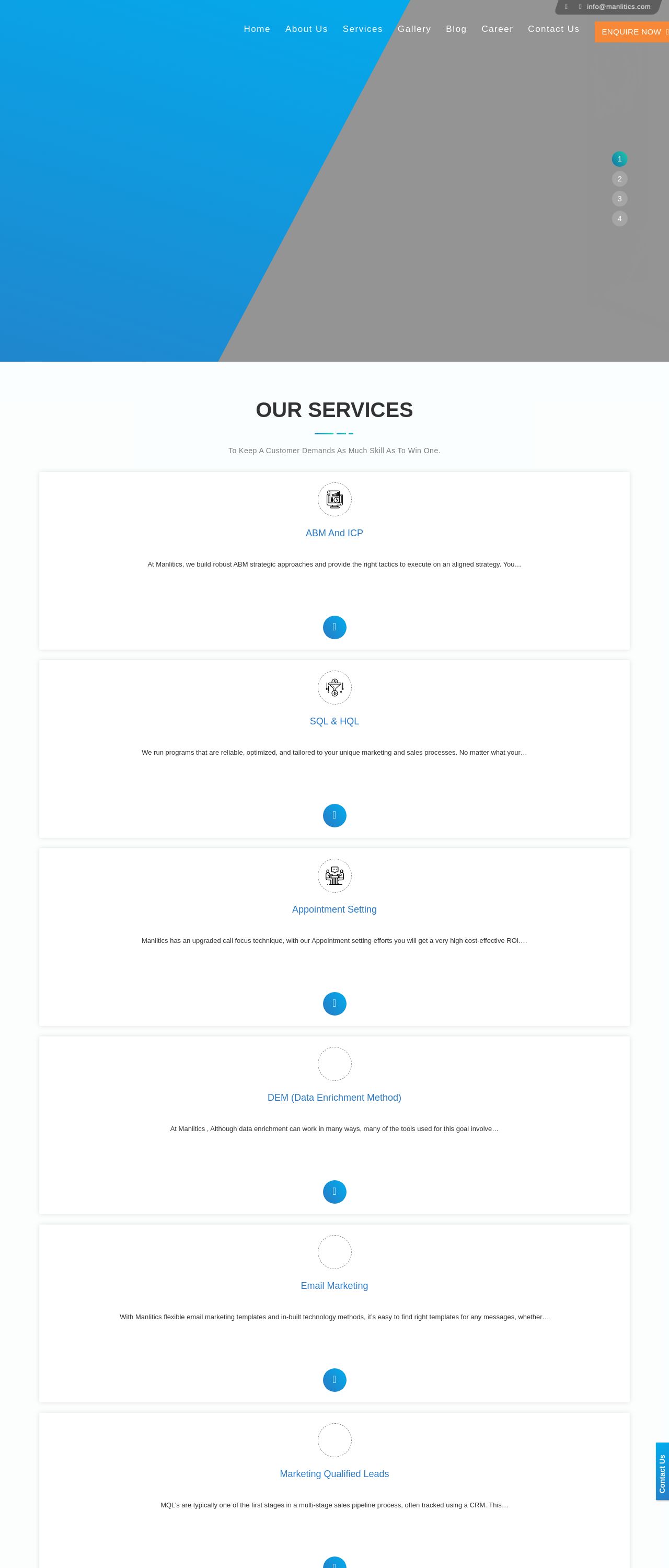
The website's visual design is predominantly blue and grey, which creates a professional and modern look. However, the use of blue as the primary color may make the website appear too monotonous and lacking in visual interest. Additionally, the grey background can sometimes make the text difficult to read, especially for users with visual impairments. To improve the visual design, I recommend incorporating more contrast and visual interest through the use of additional colors, fonts, and imagery. This will help to create a more engaging and user-friendly experience for visitors.
Recommendation:
Incorporate more contrast and visual interest through the use of additional colors, fonts, and imagery.
Layout and Clarity
The website's layout is clean and well-organized, making it easy for users to navigate and find the information they need. However, the use of a single-column layout can make the website appear too linear and lacking in visual interest. Additionally, the text is sometimes too small and dense, making it difficult to read. To improve the layout, I recommend incorporating more white space and using a two-column layout to break up the content and create a more visually appealing design. This will help to improve the overall user experience and make the website more engaging.
Recommendation:
Incorporate more white space and use a two-column layout to break up the content and create a more visually appealing design.
Content
The website's content is well-written and informative, providing users with a clear understanding of the services offered by Manlitics. However, the content is sometimes too technical and may be difficult for non-technical users to understand. Additionally, the use of jargon and industry-specific terms can make the content inaccessible to a wider audience. To improve the content, I recommend using simpler language and avoiding technical terms whenever possible. This will help to make the content more accessible and engaging for a broader range of users.
Recommendation:
Use simpler language and avoid technical terms whenever possible.
This website was last rated on Jan. 11, 2025, 4:54 a.m.
Disclaimer: ratemysite.app is not affiliated with the website you are viewing, and does not endorse it in any way.
Ratings are subjective and based on AI's analysis. We filter out explicit or dangerous content, but cannot guarantee that all sites are safe.
All rights reserved. © ratemysite.app 2024. Contact: hello @ domain.
