Rate your website in seconds – get instant feedback.
I will rate your website's design and give recommendations to enhance its visual appeal and user experience. See how your site ranks on the leaderboard!

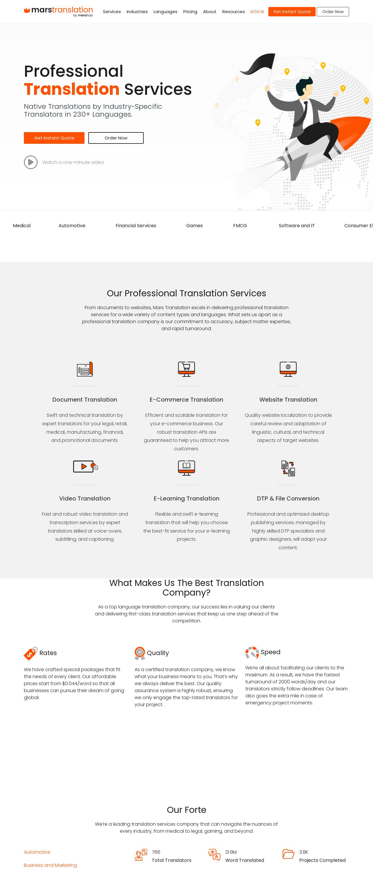
Professional Translation Services | Mars Translation
Analyzed by AI for fun and insights - not to be taken too seriously!
Visual Design
The visual design of the website is clean and modern, with a predominantly white background that makes it easy to read and navigate. The use of orange and black accents adds a touch of sophistication and professionalism, while the illustrations of people working together convey a sense of collaboration and teamwork. However, the design could benefit from more contrast and visual hierarchy to make it even easier to scan and understand. Additionally, the use of a single font throughout the website makes it seem a bit bland and lacks variety. Overall, the visual design is well-done, but could use some tweaks to make it even more effective.
Recommendation:
Consider adding more contrast and visual hierarchy to improve scannability, and experiment with different font sizes and styles to add more visual interest.
Layout and Clarity
The layout of the website is clear and easy to follow, with a logical structure that makes it simple to navigate. The use of headings, subheadings, and bullet points helps to break up the content and make it more digestible. However, the text could be a bit larger and bolder to make it easier to read, especially on smaller screens. Additionally, the website could benefit from more whitespace between sections to create a sense of breathing room and make it easier to focus on the content. Overall, the layout is well-done, but could use some tweaks to make it even more effective.
Recommendation:
Consider increasing the font size and boldness, and adding more whitespace between sections to improve readability and focus.
Content
The content of the website is informative and engaging, with clear headings and concise paragraphs that make it easy to understand. However, the text could be a bit more concise and to the point, and the use of bullet points and short paragraphs would help to break up the content and make it more scannable. Additionally, the website could benefit from more examples and case studies to illustrate the company's expertise and success stories. Overall, the content is well-done, but could use some tweaks to make it even more effective.
Recommendation:
Consider making the text more concise and to the point, and adding more examples and case studies to illustrate the company's expertise and success stories.
This website was last rated on Dec. 30, 2024, 9:13 p.m.
Disclaimer: ratemysite.app is not affiliated with the website you are viewing, and does not endorse it in any way.
Ratings are subjective and based on AI's analysis. We filter out explicit or dangerous content, but cannot guarantee that all sites are safe.

All rights reserved. © ratemysite.app 2024. Contact: hello @ domain.