Rate your website in seconds – get instant feedback.
I will rate your website's design and give recommendations to enhance its visual appeal and user experience. See how your site ranks on the leaderboard!

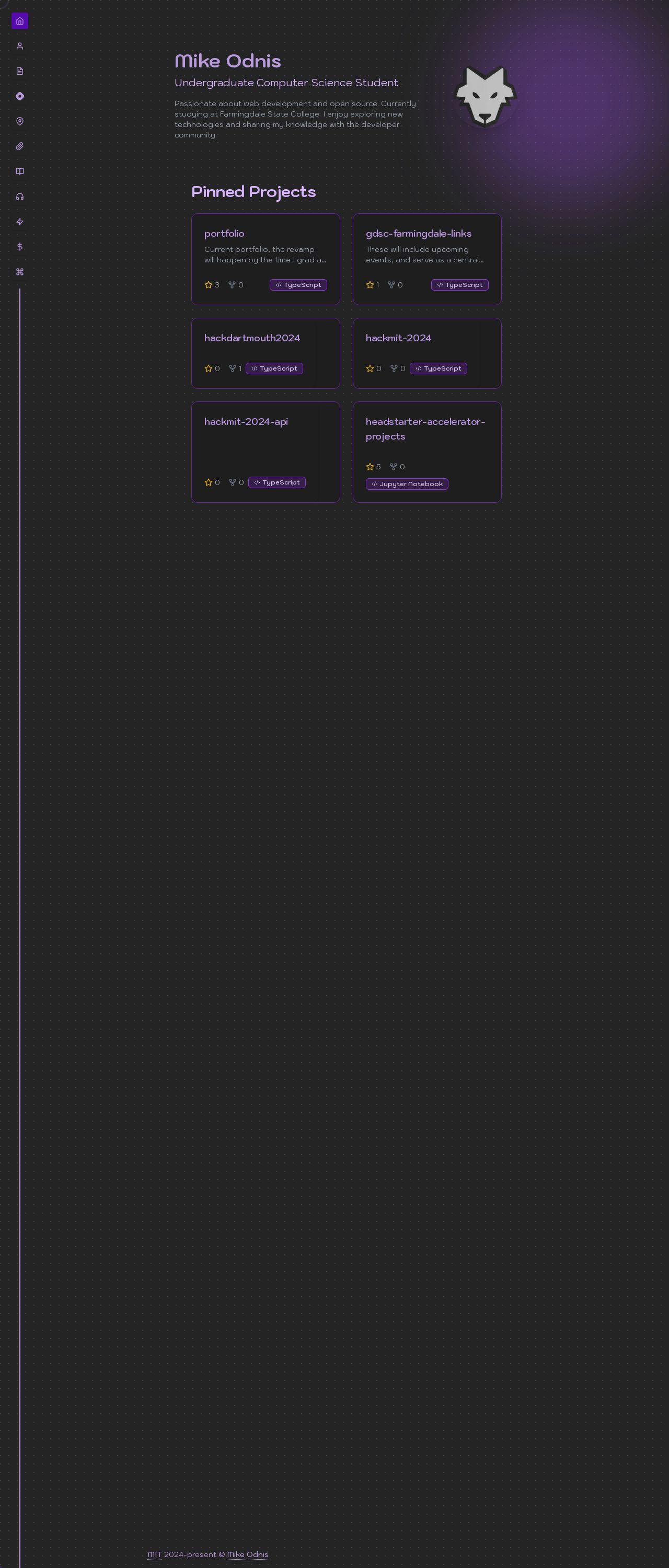
Mike Odnis
Analyzed by AI for fun and insights - not to be taken too seriously!
Visual Design
The visual design of the website is simple and clean, with a focus on showcasing the user's work. The use of a solid black background effectively highlights the white text and images, creating a clear and easy-to-read layout. However, the design could benefit from some additional visual elements to break up the text and create a more engaging user experience. For example, incorporating some subtle gradients or textures could add depth and visual interest to the page. One notable aspect of the design is the use of a custom favicon, which is a small icon that appears in the browser's address bar and tab. This is a nice touch, as it helps to reinforce the website's brand identity and makes the site more recognizable. However, the favicon could be improved by making it more distinctive and memorable. For example, using a custom icon that is more unique to the website's brand could help to make it stand out. Overall, the visual design of the website is clean and effective, but could benefit from some additional visual elements to create a more engaging user experience.
Recommendation:
Add some subtle gradients or textures to the background to add depth and visual interest to the page.
Layout and Clarity
The layout of the website is well-organized and easy to navigate, with a clear hierarchy of information. The use of headings, paragraphs, and bullet points helps to break up the content and make it easy to scan. However, the layout could benefit from some additional whitespace to create a more spacious and breathable design. This would help to make the content feel less crowded and more readable. One area for improvement is the use of images. While the website does include some images, they could be used more effectively to break up the text and create visual interest. For example, using larger images or incorporating images into the layout could help to create a more dynamic and engaging design. Overall, the layout and clarity of the website are good, but could benefit from some additional whitespace and more effective use of images.
Recommendation:
Add some additional whitespace to the design to create a more spacious and breathable layout.
Content
The content of the website is clear and concise, with a focus on showcasing the user's work and experience. The writing is well-written and easy to understand, making it accessible to a wide range of readers. However, the content could benefit from some additional depth and complexity to make it more engaging and interesting. For example, including more personal anecdotes or stories could help to make the content feel more relatable and authentic. One area for improvement is the use of subheadings and headings to break up the content and create a clear hierarchy of information. While the website does use headings, they could be more descriptive and help to guide the reader through the content. Overall, the content of the website is good, but could benefit from some additional depth and complexity to make it more engaging and interesting.
Recommendation:
Add some additional subheadings and headings to break up the content and create a clear hierarchy of information.
This website was last rated on Jan. 14, 2025, 5:15 a.m.
Disclaimer: ratemysite.app is not affiliated with the website you are viewing, and does not endorse it in any way.
Ratings are subjective and based on AI's analysis. We filter out explicit or dangerous content, but cannot guarantee that all sites are safe.

All rights reserved. © ratemysite.app 2024. Contact: hello @ domain.