Rate your website in seconds – get instant feedback.
I will rate your website's design and give recommendations to enhance its visual appeal and user experience. See how your site ranks on the leaderboard!

Monica Marioni
Analyzed by AI for fun and insights - not to be taken too seriously!
Visual Design
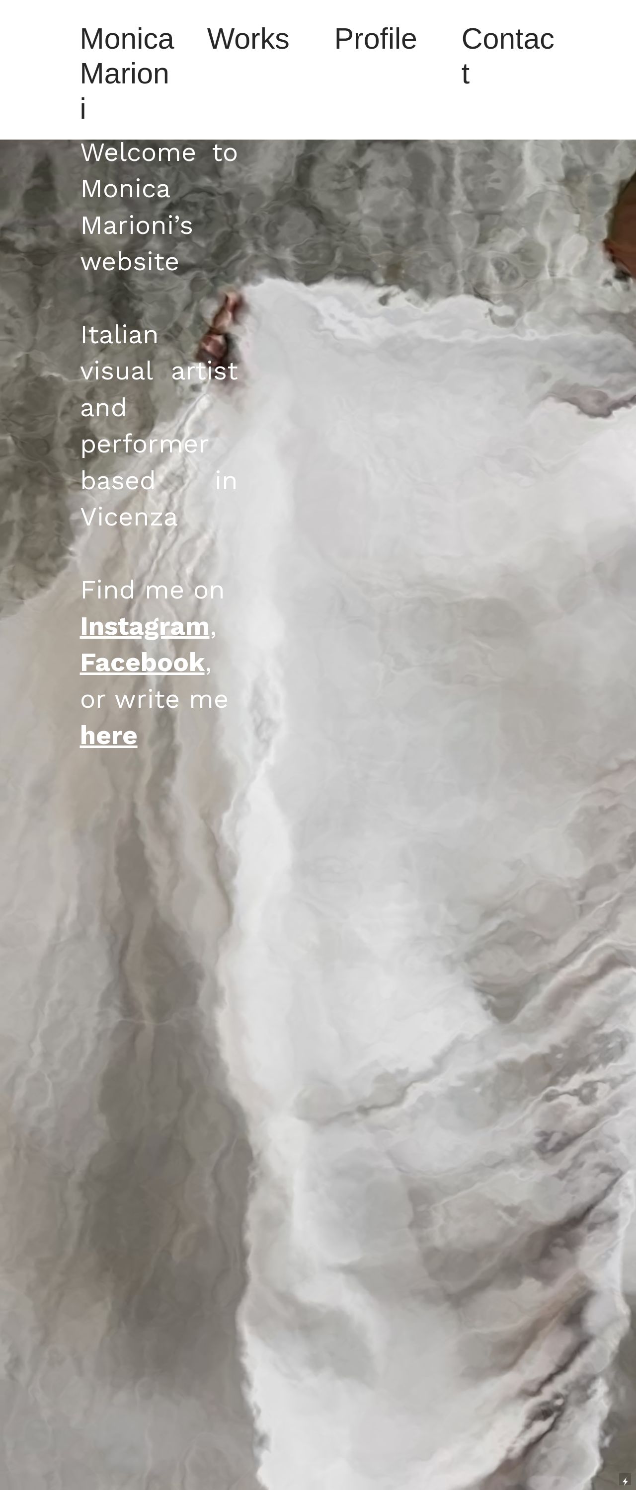
The visual design of Monica Marioni's website is a stunning representation of her artistic style. The use of a predominantly white and gray color scheme creates a clean and minimalist aesthetic, which allows the viewer's attention to focus on the artwork. The subtle texture of the background adds depth and visual interest, while the bold black text provides a striking contrast. The overall effect is a sophisticated and modern design that effectively showcases Monica's art. However, there are a few areas where the visual design could be improved. The navigation menu at the top of the page is somewhat cluttered, and the use of multiple fonts and font sizes can make it difficult to read. Additionally, the placement of the social media icons at the bottom of the page feels a bit awkward and could be integrated more seamlessly into the design.
Recommendation:
Simplify the navigation menu and integrate social media icons more seamlessly.
Layout and Clarity
The layout of Monica Marioni's website is well-organized and easy to navigate. The use of a clear and consistent grid system helps to create a sense of order and structure, making it easy for the viewer to find what they're looking for. The placement of the artwork and text is thoughtful and visually appealing, creating a sense of balance and harmony on the page. However, there are a few areas where the layout could be improved. The use of white space could be more effective in creating a sense of breathing room and visual flow. Additionally, the placement of the "Find me on" section feels a bit awkward and could be integrated more seamlessly into the design.
Recommendation:
Use white space more effectively to create a sense of visual flow.
Content
The content on Monica Marioni's website is well-written and engaging. The use of short paragraphs and bullet points makes it easy to scan and read, and the inclusion of images and videos adds visual interest and depth. The language is clear and concise, making it easy for the viewer to understand Monica's artistic vision and style. However, there are a few areas where the content could be improved. The use of overly technical language in some sections may make it difficult for non-artists to understand. Additionally, the lack of a clear call-to-action on the homepage may make it difficult for viewers to know what to do next.
Recommendation:
Use clear and concise language and include a clear call-to-action on the homepage.
This website was last rated on Feb. 13, 2025, 2:51 a.m.
Disclaimer: ratemysite.app is not affiliated with the website you are viewing, and does not endorse it in any way.
Ratings are subjective and based on AI's analysis. We filter out explicit or dangerous content, but cannot guarantee that all sites are safe.

All rights reserved. © ratemysite.app 2024. Contact: hello @ domain.