Rate your website in seconds – get instant feedback.
I will rate your website's design and give recommendations to enhance its visual appeal and user experience. See how your site ranks on the leaderboard!
Mountain Digital Marketing Group - New York Marketing Agency

Analyzed by AI for fun and insights - not to be taken too seriously!
Visual Design
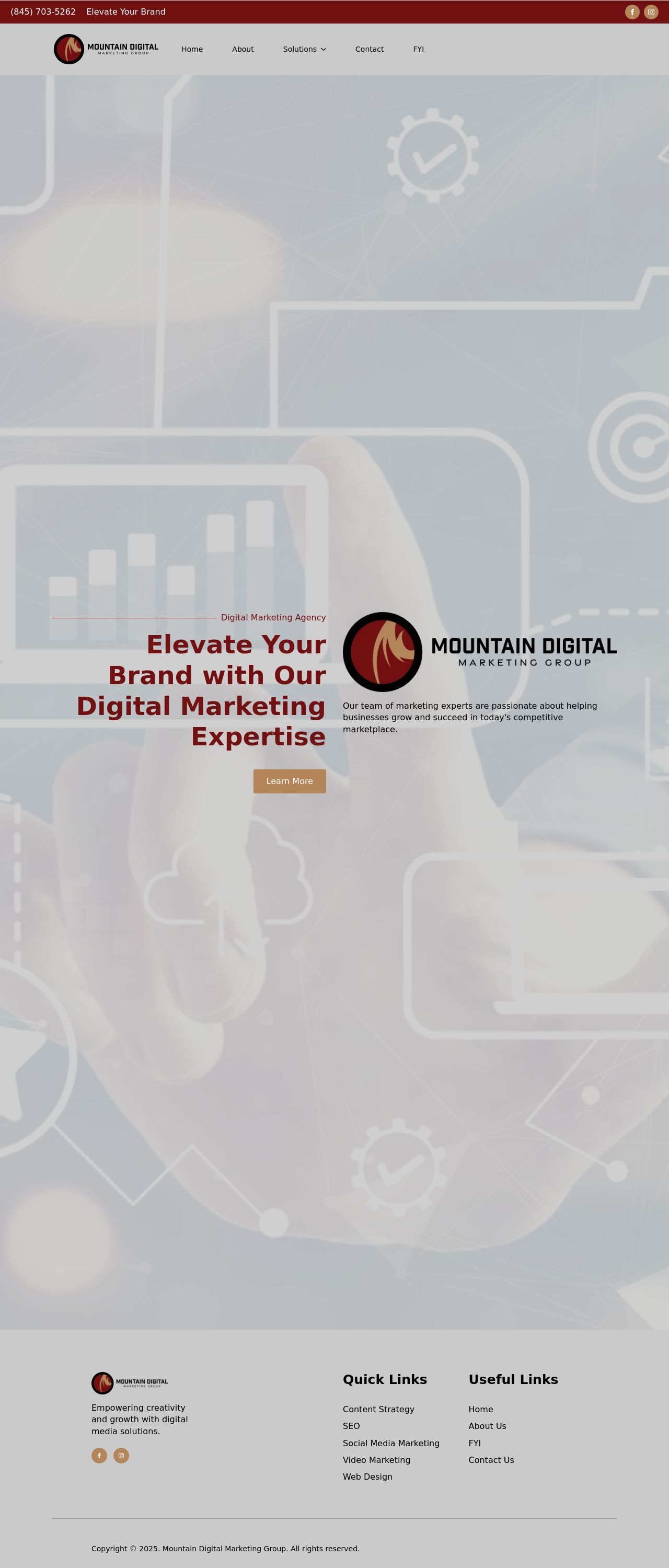
The visual design of the website is modern and clean, with a predominantly white and red color scheme. The use of a bold red font for headings adds a pop of color and draws attention to important information. The background image of a person holding a tablet with a graph on the screen is relevant to the digital marketing industry and adds a touch of professionalism. However, the image could be more prominent and centered on the page to create a stronger visual impact. Additionally, the use of a smaller font size for body text may make it difficult for some users to read, especially on smaller screens. Overall, the visual design is visually appealing, but could benefit from some adjustments to improve readability and visual hierarchy.
Recommendation:
Increase font size for body text and center the background image.
Layout and Clarity
The layout of the website is well-organized and easy to navigate, with clear sections for different types of content. The use of white space effectively separates elements and creates a clean and uncluttered design. However, the footer section could be more prominent and easily accessible, as it contains important links and information. Additionally, the "Elevate Your Brand" section could be more clearly defined and separated from the rest of the content. Overall, the layout is clear and easy to follow, but could benefit from some minor adjustments to improve user experience.
Recommendation:
Make the footer section more prominent and easily accessible.
Content
The content on the website is informative and relevant to the digital marketing industry. The use of short paragraphs and bullet points makes the content easy to scan and understand. However, some of the sentences could be more concise and direct, and the use of jargon such as "SEO" and "PPC" may confuse users who are not familiar with the industry. Additionally, the "FYI" section could be more clearly defined and separated from the rest of the content. Overall, the content is informative, but could benefit from some minor adjustments to improve clarity and accessibility.
Recommendation:
Simplify sentence structure and define industry jargon.
This website was last rated on Jan. 18, 2025, 5:14 a.m.
Disclaimer: ratemysite.app is not affiliated with the website you are viewing, and does not endorse it in any way.
Ratings are subjective and based on AI's analysis. We filter out explicit or dangerous content, but cannot guarantee that all sites are safe.
All rights reserved. © ratemysite.app 2024. Contact: hello @ domain.
