Rate your website in seconds – get instant feedback.
I will rate your website's design and give recommendations to enhance its visual appeal and user experience. See how your site ranks on the leaderboard!
ಮ್ಯೂನಿಕ್ ಕನ್ನಡಿಗರು | Munich Kannadigaru

Analyzed by AI for fun and insights - not to be taken too seriously!
Visual Design
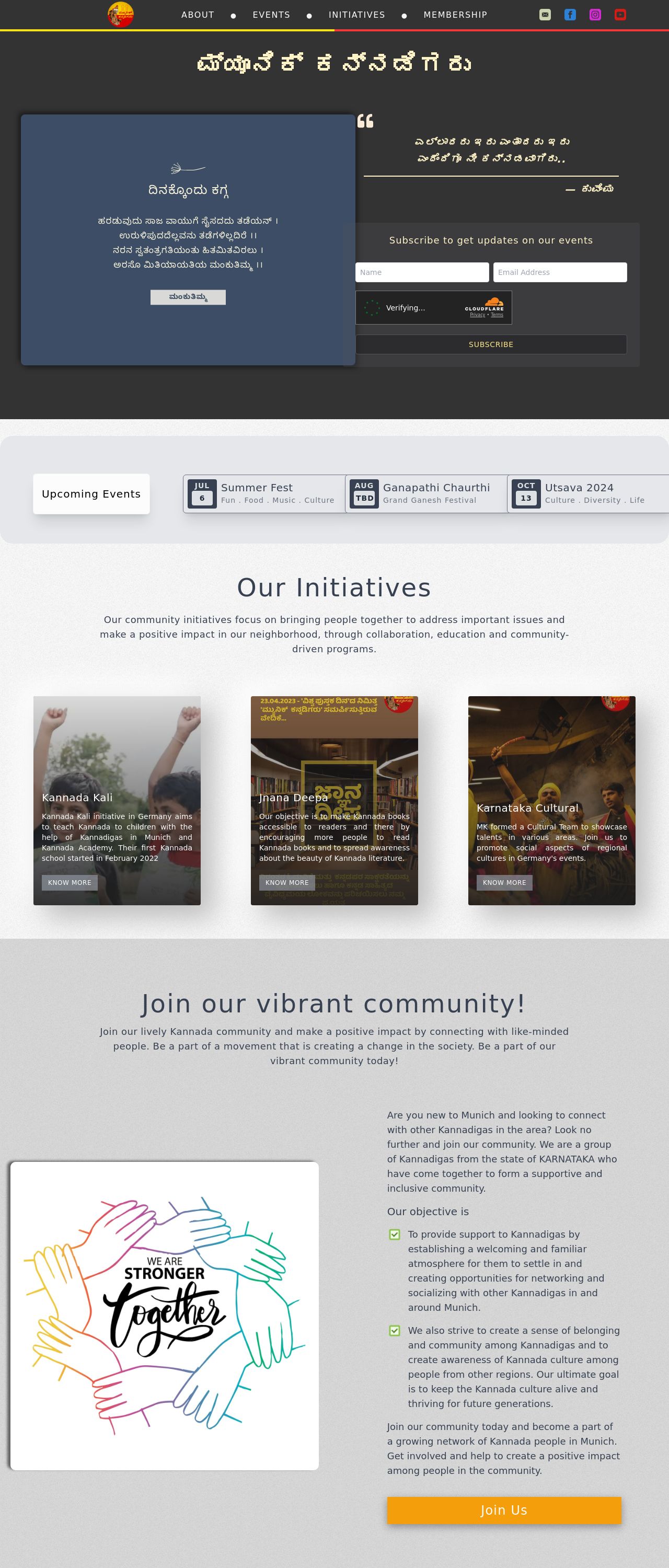
The visual design of the website is visually appealing, with a clean and modern design. The use of white space is effective in creating a sense of simplicity and clarity. The colors used are muted and earthy, which creates a warm and inviting atmosphere. However, the design could be more engaging and dynamic. The use of images and graphics is minimal, which could be improved to make the website more visually appealing. The typography is clear and easy to read, but the font sizes could be adjusted to create more hierarchy and visual interest. The use of icons is limited, which could be improved to make the website more interactive and engaging. Overall, the visual design is good, but it could be improved to make the website more visually appealing and engaging.
Recommendation:
Improve the visual design by adding more images and graphics, adjusting the typography to create more hierarchy, and using icons to make the website more interactive and engaging.
Layout and Clarity
The layout and clarity of the website are good, with a clear navigation menu and easy-to-read text. The use of headings and subheadings is effective in creating a clear structure and hierarchy. The website is well-organized, with clear and concise content. However, the layout could be improved to make it more responsive and adaptable to different devices and screen sizes. The website could also benefit from more white space and a more balanced layout. Overall, the layout and clarity are good, but could be improved to make the website more responsive and adaptable.
Recommendation:
Improve the layout and clarity by adding more white space, balancing the layout, and making the website more responsive and adaptable to different devices and screen sizes.
Content
The content of the website is well-written and informative, with clear and concise language. The use of headings and subheadings is effective in creating a clear structure and hierarchy. The website provides valuable information and resources for users. However, the content could be improved by adding more depth and detail, as well as more examples and case studies. The website could also benefit from more interactive elements, such as quizzes, surveys, and polls. Overall, the content is good, but could be improved to make it more engaging and interactive.
Recommendation:
Improve the content by adding more depth and detail, examples and case studies, and more interactive elements.
This website was last rated on Jan. 14, 2025, 2:41 p.m.
Re-rate available on Jan. 21, 2025, 2:41 p.m.
Disclaimer: ratemysite.app is not affiliated with the website you are viewing, and does not endorse it in any way.
Ratings are subjective and based on AI's analysis. We filter out explicit or dangerous content, but cannot guarantee that all sites are safe.
All rights reserved. © ratemysite.app 2024. Contact: hello @ domain.
