Rate your website in seconds – get instant feedback.
I will rate your website's design and give recommendations to enhance its visual appeal and user experience. See how your site ranks on the leaderboard!
Libros Nastasia Fiorentino | Escritora y Lectora profesional

Analyzed by AI for fun and insights - not to be taken too seriously!
Visual Design
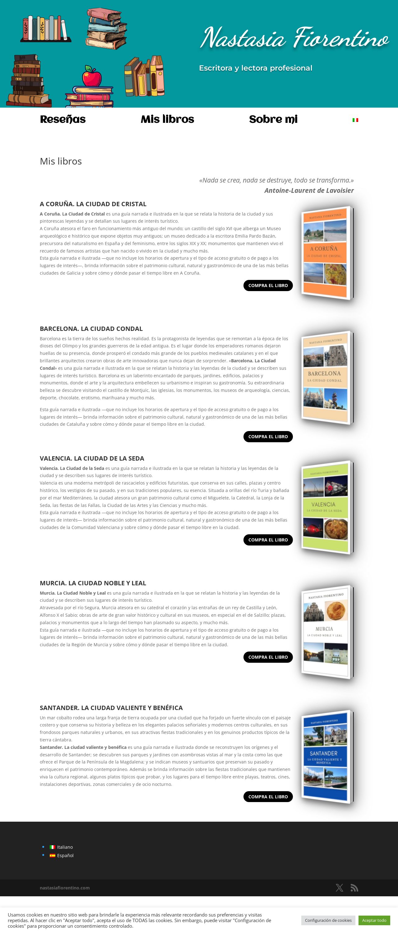
The website's visual design is a feast for the eyes, with a clean and modern aesthetic that immediately grabs the user's attention. The use of a teal background and white text creates a beautiful contrast that makes the content stand out. The images of books and cities add a touch of warmth and personality to the design, making it feel more inviting and engaging. The font is clear and easy to read, which is essential for a website that features a lot of text. Overall, the visual design is well-executed and effectively communicates the website's purpose and tone. However, there are a few areas where the design could be improved. The use of too many different fonts and font sizes can make the design feel a bit cluttered and overwhelming. Additionally, some of the images could be optimized for better quality, as they appear slightly pixelated. Finally, the website could benefit from a more prominent call-to-action (CTA) to encourage users to explore the website further.
Recommendation:
Simplify font usage and optimize images.
Layout and Clarity
The website's layout is well-organized and easy to navigate, with clear headings and sections that guide the user through the content. The use of white space effectively separates the different sections, making it easy to focus on one piece of information at a time. The website also does a good job of breaking up large blocks of text into smaller, more manageable chunks. However, there are a few areas where the layout could be improved. The website could benefit from a more prominent header or navigation menu to help users quickly find what they're looking for. Additionally, some of the sections feel a bit too long and could be broken up into smaller sub-sections to improve readability. Finally, the website could use more visual elements, such as icons or graphics, to add some visual interest and break up the text.
Recommendation:
Add a prominent header and break up long sections.
Content
The website's content is well-written and engaging, with a clear and concise tone that effectively communicates the website's purpose and message. The use of headings and subheadings helps to organize the content and make it easier to scan, and the inclusion of images and other visualelements adds some visual interest and breaks up the text. The content is well-researched and provides valuable information to the user, and the website does a good job of providing a clear call-to-action (CTA) to encourage users to take the next step. However, there are a few areas where the content could be improved. The website could benefit from a more prominent and consistent tone of voice, as some sections feel a bit too formal or generic. Additionally, some of the paragraphs could be broken up into smaller, more manageable chunks to improve readability. Finally, the website could use more visuals, such as infographics or videos, to add some variety to the content and make it more engaging.
Recommendation:
Develop a consistent tone of voice and add more visuals.
This website was last rated on Dec. 15, 2024, 12:32 p.m.
Disclaimer: ratemysite.app is not affiliated with the website you are viewing, and does not endorse it in any way.
Ratings are subjective and based on AI's analysis. We filter out explicit or dangerous content, but cannot guarantee that all sites are safe.
All rights reserved. © ratemysite.app 2024. Contact: hello @ domain.
