Rate your website in seconds – get instant feedback.
I will rate your website's design and give recommendations to enhance its visual appeal and user experience. See how your site ranks on the leaderboard!

Polynesian Journal of Mathematics
Analyzed by AI for fun and insights - not to be taken too seriously!
Visual Design
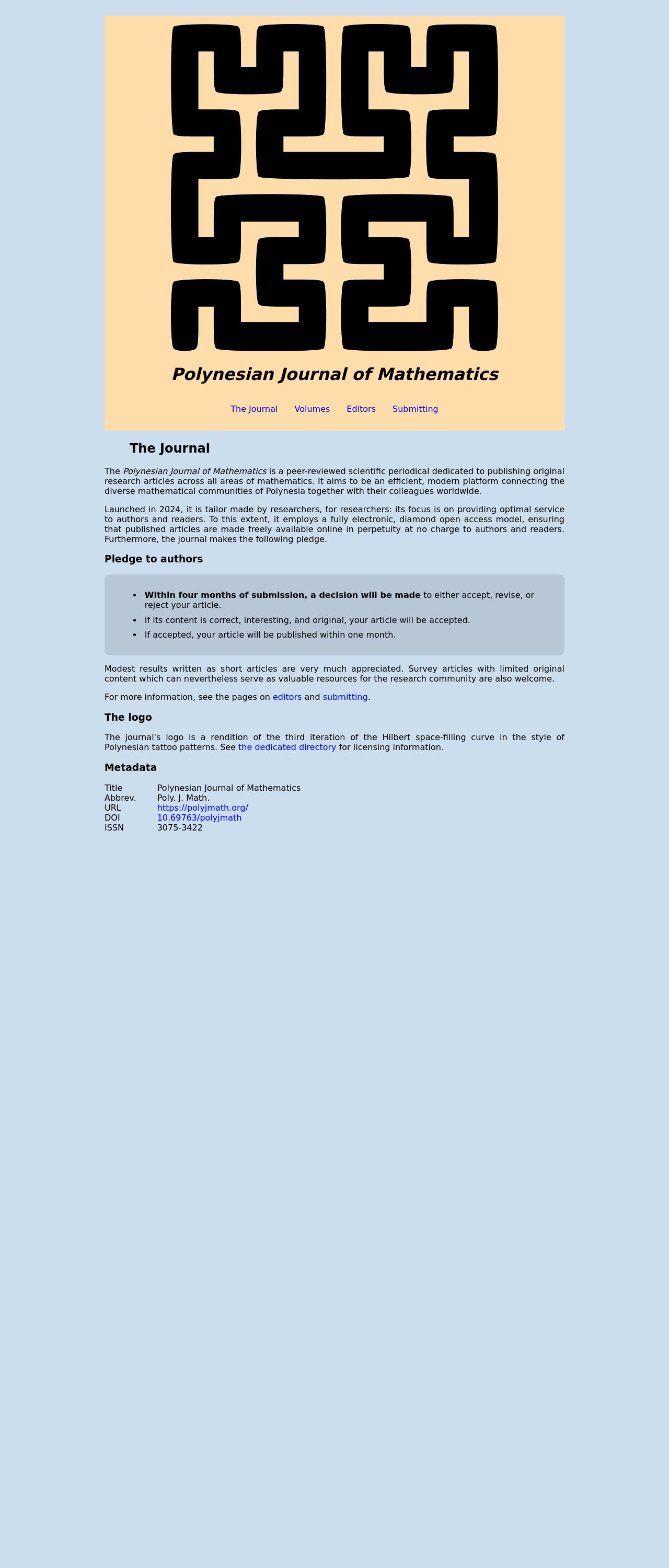
The visual design of the Polynesian Journal of Mathematics website is visually appealing and effective. The use of a yellow background with a black logo that resembles Polynesian tattoo patterns creates a unique and cohesive look. The logo is prominently displayed at the top of the page, making it easily recognizable. The text is clear and easy to read, although it could benefit from being slightly larger to make it more readable. The use of white text on the yellow background makes the content stand out, but it could be improved by using a darker font to make the text more legible. Overall, the visual design is effective in conveying the journal's theme and creating a professional look.
Recommendation:
Consider increasing the font size of the text to make it more readable, and explore using a darker font to improve legibility.
Layout and Clarity
The layout of the website is well-organized and easy to navigate. The use of clear headings and concise paragraphs makes it simple to scan the content. The journal's pledge to authors and the layout of the text are well-designed, making it easy to understand the journal's mission and goals. However, the text could be formatted to make it more visually appealing, with more white space between paragraphs to improve readability. Additionally, the use of a table of contents or a navigation menu would enhance the user experience.
Recommendation:
Consider adding more white space between paragraphs to improve readability, and explore using a table of contents or a navigation menu to enhance the user experience.
Content
The content of the website is informative and well-structured, providing a clear overview of the journal's mission and goals. The journal's pledge to authors is outlined in a concise and easy-to-understand format, making it clear what authors can expect from the publishing process. However, the text could be improved by using more engaging language and imagery to make it more visually appealing. Additionally, providing examples of published articles or including images related to mathematics would enhance the content.
Recommendation:
Consider using more engaging language and imagery to make the content more visually appealing, and explore providing examples of published articles or including images related to mathematics.
This website was last rated on Jan. 26, 2025, 9:07 p.m.
Disclaimer: ratemysite.app is not affiliated with the website you are viewing, and does not endorse it in any way.
Ratings are subjective and based on AI's analysis. We filter out explicit or dangerous content, but cannot guarantee that all sites are safe.

All rights reserved. © ratemysite.app 2024. Contact: hello @ domain.