Rate your website in seconds – get instant feedback.
I will rate your website's design and give recommendations to enhance its visual appeal and user experience. See how your site ranks on the leaderboard!
Home - Pronopval Nopal Fresco y Sostenible

Analyzed by AI for fun and insights - not to be taken too seriously!
Visual Design
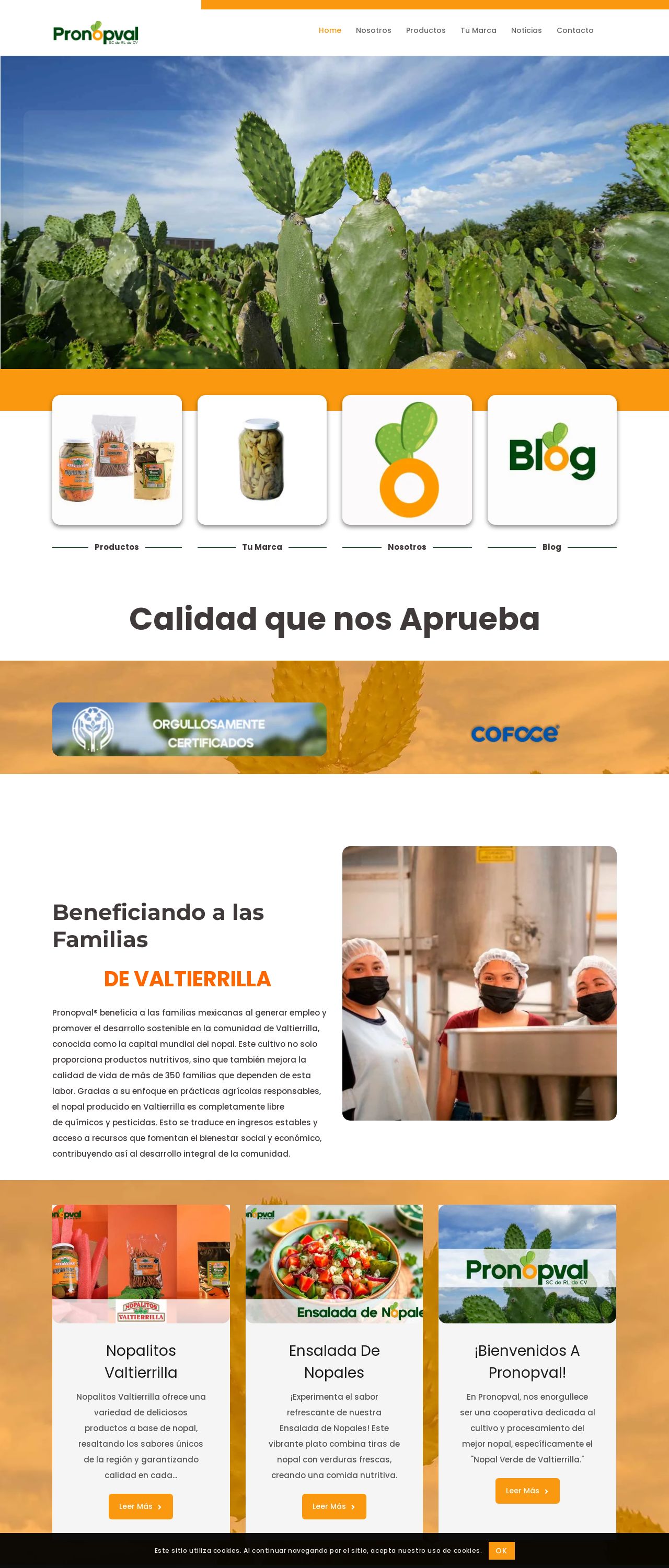
The visual design of this website is a true feast for the eyes. The use of a vibrant orange color scheme immediately grabs your attention and sets the tone for a lively and energetic brand. The images of cacti and other plants are crisp and well-defined, adding a touch of natural beauty to the design. The typography is clean and easy to read, making it simple to navigate the site. One thing that really stands out is the use of whitespace, which creates a sense of breathability and makes the content feel less cluttered. Overall, the visual design is a great representation of the brand's personality and style.
Recommendation:
Consider adding more visual interest with graphics or icons to break up the text.
Layout and Clarity
The layout of this website is well-organized and easy to follow. The use of a clear hierarchy of information makes it simple to find what you're looking for. The navigation menu is prominent and easy to use, and the content is divided into clear sections. One thing that could be improved is the use of headings and subheadings, which would help to break up the text and make it easier to scan. Additionally, some of the paragraphs are a bit long and could be broken up for better readability.
Recommendation:
Break up long paragraphs into shorter ones for better readability.
Content
The content on this website is informative and engaging. The writing is clear and concise, and the use of headings and subheadings helps to break up the text. The images are relevant and add visual interest to the page. One thing that could be improved is the use of more descriptive headings, which would help to give users a better idea of what each section is about. Additionally, some of the sentences are a bit long and could be broken up for better readability.
Recommendation:
Use more descriptive headings to give users a better idea of what each section is about.
This website was last rated on Nov. 26, 2024, 1 a.m.
Disclaimer: ratemysite.app is not affiliated with the website you are viewing, and does not endorse it in any way.
Ratings are subjective and based on AI's analysis. We filter out explicit or dangerous content, but cannot guarantee that all sites are safe.
All rights reserved. © ratemysite.app 2024. Contact: hello @ domain.
