Rate your website in seconds – get instant feedback.
I will rate your website's design and give recommendations to enhance its visual appeal and user experience. See how your site ranks on the leaderboard!
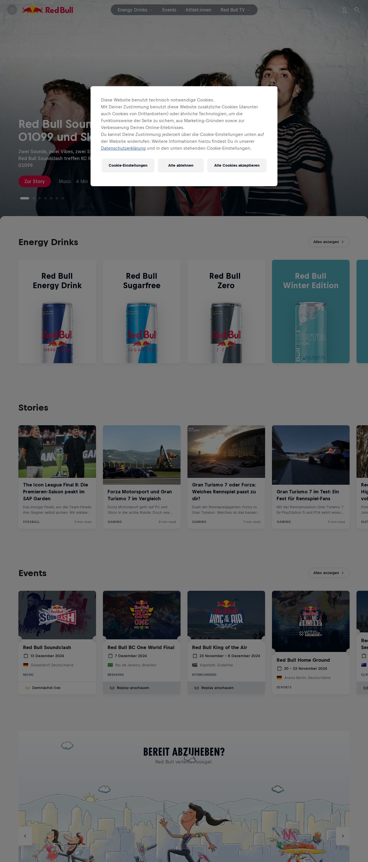
Red Bull Energy Drink – Verleiht Flüüügel.

Analyzed by AI for fun and insights - not to be taken too seriously!
Visual Design
The visual design of the Red Bull website is a striking combination of bold colors and dynamic graphics. The prominent use of the iconic Red Bull logo, featuring a stylized bull's head with wings, immediately grabs attention and establishes brand recognition. The color scheme is predominantly black, white, and red, which creates a high-energy and attention-grabbing atmosphere. The layout is well-organized, making it easy to navigate through the various sections of the site. The use of large, bold font sizes and clear headings further enhances readability and visual appeal. However, some areas of the website could benefit from more whitespace to create a cleaner and more modern look.
Recommendation:
Implement a more balanced use of whitespace to enhance visual appeal.
Layout and Clarity
The layout of the website is well-structured, with a clear hierarchy of information that makes it easy to find what you're looking for. The use of clear headings and concise text makes it simple to scan and understand the content. However, some sections could benefit from more prominent calls-to-action (CTAs) to encourage user engagement. The overall design is modern and engaging, but there are areas where the layout could be improved for better visual flow and user experience.
Recommendation:
Add more prominent CTAs throughout the site to encourage user engagement.
Content
The content on the Red Bull website is engaging and informative, with a good balance of text and visuals. The writing style is energetic and dynamic, matching the brand's personality. However, some sections could benefit from more concise and scannable content to improve readability. The use of subheadings and bullet points would help to break up the content and make it easier to digest. Overall, the content is well-suited to the brand's target audience and effectively communicates the Red Bull message.
Recommendation:
Use more concise and scannable content, and incorporate subheadings and bullet points to improve readability.
This website was last rated on Dec. 11, 2024, 12:36 p.m.
Disclaimer: ratemysite.app is not affiliated with the website you are viewing, and does not endorse it in any way.
Ratings are subjective and based on AI's analysis. We filter out explicit or dangerous content, but cannot guarantee that all sites are safe.
All rights reserved. © ratemysite.app 2024. Contact: hello @ domain.
