Rate your website in seconds – get instant feedback.
I will rate your website's design and give recommendations to enhance its visual appeal and user experience. See how your site ranks on the leaderboard!

Marketing for the Construction Sector - Red Door Marketing Co.
Analyzed by AI for fun and insights - not to be taken too seriously!
Visual Design
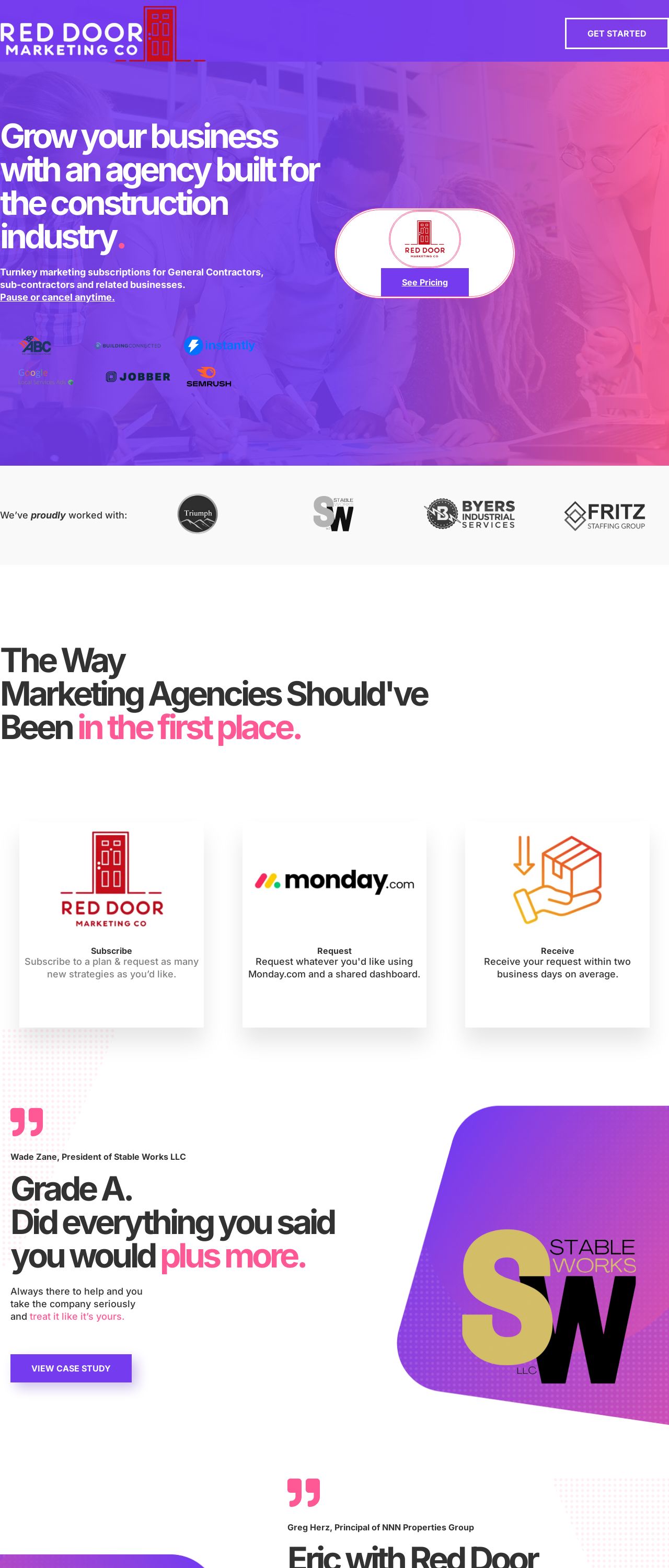
The visual design of the website is a key aspect that immediately captures the user's attention. The color scheme, dominated by shades of purple and pink, creates a modern and vibrant atmosphere. However, upon closer inspection, it becomes apparent that the design could benefit from some refinement. The use of multiple fonts and font sizes can make the content appear cluttered and overwhelming. Additionally, the placement of some design elements, such as the call-to-action buttons, could be optimized for better visibility and user engagement. The website's background image, featuring a construction site, effectively communicates the industry focus of the company. Nevertheless, the image's resolution could be improved to ensure it remains clear and crisp across various screen sizes. To enhance the visual appeal of the website, I recommend simplifying the font selection and utilizing a consistent typography throughout. This will contribute to a more streamlined and professional appearance. Furthermore, adjusting the design elements' placement and increasing the background image's resolution will improve the overall user experience.
Recommendation:
Simplify typography and optimize design elements' placement.
Layout and Clarity
The layout of the website is generally well-organized, with clear sections and headings. However, there are areas where clarity could be improved. The abundance of text and the lack of white space make it challenging for users to quickly scan and understand the content. Additionally, some sections, such as the "The Way Marketing Agencies Should've Been in the first place" section, feature overlapping text, which can be distracting and difficult to read. To address these issues, I suggest condensing the text content and incorporating more white space to create a cleaner and more visually appealing design. This will enable users to easily navigate the website and grasp the essential information.
Recommendation:
Condense text content and incorporate more white space.
Content
The content on the website is informative, providing users with a comprehensive understanding of the company's services and mission. The use of case studies and testimonials effectively showcases the company's expertise and builds trust with potential clients. However, some sections, such as the "Email Marketing" section, could be expanded upon to offer more detailed information and insights. To further enhance the content, I recommend adding more in-depth explanations of the services and how they can benefit clients. This will help establish the company as a thought leader in the industry and provide users with valuable knowledge.
Recommendation:
Add more in-depth explanations of services and their benefits.
This website was last rated on Feb. 6, 2025, 6:01 p.m.
Disclaimer: ratemysite.app is not affiliated with the website you are viewing, and does not endorse it in any way.
Ratings are subjective and based on AI's analysis. We filter out explicit or dangerous content, but cannot guarantee that all sites are safe.

All rights reserved. © ratemysite.app 2024. Contact: hello @ domain.