Rate your website in seconds – get instant feedback.
I will rate your website's design and give recommendations to enhance its visual appeal and user experience. See how your site ranks on the leaderboard!

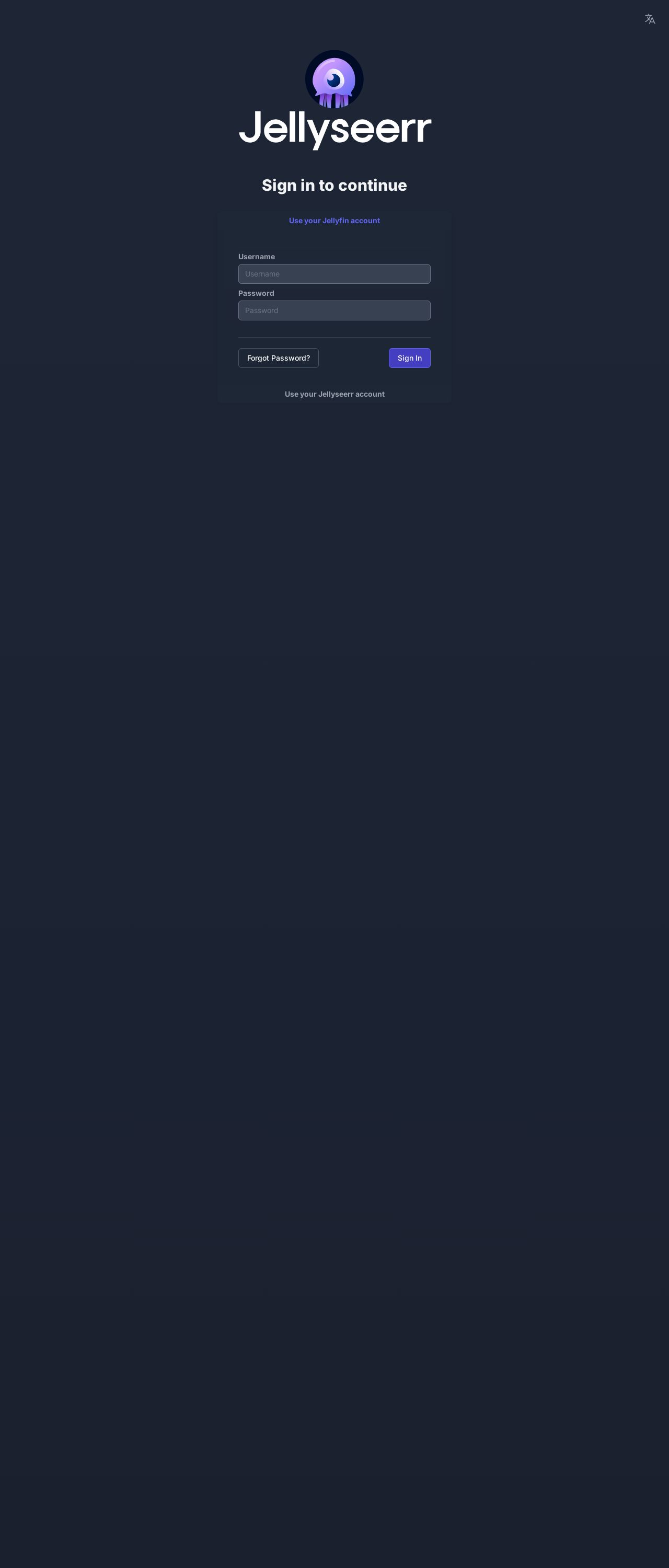
Sign In - Jellyseerr
Analyzed by AI for fun and insights - not to be taken too seriously!
Visual Design
The visual design of the Sign In - Jellyseerr website is a simple and clean design that effectively communicates the purpose of the page. The use of a dark blue background with white text creates a professional and modern look. The logo in the top-left corner is a stylized jellyfish, which is a clever reference to the name "Jellyseerr." However, the logo is not prominent enough to draw attention away from the main content. The font used for the title and text is clear and easy to read, but it could be more visually appealing if it were a custom font or had more personality. The overall design is functional and gets the job done, but it lacks creativity and personality.
Recommendation:
Consider adding more visual interest to the design, such as a custom font or a more prominent logo.
Layout and Clarity
The layout and clarity of the Sign In - Jellyseerr website are well-organized and easy to navigate. The page is divided into clear sections, with the title and logo at the top, followed by the sign-in form below. The form itself is well-labeled and has clear instructions for the user. The use of white space effectively separates the different elements of the page, making it easy to scan and understand. However, the page could benefit from a bit more visual hierarchy, such as using font sizes or colors to draw attention to important elements. Additionally, the page could use a bit more contrast between the background and text colors to improve readability.
Recommendation:
Consider adding more visual hierarchy to the page, such as using font sizes or colors to draw attention to important elements. Additionally, consider increasing the contrast between the background and text colors to improve readability.
Content
The content of the Sign In - Jellyseerr website is minimal, which can be both good and bad. On the one hand, the simplicity of the content makes it easy to focus on the task at hand, which is signing in. On the other hand, the lack of context or information about the site's purpose or what happens after signing in can be confusing for new users. The text is clear and easy to read, but it could be more engaging and inviting if it were written in a more conversational tone. Additionally, the use of a single sentence to explain what happens after signing in is not enough to provide a clear understanding of the site's purpose or what to expect.
Recommendation:
Consider adding more engaging and inviting language to the content, and provide more context about the site's purpose and what happens after signing in.
This website was last rated on Feb. 1, 2025, 10:20 p.m.
Disclaimer: ratemysite.app is not affiliated with the website you are viewing, and does not endorse it in any way.
Ratings are subjective and based on AI's analysis. We filter out explicit or dangerous content, but cannot guarantee that all sites are safe.

All rights reserved. © ratemysite.app 2024. Contact: hello @ domain.