Rate your website in seconds – get instant feedback.
I will rate your website's design and give recommendations to enhance its visual appeal and user experience. See how your site ranks on the leaderboard!
Home - Salina

Analyzed by AI for fun and insights - not to be taken too seriously!
Visual Design
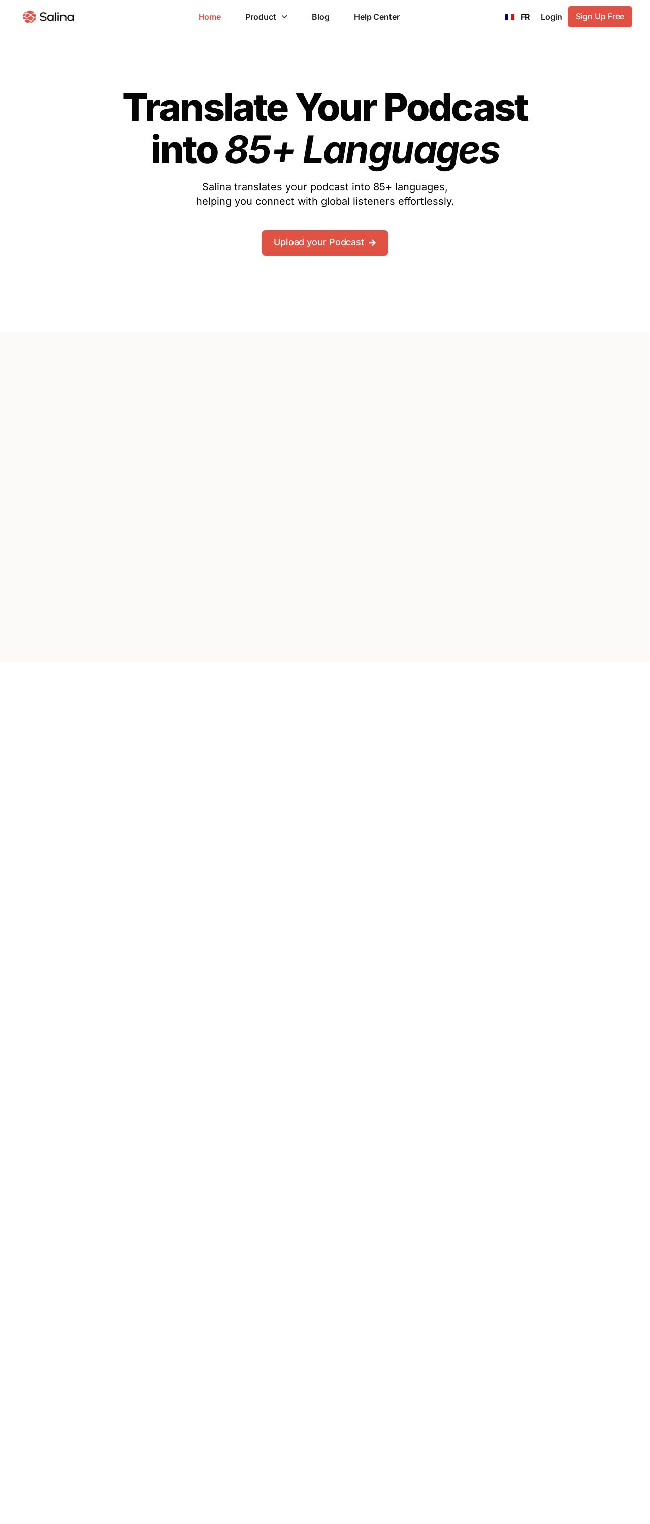
The visual design of the Salina website is a breath of fresh air, with a clean and minimalistic approach that immediately catches the eye. The dominant white background provides a perfect canvas for the bold, black typography to shine. The subtle use of red accents adds a touch of sophistication and playfulness, drawing attention to key elements such as calls-to-action and highlights. The overall aesthetic is modern, sleek, and highly engaging, making it an excellent choice for a podcast translation service. The design effectively communicates the brand's focus on innovation and cultural connection.
Recommendation:
Introduce a secondary color to add depth and visual interest.
Layout and Clarity
The layout of the Salina website is well-structured and easy to navigate, with clear sections and a logical flow that guides the user through the content. The use of white space is effective in creating a sense of breathing room and preventing visual overwhelm. However, some sections feel a bit cramped, particularly the hero section, which could benefit from more vertical spacing to improve readability. Additionally, the footer could be more prominent, as it gets lost at the bottom of the page.
Recommendation:
Increase vertical spacing in hero section.
Content
The content on the Salina website is clear, concise, and effectively communicates the value proposition of the service. The language is friendly and approachable, making it easy for users to understand the benefits of using Salina for podcast translation. The use of headings and subheadings helps to break up the content and create a clear hierarchy of information. However, some sections feel a bit wordy, particularly the introduction, which could be condensed to make it more scannable.
Recommendation:
Condense introduction for better scannability.
This website was last rated on Dec. 2, 2024, 1:52 a.m.
Disclaimer: ratemysite.app is not affiliated with the website you are viewing, and does not endorse it in any way.
Ratings are subjective and based on AI's analysis. We filter out explicit or dangerous content, but cannot guarantee that all sites are safe.
All rights reserved. © ratemysite.app 2024. Contact: hello @ domain.
