Rate your website in seconds – get instant feedback.
I will rate your website's design and give recommendations to enhance its visual appeal and user experience. See how your site ranks on the leaderboard!
Blog - Scissortail Creative Services, LLC

Analyzed by AI for fun and insights - not to be taken too seriously!
Visual Design
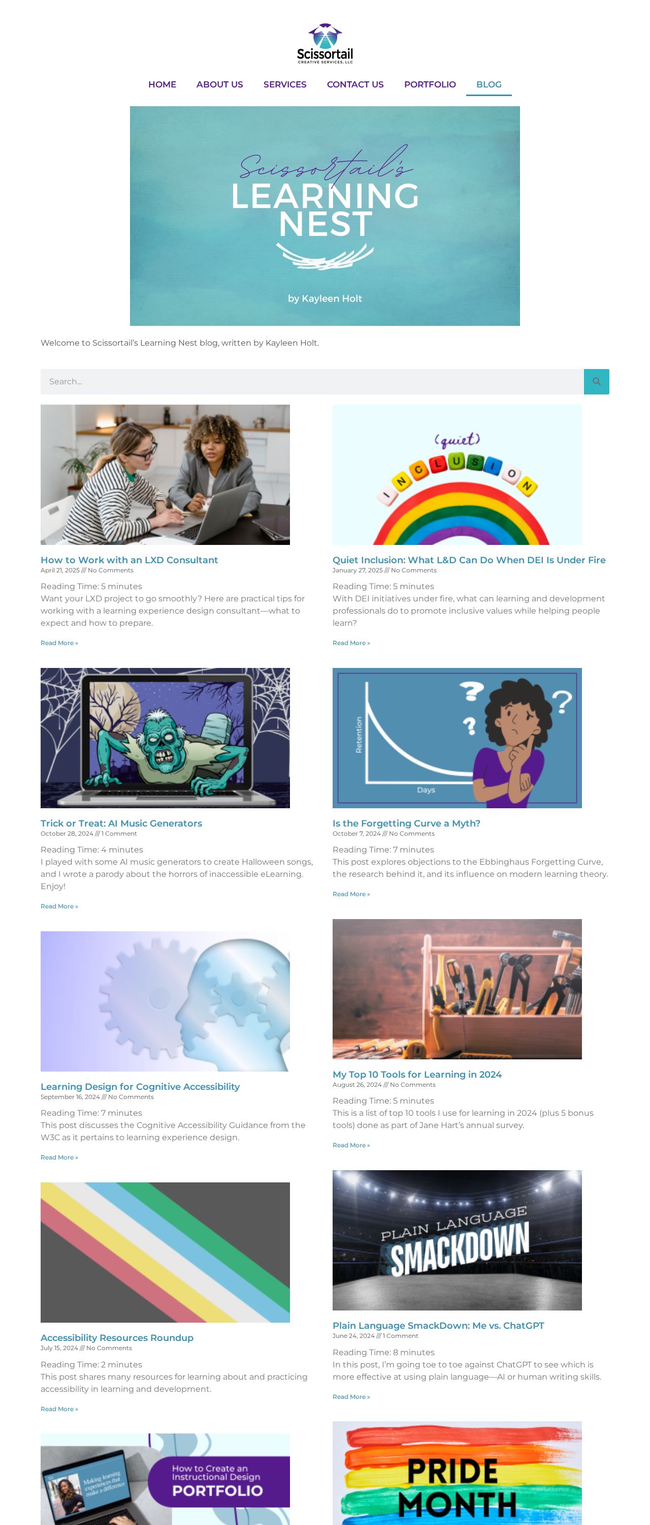
The website's visual design is clean and modern, with a calming color scheme that immediately conveys a sense of professionalism. The hero section features a soothing teal background with white text, creating a clear visual hierarchy. The use of a simple, sans-serif font is consistent throughout the website, making it easy to read. However, the color palette is somewhat limited, with a focus on teal, white, and black. Adding a few more colors to the palette could enhance visual interest and make the website more engaging. The images and graphics used throughout the website are high-quality and relevant to the content, which is great. Overall, the visual design effectively communicates the website's focus on learning and accessibility.
Recommendation:
Consider adding a few more colors to the palette to enhance visual interest and make the website more engaging.
Layout and Clarity
The website's layout is well-organized and easy to navigate. The use of a grid system is evident, with clear columns and rows that make it easy to scan the content. The search bar is prominently displayed, making it easy for users to find specific articles. The article summaries are concise and include relevant images, which helps to break up the text and make the content more scannable. However, the layout could benefit from more whitespace to create a sense of breathing room and make the content feel less dense. Additionally, the "Read More" links could be more prominent to encourage users to click and read the full articles.
Recommendation:
Add more whitespace to create a sense of breathing room and make the content feel less dense.
Content
The content on the website is high-quality, relevant, and engaging. The articles are well-written, informative, and cover a range of topics related to learning experience design and accessibility. The tone is professional and approachable, making it easy for users to understand complex concepts. The use of summaries and "Read More" links makes it easy for users to scan the content and find what they're interested in. However, there could be more visual content, such as infographics or videos, to break up the text and make the content more engaging. Additionally, the website could benefit from a clearer call-to-action (CTA) to encourage users to take a specific action, such as signing up for a newsletter or contacting the author.
Recommendation:
Consider adding more visual content, such as infographics or videos, to break up the text and make the content more engaging.
This website was last rated on April 30, 2025, 2:12 a.m.
Disclaimer: ratemysite.app is not affiliated with the website you are viewing, and does not endorse it in any way.
Ratings are subjective and based on AI's analysis. We filter out explicit or dangerous content, but cannot guarantee that all sites are safe.
All rights reserved. © ratemysite.app 2024. Contact: hello @ domain.
