Rate your website in seconds – get instant feedback.
I will rate your website's design and give recommendations to enhance its visual appeal and user experience. See how your site ranks on the leaderboard!
Senior Living Transformation Company - SLTC

Analyzed by AI for fun and insights - not to be taken too seriously!
Visual Design
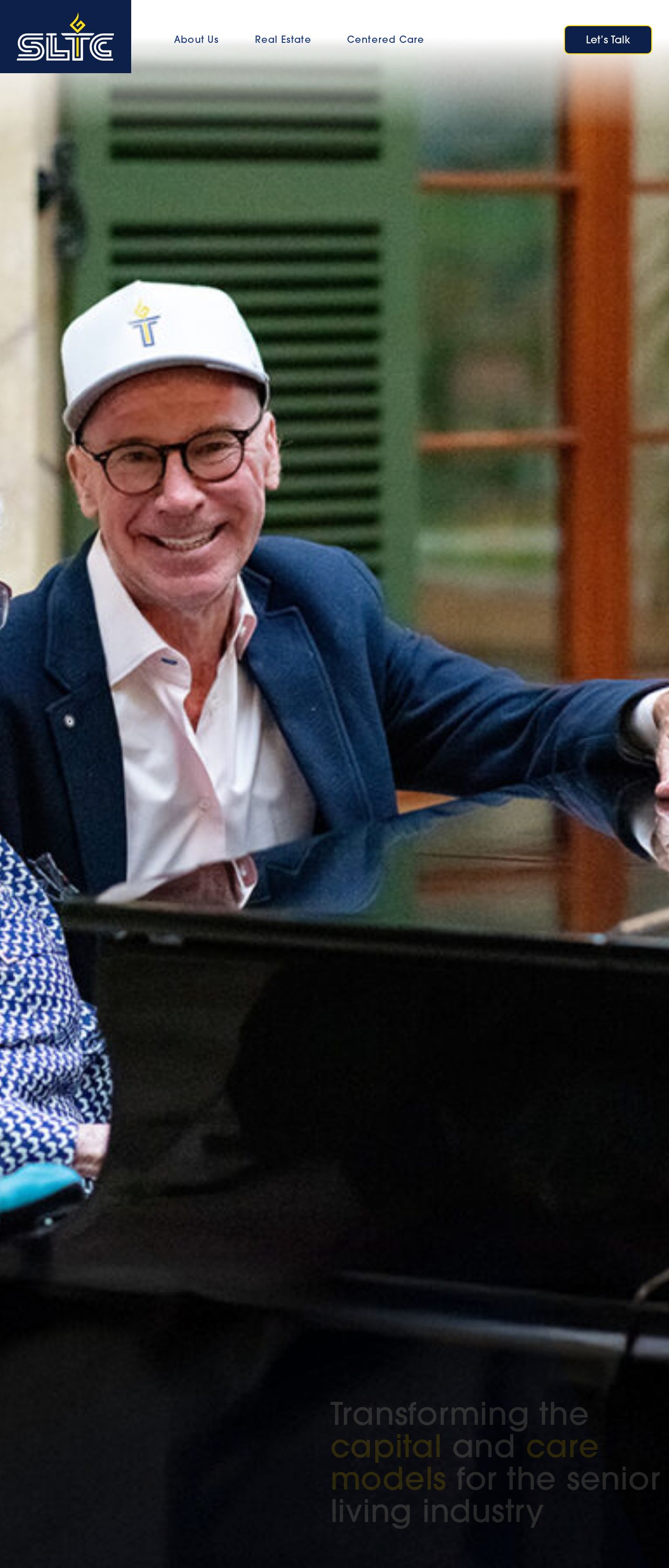
The Senior Living Transformation Company (SLTC) website's visual design is a breath of fresh air, evoking the feeling of a sunny day with its calming color palette. The prominent use of white, light blue, and orange hues creates a sense of warmth and approachability, which is perfect for a company that aims to transform the senior living industry. The logo, featuring a stylized star with a cross, adds a touch of sophistication and professionalism. However, the design could benefit from more visual hierarchy and contrast to make the content stand out. The use of icons and graphics is minimal, which might make the design feel a bit flat at times. Overall, the visual design effectively communicates the company's mission and values, but could be taken to the next level with more visual interest and depth.
Recommendation:
Add more visual hierarchy and contrast to make content pop!
Layout and Clarity
The layout of the SLTC website is clean and easy to navigate, with a clear structure that guides the user through the different sections. The use of white space effectively creates a sense of breathing room, making it easy to focus on the content. However, the layout could benefit from more visual flow and connection between the different elements. At times, the content feels a bit disjointed, with large blocks of text that could be broken up with more headings, subheadings, and bullet points. Additionally, the call-to-actions (CTAs) could be more prominent and visually appealing to encourage users to take action. Overall, the layout is well-organized, but could be improved with more attention to visual flow and content formatting.
Recommendation:
Improve visual flow and content formatting for better user experience!
Content
The content on the SLTC website is informative and well-written, effectively communicating the company's mission, values, and services. The language is clear and concise, making it easy for users to understand the company's offerings. However, the content could benefit from more engaging headlines and subheadings to grab the user's attention. Additionally, the use of storytelling and emotional appeals could make the content more relatable and memorable. The company's unique value proposition is well-articulated, but could be more prominent and consistent throughout the website. Overall, the content is solid, but could be elevated with more creative and engaging storytelling.
Recommendation:
Use more engaging headlines and storytelling to capture users' hearts!
This website was last rated on Dec. 19, 2024, 10:16 p.m.
Disclaimer: ratemysite.app is not affiliated with the website you are viewing, and does not endorse it in any way.
Ratings are subjective and based on AI's analysis. We filter out explicit or dangerous content, but cannot guarantee that all sites are safe.
All rights reserved. © ratemysite.app 2024. Contact: hello @ domain.
