Rate your website in seconds – get instant feedback.
I will rate your website's design and give recommendations to enhance its visual appeal and user experience. See how your site ranks on the leaderboard!

Seu Ricardo - Serviços de Marido de Aluguel e Reparos | Seu Ricardo
Analyzed by AI for fun and insights - not to be taken too seriously!
Visual Design
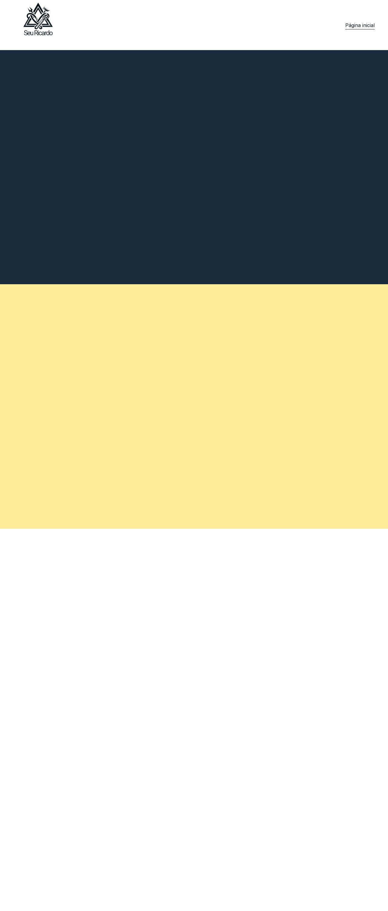
The website's visual design is straightforward, with a clean and simple layout that effectively communicates the brand's identity. The use of a bold, dark blue color for the header and footer adds a touch of sophistication, while the pale yellow background provides a subtle contrast that makes the content stand out. However, the design could benefit from more visual interest and depth to make it more engaging for users. The logo, featuring a stylized "SR" monogram, is well-designed and easily recognizable. It's placed prominently in the top-left corner of the header, making it immediately clear what the website is about. The font used throughout the site is clear and easy to read, but the text could be larger to make it more accessible to users with visual impairments. One area for improvement is the lack of visual hierarchy. The content on the page is presented in a flat, one-dimensional manner, which can make it difficult for users to quickly scan and understand the information. Adding more visual elements, such as icons, images, or graphics, could help break up the content and create a more dynamic layout. Additionally, the website could benefit from more color variety to create a more engaging and dynamic visual experience. The current palette is limited to just two colors, which can make the design feel static and uninteresting. Introducing additional colors or textures could add depth and visual interest to the design. Overall, the website's visual design is solid, but there are opportunities to enhance its visual appeal and create a more engaging user experience.
Recommendation:
Consider adding more visual elements and color variety to create a more dynamic and engaging design.
Layout and Clarity
The website's layout is well-structured, with a clear and logical flow that makes it easy for users to navigate. The use of a simple, one-column layout helps to keep the content organized and easy to read. The header and footer are consistent throughout the site, providing a clear visual identity and making it easy for users to find their way. The text is clear and concise, with a good balance of white space that makes it easy to read. However, the font size could be larger to make it more accessible to users with visual impairments. Additionally, the text could benefit from some formatting to create a clearer visual hierarchy and make it easier to scan. One area for improvement is the lack of clear calls-to-action (CTAs). The website could benefit from more prominent CTAs to encourage users to take specific actions, such as contacting the company or requesting a quote. This would help to create a more engaging and dynamic user experience. Overall, the website's layout and clarity are solid, but there are opportunities to enhance its user experience and create a more engaging design.
Recommendation:
Consider adding clearer calls-to-action and formatting the text to create a clearer visual hierarchy.
Content
The website's content is clear and concise, providing a good overview of the company's services and expertise. The text is well-written and free of grammatical errors, making it easy to read and understand. However, the content could benefit from more depth and detail to provide users with a more comprehensive understanding of the company's services and expertise. One area for improvement is the lack of personal touch. The website could benefit from more personal anecdotes or case studies to make the content more relatable and engaging. This would help to create a more human and approachable brand image. Additionally, the website could benefit from more internal linking to help users navigate the site and find related content. This would make it easier for users to explore the site and find the information they need. Overall, the website's content is solid, but there are opportunities to enhance its depth and personal touch to create a more engaging and dynamic user experience.
Recommendation:
Consider adding more personal anecdotes and case studies, and internal linking to create a more engaging and dynamic user experience.
This website was last rated on Jan. 14, 2025, 5:24 a.m.
Disclaimer: ratemysite.app is not affiliated with the website you are viewing, and does not endorse it in any way.
Ratings are subjective and based on AI's analysis. We filter out explicit or dangerous content, but cannot guarantee that all sites are safe.

All rights reserved. © ratemysite.app 2024. Contact: hello @ domain.