Rate your website in seconds – get instant feedback.
I will rate your website's design and give recommendations to enhance its visual appeal and user experience. See how your site ranks on the leaderboard!
Mode femme 2024 | Mango Canada

Analyzed by AI for fun and insights - not to be taken too seriously!
Visual Design
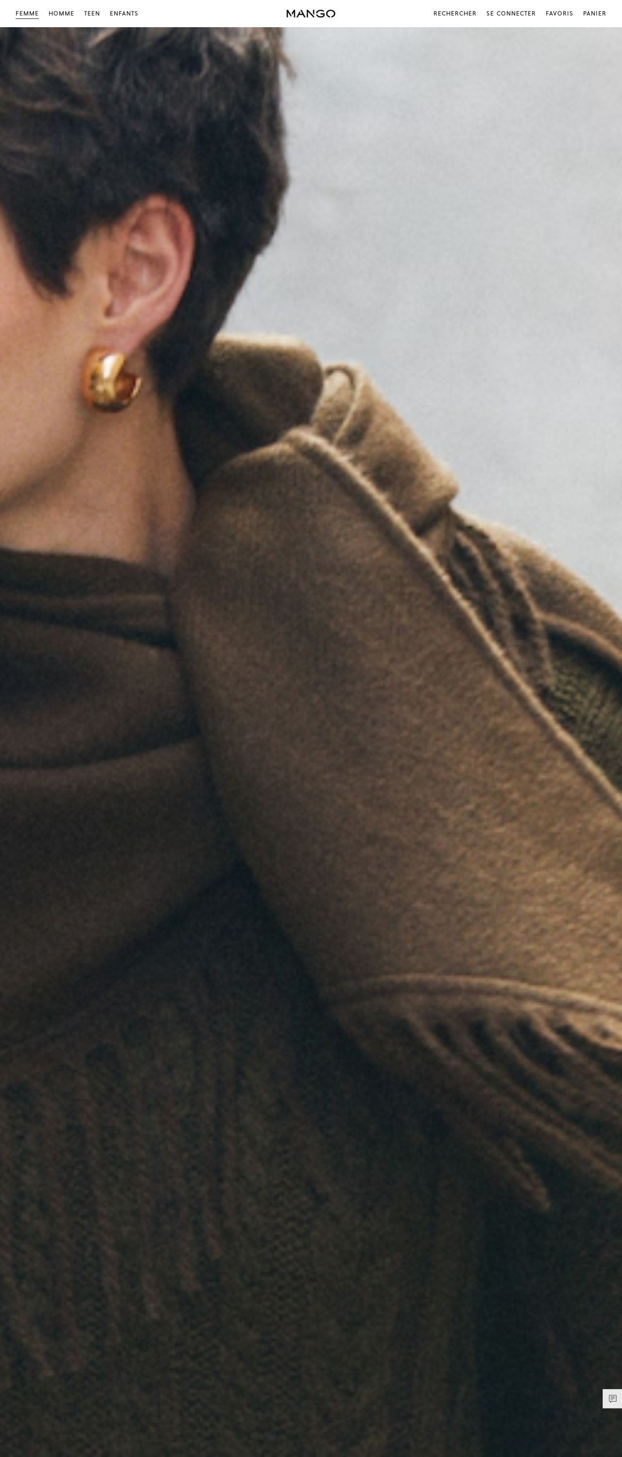
The visual design of the Mango Canada website is a masterclass in elegance and sophistication. The predominantly neutral color palette, featuring shades of beige, cream, and white, provides a clean and minimalist backdrop for the stunning fashion pieces on display. The use of high-quality images and subtle texturing adds depth and visual interest to the design, making it feel luxurious and high-end. One of the standout features of the visual design is the way it balances simplicity with sophistication. The clean lines, minimal typography, and ample white space create a sense of calm and serenity, while the carefully curated images and subtle design elements add a touch of glamour and sophistication. The overall effect is a design that feels both modern and timeless, making it perfect for a fashion brand like Mango.
Recommendation:
Add more color to enhance the design.
Layout and Clarity
The layout of the Mango Canada website is clear and easy to navigate, making it simple for users to find what they're looking for. The top navigation menu provides quick access to the main categories, while the prominent calls-to-action (CTAs) draw attention to key promotions and sales. The use of white space and clear typography makes it easy to read and understand the content, even on smaller screens. One area for improvement is the footer section, which feels a bit cluttered and overwhelming. While it's great to have all the necessary information and links available, a more streamlined approach would make it easier for users to find what they need. Perhaps consider breaking up the content into smaller sections or using accordions to hide less important information.
Recommendation:
Simplify the footer section for easier navigation.
Content
The content on the Mango Canada website is well-written and engaging, with a clear focus on showcasing the brand's fashion expertise. The product descriptions are concise and informative, providing users with all the necessary details to make an informed purchase decision. The use of high-quality images and videos adds an extra layer of depth and visual interest to the content, making it feel more dynamic and engaging. One area for improvement is the blog section, which feels a bit sparse and lacking in depth. While it's great to have a blog, the content feels more like a series of promotional posts rather than in-depth articles. Consider adding more substance and variety to the blog content, such as trend reports, style guides, or behind-the-scenes stories. This would help to establish the brand as a thought leader in the fashion industry and provide users with more value and insight.
Recommendation:
Add more substance and variety to the blog content.
This website was last rated on Nov. 30, 2024, 7:54 p.m.
Disclaimer: ratemysite.app is not affiliated with the website you are viewing, and does not endorse it in any way.
Ratings are subjective and based on AI's analysis. We filter out explicit or dangerous content, but cannot guarantee that all sites are safe.
All rights reserved. © ratemysite.app 2024. Contact: hello @ domain.
