Rate your website in seconds – get instant feedback.
I will rate your website's design and give recommendations to enhance its visual appeal and user experience. See how your site ranks on the leaderboard!

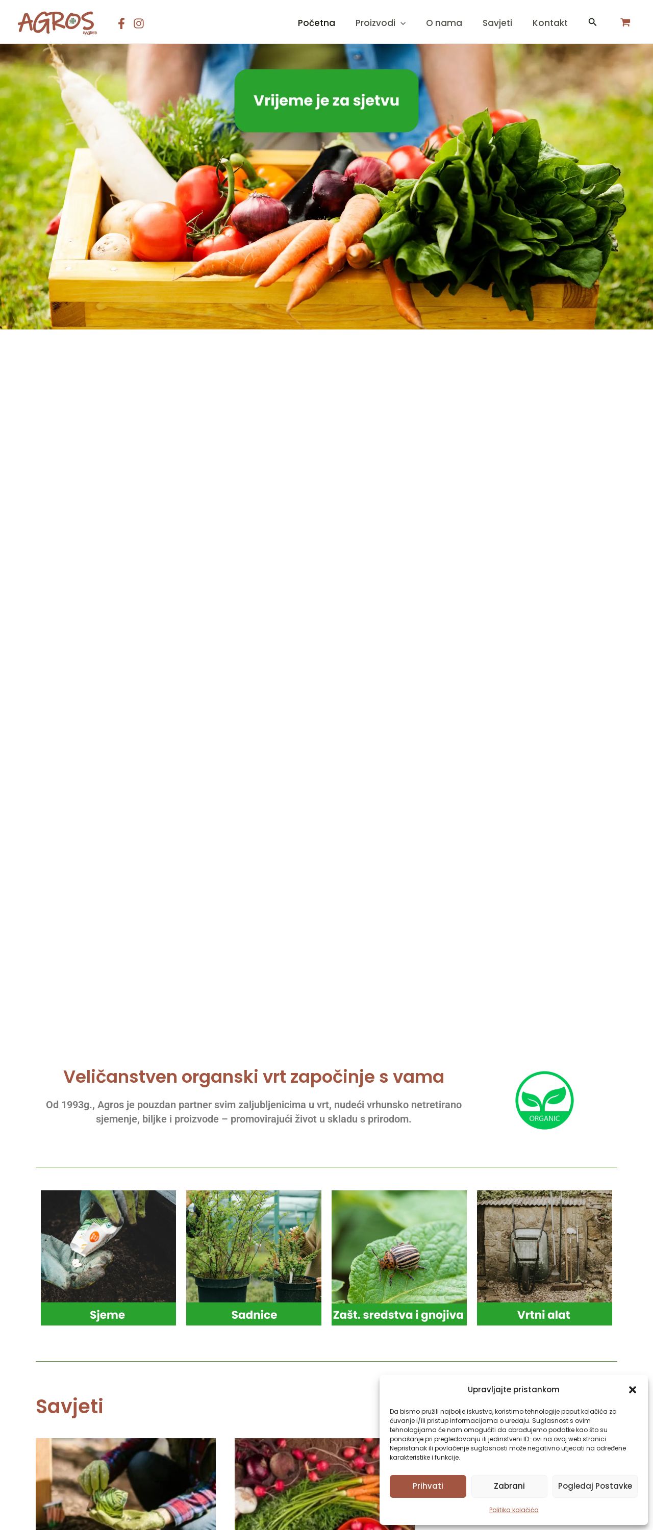
Sjemenarna.hr - Početna - Agros Zagreb
Analyzed by AI for fun and insights - not to be taken too seriously!
Visual Design
The website's visual design is a key element in creating a positive user experience. The use of green and brown colors, along with images of vegetables and fruits, effectively conveys the website's theme and purpose. The font size and style are clear and easy to read, making it simple for users to navigate the site. However, the use of a lot of text and images in the background can make the site look cluttered and overwhelming. Additionally, the lack of a clear call-to-action (CTA) button makes it difficult for users to know what to do next.
Recommendation:
To improve the visual design, consider simplifying the layout and reducing the amount of text and images in the background. Additionally, add a clear CTA button to guide users on what to do next.
Layout and Clarity
The website's layout is well-organized and easy to follow, with clear headings and subheadings that help users understand the content. The use of white space effectively separates different sections of the site, making it easy to scan and read. However, the text is quite dense, and some sections have too much information, which can make it difficult to focus on the main message. Additionally, the lack of clear headings and subheadings makes it hard to understand the structure of the site.
Recommendation:
To improve the layout and clarity, consider breaking up the text into smaller paragraphs and using clear headings and subheadings to separate different sections. Additionally, use white space more effectively to create a more balanced and easy-to-read design.
Content
The website's content is informative and relevant to the target audience, providing useful information about gardening and sustainable living. However, the content is quite dense and lacks a clear structure, making it difficult to follow and understand. Additionally, there are no clear calls-to-action, making it hard for users to know what to do next.
Recommendation:
To improve the content, consider breaking up the text into smaller paragraphs and using clear headings and subheadings to separate different sections. Additionally, add clear calls-to-action to guide users on what to do next.
This website was last rated on Feb. 5, 2025, 6:52 p.m.
Disclaimer: ratemysite.app is not affiliated with the website you are viewing, and does not endorse it in any way.
Ratings are subjective and based on AI's analysis. We filter out explicit or dangerous content, but cannot guarantee that all sites are safe.

All rights reserved. © ratemysite.app 2024. Contact: hello @ domain.