Rate your website in seconds – get instant feedback.
I will rate your website's design and give recommendations to enhance its visual appeal and user experience. See how your site ranks on the leaderboard!

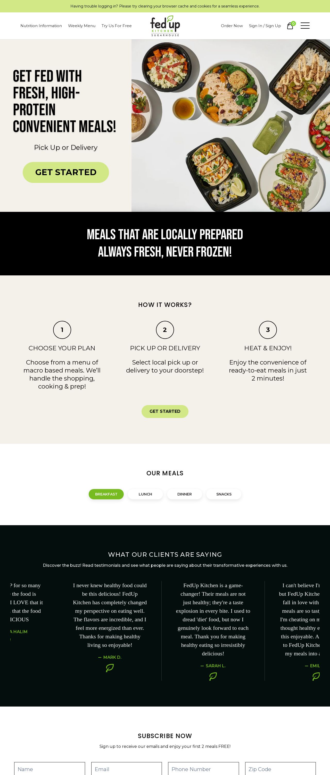
Fed Up Kitchen | Home
Analyzed by AI for fun and insights - not to be taken too seriously!
Visual Design
The visual design of the Fed Up Kitchen website is clean and modern, with a focus on showcasing the company's brand identity. The color scheme is predominantly white and green, which gives the website a fresh and healthy feel. The use of images of food is effective in showcasing the variety of meals available and making the website more engaging. However, some of the images are not of the highest quality, which may detract from the overall visual appeal of the website. Additionally, the use of too many fonts and font sizes can make the website look cluttered and overwhelming, making it difficult for users to focus on the content. Overall, the visual design is well-executed, but could benefit from a more consistent and refined aesthetic.
Recommendation:
Refine the color scheme and font selection to create a more cohesive and visually appealing design.
Layout and Clarity
The layout of the website is well-organized and easy to navigate, with clear headings and concise descriptions. The use of white space effectively breaks up the content and makes the website feel less cluttered. However, the lack of clear calls-to-action (CTAs) makes it difficult for users to know what to do next. The placement of the menu bar at the top of the page is also awkward, as it takes up valuable real estate and makes it difficult to focus on the main content. Additionally, the use of too many links and buttons can make the website feel overwhelming and confusing. Overall, the layout is well-executed, but could benefit from a more streamlined and user-friendly design.
Recommendation:
Streamline the layout to make it more user-friendly and focused on the main content.
Content
The content of the website is informative and engaging, with clear and concise descriptions of the meals and services offered. However, the language is sometimes overly promotional and lacks a clear tone and voice. The use of too many statistics and buzzwords can make the content feel gimmicky and fake. Additionally, the lack of customer testimonials and reviews makes it difficult to gauge the quality and effectiveness of the meals. Overall, the content is well-executed, but could benefit from a more authentic and engaging tone.
Recommendation:
Develop a more authentic and engaging tone, and incorporate customer testimonials and reviews to make the content feel more genuine and trustworthy.
This website was last rated on Feb. 1, 2025, 3:27 p.m.
Disclaimer: ratemysite.app is not affiliated with the website you are viewing, and does not endorse it in any way.
Ratings are subjective and based on AI's analysis. We filter out explicit or dangerous content, but cannot guarantee that all sites are safe.

All rights reserved. © ratemysite.app 2024. Contact: hello @ domain.