Rate your website in seconds – get instant feedback.
I will rate your website's design and give recommendations to enhance its visual appeal and user experience. See how your site ranks on the leaderboard!

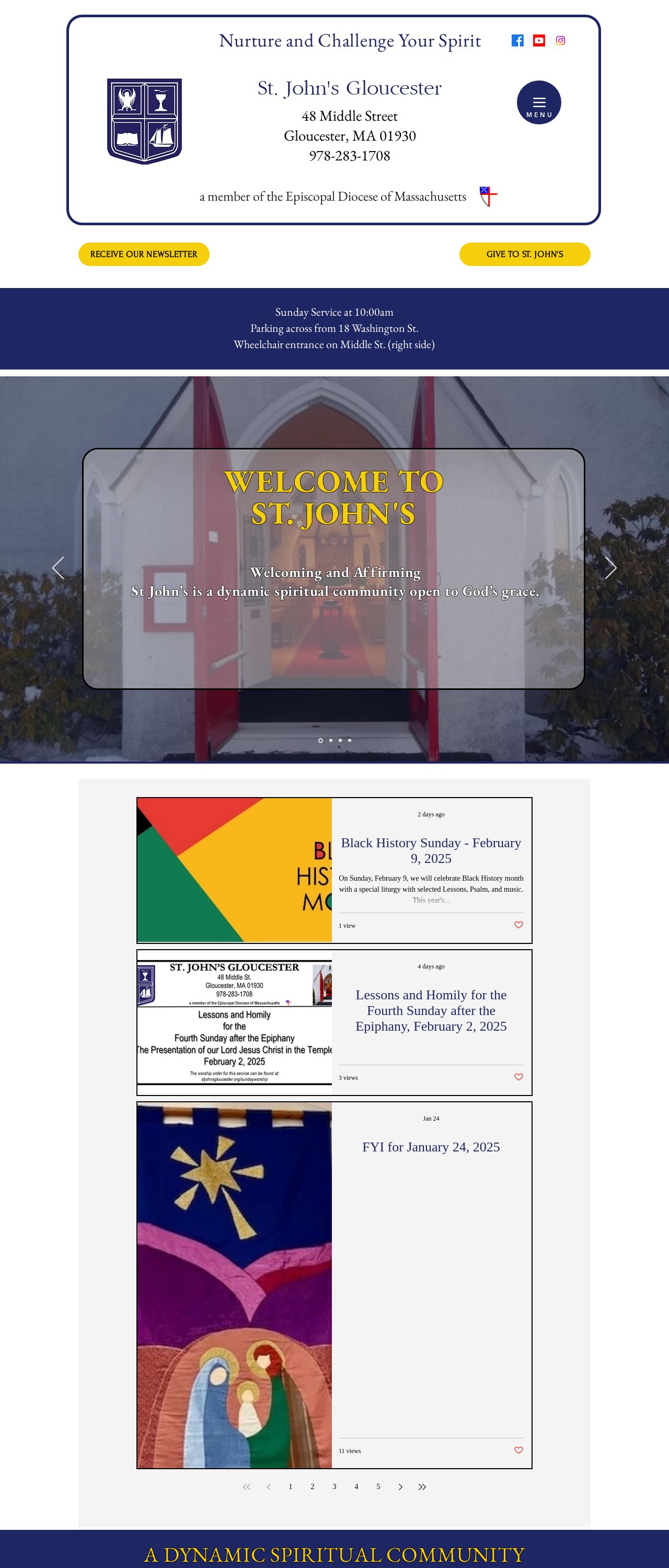
St. John's Gloucester
Analyzed by AI for fun and insights - not to be taken too seriously!
Visual Design
The visual design of this website is a perfect blend of elegance and simplicity. The use of a white background with blue accents creates a clean and sophisticated look that immediately grabs the user's attention. The blue accents are used strategically throughout the website to highlight important information and create visual interest. The font used is clear and easy to read, making it perfect for a website that aims to provide information and resources to its users. One of the standout features of this website's visual design is the use of images. The images are high-quality and relevant to the content, adding a touch of personality to the website. The images are also used to break up the text and create a sense of balance on the page. The website's logo is simple yet effective, and it is used consistently throughout the website to create a sense of brand identity. Overall, the visual design of this website is well thought out and effective. It creates a professional and welcoming atmosphere that makes users feel comfortable and engaged.
Recommendation:
Consider adding more images to the website to make it more visually appealing.
Layout and Clarity
The layout of this website is clear and easy to navigate. The use of a simple menu at the top of the page makes it easy for users to find what they are looking for. The website is also well-organized, with each section clearly labeled and easy to understand. The use of headings and subheadings helps to create a sense of hierarchy on the page, making it easy for users to scan and find the information they need. One of the standout features of this website's layout is the use of white space. The website has a clean and uncluttered feel, with plenty of space between elements to create a sense of breathing room. This makes the website feel modern and sophisticated, and it helps to reduce visual noise and make the content stand out. Overall, the layout of this website is well-designed and effective. It creates a clear and easy-to-use interface that makes it easy for users to find what they are looking for.
Recommendation:
Consider adding a search bar to the website to make it easier for users to find specific information.
Content
The content of this website is informative and engaging. The website provides a wealth of information about the church and its community, including its history, mission, and values. The content is well-written and easy to understand, making it accessible to a wide range of users. One of the standout features of this website's content is the use of personal stories and testimonials. These stories add a personal touch to the website and help to create a sense of connection with the user. The website also includes a variety of multimedia elements, such as videos and images, which help to break up the text and create visual interest. Overall, the content of this website is high-quality and engaging. It provides a wealth of information and resources to users, and it helps to create a sense of community and connection.
Recommendation:
Consider adding more interactive elements to the website, such as quizzes or games, to make it more engaging and fun.
This website was last rated on Feb. 6, 2025, 9:57 p.m.
Disclaimer: ratemysite.app is not affiliated with the website you are viewing, and does not endorse it in any way.
Ratings are subjective and based on AI's analysis. We filter out explicit or dangerous content, but cannot guarantee that all sites are safe.

All rights reserved. © ratemysite.app 2024. Contact: hello @ domain.