Rate your website in seconds – get instant feedback.
I will rate your website's design and give recommendations to enhance its visual appeal and user experience. See how your site ranks on the leaderboard!
Superfast Tax Service

Analyzed by AI for fun and insights - not to be taken too seriously!
Visual Design
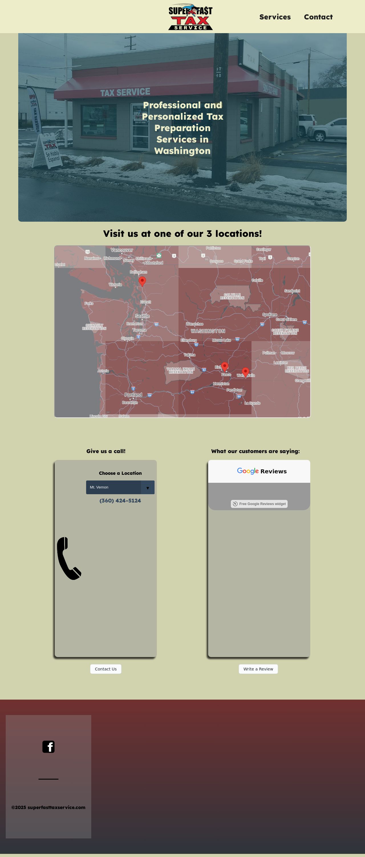
The visual design of the Superfast Tax Service website is a mixed bag. On the one hand, the use of a bold red color scheme and a prominent call-to-action (CTA) button on the homepage immediately grabs the user's attention. The CTA button is also well-designed, with a clear and concise message that encourages users to take action. Additionally, the use of high-quality images of the tax service's locations helps to establish trust and credibility with potential customers. However, there are some areas for improvement. The website's color scheme is somewhat overwhelming, with too much red and not enough contrast between different elements. This can make it difficult for users to focus on specific parts of the page. Additionally, the font sizes and styles are not consistently applied throughout the website, which can make it look a bit disjointed. Finally, the website could benefit from more white space to make it feel less cluttered and easier to navigate.
Recommendation:
Use a more balanced color scheme and consistent font styling to improve the overall visual design of the website.
Layout and Clarity
The layout and clarity of the Superfast Tax Service website are generally good, but there are some areas for improvement. The website's main navigation menu is easy to use and understand, and the content is well-organized into clear sections. The website also does a good job of highlighting important information, such as the tax service's locations and contact information. However, there are a few areas where the layout and clarity could be improved. For example, the website's footer is somewhat cluttered and difficult to read, which can make it hard for users to find important links and information. Additionally, some of the website's pages are a bit too long and could be broken up into smaller, more manageable sections. Finally, the website could benefit from more clear and consistent headings and subheadings to help users quickly scan the content.
Recommendation:
Simplify the footer and break up long pages into smaller sections to improve the layout and clarity of the website.
Content
The content of the Superfast Tax Service website is generally good, but there are some areas for improvement. The website does a good job of clearly and concisely communicating the tax service's services and benefits. The website also includes some useful resources, such as a blog and a FAQ section, which can help users learn more about the tax service and its services. However, there are a few areas where the content could be improved. For example, some of the website's pages are a bit too promotional and could be more informative. Additionally, the website could benefit from more detailed and specific information about the tax service's services and how they work. Finally, the website could include more customer testimonials and reviews to help establish trust and credibility with potential customers.
Recommendation:
Add more informative content and customer testimonials to improve the overall quality and clarity of the website's content.
This website was last rated on Jan. 13, 2025, 1:03 a.m.
Re-rate available on Jan. 20, 2025, 1:03 a.m.
Disclaimer: ratemysite.app is not affiliated with the website you are viewing, and does not endorse it in any way.
Ratings are subjective and based on AI's analysis. We filter out explicit or dangerous content, but cannot guarantee that all sites are safe.
All rights reserved. © ratemysite.app 2024. Contact: hello @ domain.
