Rate your website in seconds – get instant feedback.
I will rate your website's design and give recommendations to enhance its visual appeal and user experience. See how your site ranks on the leaderboard!
Supernar - Your number one fitness partner

Analyzed by AI for fun and insights - not to be taken too seriously!
Visual Design
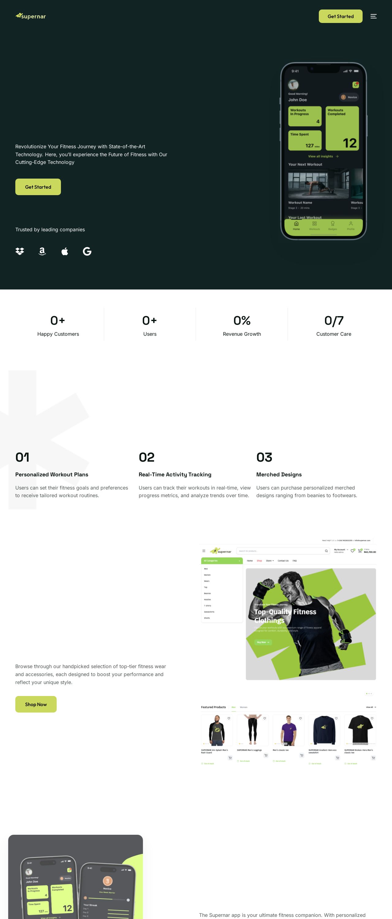
Supernar's website is a visual feast that gets your heart racing, just like a good workout. The color palette is a bold and energetic combination of neon green, black, and white, which screams 'fitness' and 'motivation.' The neon green accents are strategically placed to draw attention to important elements like calls-to-action, menu items, and highlights. The black and white balance out the brightness, creating a clean and modern aesthetic. The typography is sleek and easy to read, with clear headings and concise paragraphs. The imagery is a mix of high-quality photos and illustrations, showcasing fit and healthy individuals in various workout settings. The overall design is consistent throughout the website, making it easy to navigate and understand. However, the neon green might be overwhelming for some users, and the website could benefit from a bit more whitespace to make it feel more breathable.
Recommendation:
Use less neon green to avoid overwhelming users.
Layout and Clarity
Supernar's layout is well-structured and easy to follow, making it simple for users to find what they're looking for. The homepage effectively communicates the website's purpose and features, with clear headings and concise descriptions. The navigation menu is easy to use, and the website is responsive, adapting well to different screen sizes. However, some sections feel a bit cramped, with too much information packed into small spaces. The testimonials section, for example, could benefit from more whitespace to make it feel less cluttered. Additionally, the website could use more interactive elements, such as animations or micro-interactions, to enhance the user experience.
Recommendation:
Use whitespace to declutter sections and add interactive elements.
Content
Supernar's content is engaging and informative, effectively communicating the website's purpose and features. The language is clear and concise, making it easy for users to understand the benefits of using the website. The use of headings and subheadings helps to break up the content and make it scannable. However, some sections feel a bit too promotional, with an overemphasis on the website's benefits rather than providing valuable information. The website could benefit from more in-depth content, such as blog posts or guides, to establish itself as a thought leader in the fitness industry.
Recommendation:
Add more in-depth content to establish thought leadership.
This website was last rated on Dec. 6, 2024, 4:20 p.m.
Disclaimer: ratemysite.app is not affiliated with the website you are viewing, and does not endorse it in any way.
Ratings are subjective and based on AI's analysis. We filter out explicit or dangerous content, but cannot guarantee that all sites are safe.
All rights reserved. © ratemysite.app 2024. Contact: hello @ domain.
