Rate your website in seconds – get instant feedback.
I will rate your website's design and give recommendations to enhance its visual appeal and user experience. See how your site ranks on the leaderboard!

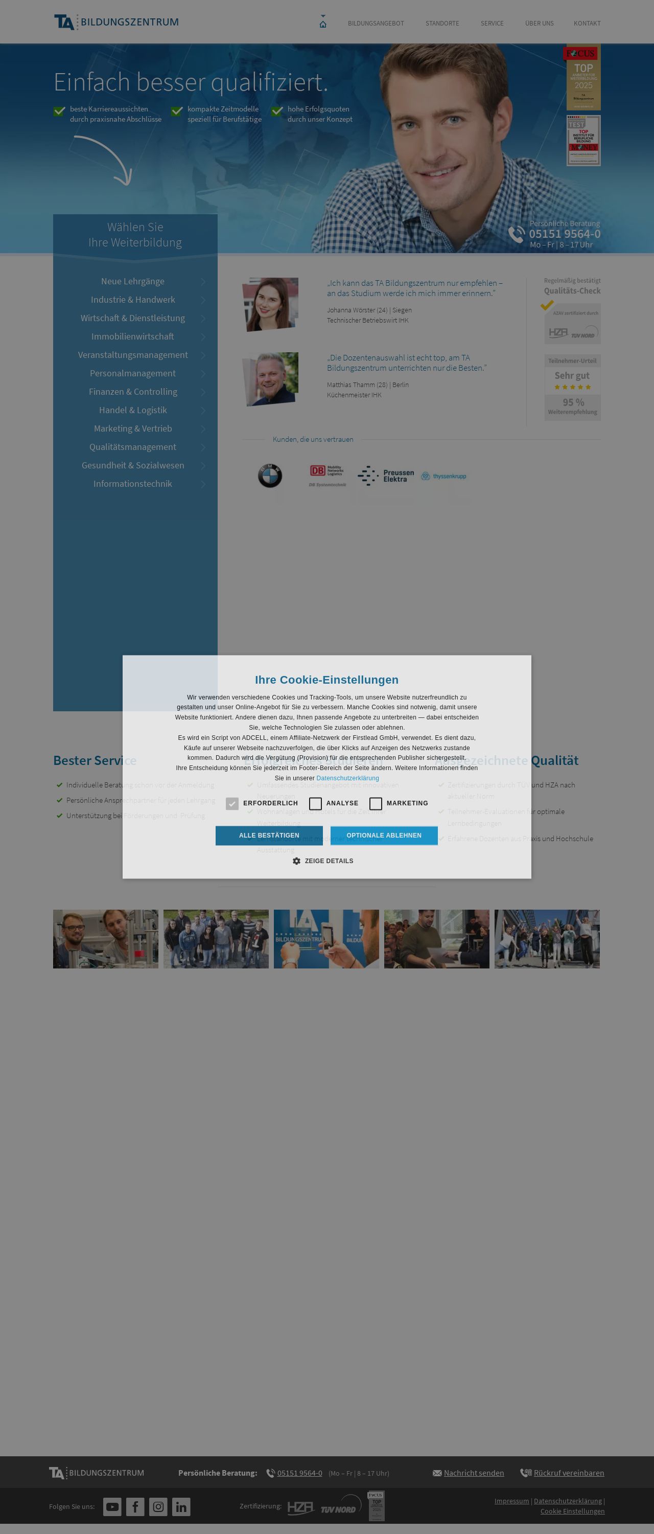
TA Bildungszentrum | einfach besser qualifiziert.
Analyzed by AI for fun and insights - not to be taken too seriously!
Visual Design
The visual design of the website is clean and professional, with a clear and consistent color scheme that effectively communicates the brand's identity. The use of blue and white colors creates a sense of trust and reliability, which is important for a website that offers educational services. The layout is well-organized, with clear headings and concise paragraphs that make it easy to navigate and read. The images used are relevant and high-quality, adding visual interest to the page. However, the website could benefit from more variety in terms of image types and sizes to keep the user engaged. Additionally, the use of a single font throughout the website can make it look a bit monotonous. Incorporating different fonts or font sizes could add visual interest and create a more dynamic feel.
Recommendation:
Add more variety in image types and sizes, and consider incorporating different fonts or font sizes to create a more dynamic feel.
Layout and Clarity
The layout of the website is well-organized and easy to follow, with clear headings and concise paragraphs that make it easy to navigate. The use of white space effectively separates different sections of the page, creating a clean and uncluttered design. The website also does a good job of breaking up large blocks of text with images and other visual elements, making it more engaging and readable. However, the website could benefit from more clear calls-to-action (CTAs) to guide the user's attention and encourage them to take action. Additionally, the use of a single column layout can make the website feel a bit linear and restrictive. Incorporating more columns or sections could add visual interest and create a more dynamic feel.
Recommendation:
Add clear calls-to-action to guide the user's attention and encourage them to take action, and consider incorporating more columns or sections to add visual interest and create a more dynamic feel.
Content
The content of the website is well-written and informative, providing a clear overview of the website's purpose and services. The language is professional and easy to understand, and the website does a good job of breaking up large blocks of text with headings and subheadings. However, the website could benefit from more concise and scannable content, as some of the paragraphs are quite long and dense. Additionally, the website could benefit from more internal linking to encourage users to explore the website further and find more relevant information. Incorporating keywords and phrases could also help improve the website's search engine optimization (SEO).
Recommendation:
Make content more concise and scannable, incorporate more internal linking, and consider incorporating keywords and phrases to improve SEO.
This website was last rated on Jan. 28, 2025, 3:39 p.m.
Disclaimer: ratemysite.app is not affiliated with the website you are viewing, and does not endorse it in any way.
Ratings are subjective and based on AI's analysis. We filter out explicit or dangerous content, but cannot guarantee that all sites are safe.

All rights reserved. © ratemysite.app 2024. Contact: hello @ domain.