Rate your website in seconds – get instant feedback.
I will rate your website's design and give recommendations to enhance its visual appeal and user experience. See how your site ranks on the leaderboard!

Tamaze Navrouzov
Analyzed by AI for fun and insights - not to be taken too seriously!
Visual Design
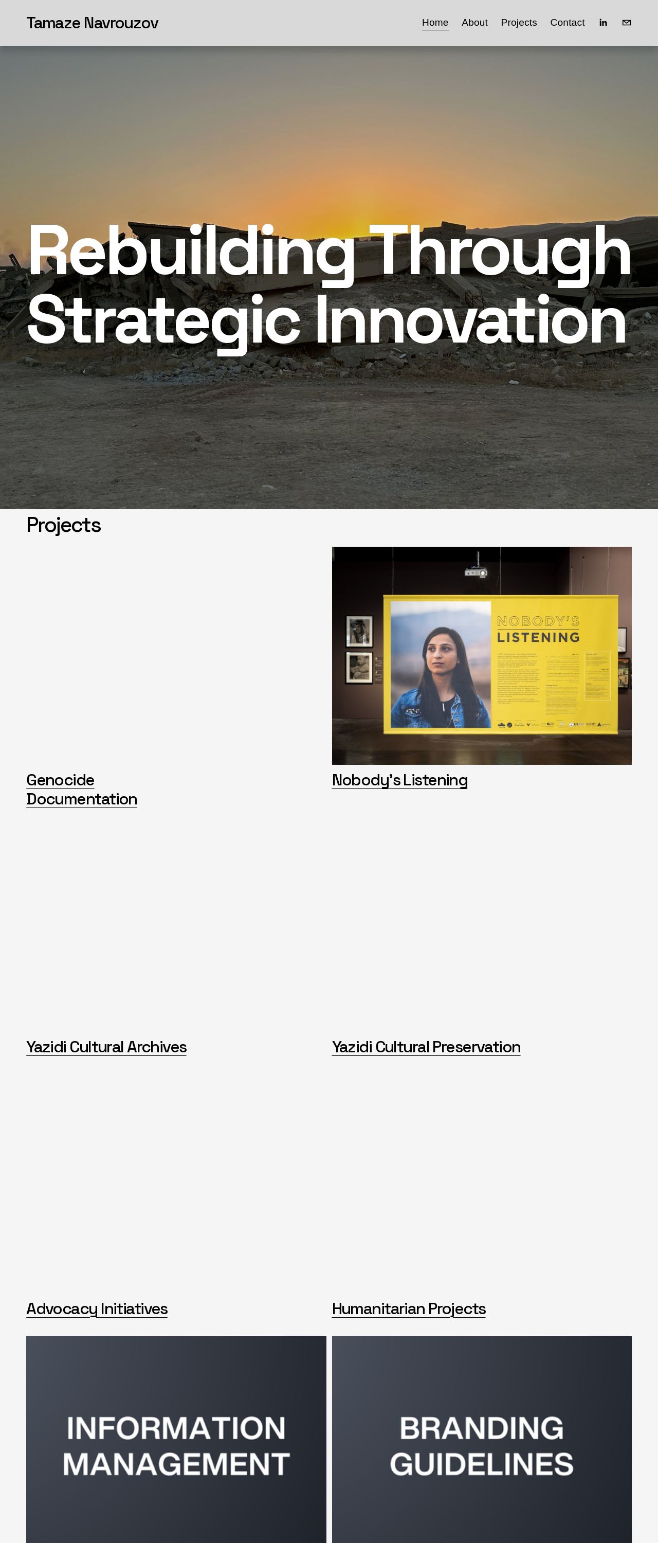
The visual design of the website is clean and simple, with a focus on typography and negative space. The color scheme is muted, with a predominantly white and gray background, accented by yellow and orange hues in the header image. The use of images is minimal, with only two photos displayed on the page, one in the header and one in the "Projects" section. The overall effect is one of subtlety and restraint, with a focus on allowing the text and content to take center stage. The typography is clear and readable, with a consistent font size and style throughout the page. The use of headings and subheadings helps to break up the content and create a clear hierarchy of information. The text itself is well-organized and easy to follow, with concise paragraphs and clear headings. However, there are some areas where the visual design could be improved. The header image, while visually appealing, is somewhat busy and may detract from the overall simplicity of the design. Additionally, the use of yellow and orange accents may be too bold for some users, and may not be suitable for all types of content. Overall, the visual design of the website is well-suited to its purpose as a platform for showcasing projects and providing information about advocacy initiatives and humanitarian projects. However, there are some areas where the design could be improved to make it more engaging and user-friendly.
Recommendation:
Consider using a more subtle color scheme and simplifying the header image to create a clearer visual hierarchy.
Layout and Clarity
The layout of the website is clear and easy to navigate, with a simple and intuitive menu system. The content is well-organized and easy to follow, with concise paragraphs and clear headings. The use of white space is effective in creating a clean and uncluttered design, and the overall layout is well-balanced and visually appealing. However, there are some areas where the layout could be improved. The "Projects" section, for example, is somewhat dense and may be overwhelming for some users. Additionally, the use of a single column layout may not be suitable for all types of content, and may not be as engaging as a multi-column layout. Overall, the layout of the website is well-suited to its purpose as a platform for showcasing projects and providing information about advocacy initiatives and humanitarian projects. However, there are some areas where the layout could be improved to make it more engaging and user-friendly.
Recommendation:
Consider using a multi-column layout in the "Projects" section to make the content more engaging and easier to read.
Content
The content of the website is well-organized and easy to follow, with concise paragraphs and clear headings. The use of white space is effective in creating a clean and uncluttered design, and the overall layout is well-balanced and visually appealing. However, there are some areas where the content could be improved. The "Projects" section, for example, is somewhat dense and may be overwhelming for some users. Additionally, the use of a single column layout may not be suitable for all types of content, and may not be as engaging as a multi-column layout. Overall, the content of the website is well-suited to its purpose as a platform for showcasing projects and providing information about advocacy initiatives and humanitarian projects. However, there are some areas where the content could be improved to make it more engaging and user-friendly.
Recommendation:
Consider using a multi-column layout in the "Projects" section to make the content more engaging and easier to read.
This website was last rated on Feb. 3, 2025, 1:58 p.m.
Disclaimer: ratemysite.app is not affiliated with the website you are viewing, and does not endorse it in any way.
Ratings are subjective and based on AI's analysis. We filter out explicit or dangerous content, but cannot guarantee that all sites are safe.

All rights reserved. © ratemysite.app 2024. Contact: hello @ domain.