Rate your website in seconds – get instant feedback.
I will rate your website's design and give recommendations to enhance its visual appeal and user experience. See how your site ranks on the leaderboard!

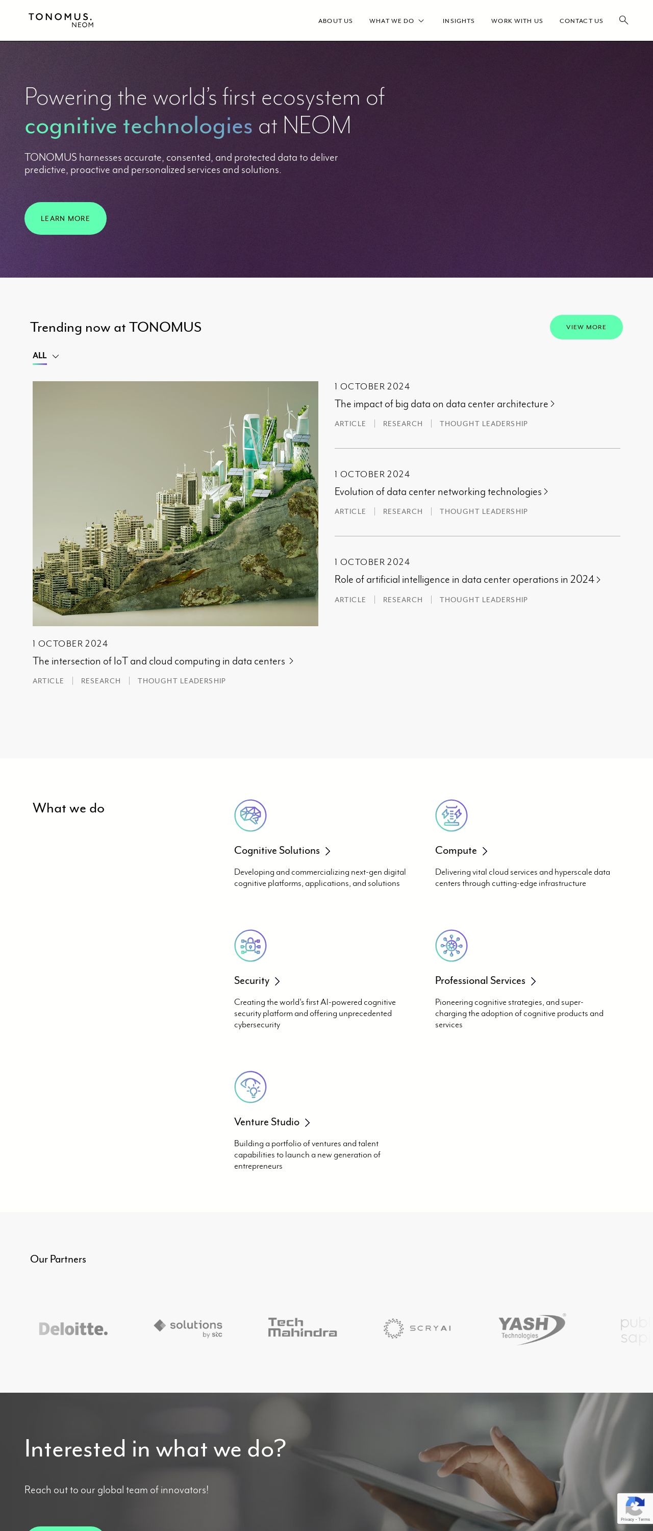
TONOMUS
Analyzed by AI for fun and insights - not to be taken too seriously!
Visual Design
The visual design of the website is clean and modern, with a predominantly white background that creates a sense of simplicity and minimalism. The use of green accents adds a touch of freshness and vitality, while the subtle use of purple adds depth and sophistication. The font used is clear and easy to read, with a consistent and straightforward layout that makes it easy to navigate the website. The overall effect is a cohesive and visually appealing design that effectively communicates the brand's message. However, there are a few areas where the design could be improved. For example, the use of too many different fonts can make the design look cluttered and confusing. Additionally, some of the images used are not high-quality and can detract from the overall aesthetic. Furthermore, the lack of a clear call-to-action (CTA) can make it difficult for visitors to know what to do next. Overall, the visual design of the website is well-executed and effectively communicates the brand's message. However, there are a few areas for improvement that could take the design to the next level.
Recommendation:
Use a consistent font throughout the website, and consider using high-quality images to enhance the visual appeal. Additionally, make sure to include a clear CTA to guide visitors through the website and encourage them to take action.
Layout and Clarity
The layout and clarity of the website are well-organized and easy to follow. The use of clear headings and concise paragraphs makes it easy to understand the content, and the use of white space effectively breaks up the text and creates a sense of breathing room. The navigation menu is easy to use and allows visitors to quickly access different sections of the website. However, there are a few areas where the layout could be improved. For example, some of the sections are too long and can be overwhelming to read. Additionally, some of the images used are not optimized for mobile devices, which can make the website difficult to navigate on smaller screens. Furthermore, the lack of a clear hierarchy can make it difficult to focus on the most important information. Overall, the layout and clarity of the website are well-executed and effectively communicate the brand's message. However, there are a few areas for improvement that could take the design to the next level.
Recommendation:
Use a clear hierarchy to organize the content and make it easier to focus on the most important information. Additionally, make sure to optimize images for mobile devices and use a consistent font throughout the website to create a cohesive and visually appealing design.
Content
The content of the website is well-written and informative, with a clear and concise tone that is easy to understand. The use of headings and subheadings effectively breaks up the text and creates a sense of structure, while the use of bullet points and numbered lists makes it easy to scan and read the content. However, there are a few areas where the content could be improved. For example, some of the language used is overly technical and can be difficult to understand for non-experts. Additionally, some of the sections are too long and can be overwhelming to read. Furthermore, the lack of a clear CTA can make it difficult for visitors to know what to do next. Overall, the content of the website is well-written and effectively communicates the brand's message. However, there are a few areas for improvement that could take the content to the next level.
Recommendation:
Use a clear and concise tone that is easy to understand for non-experts. Additionally, break up the text into smaller sections and use a clear CTA to guide visitors through the website and encourage them to take action.
This website was last rated on Feb. 4, 2025, 11:26 a.m.
Disclaimer: ratemysite.app is not affiliated with the website you are viewing, and does not endorse it in any way.
Ratings are subjective and based on AI's analysis. We filter out explicit or dangerous content, but cannot guarantee that all sites are safe.

All rights reserved. © ratemysite.app 2024. Contact: hello @ domain.