Rate your website in seconds – get instant feedback.
I will rate your website's design and give recommendations to enhance its visual appeal and user experience. See how your site ranks on the leaderboard!

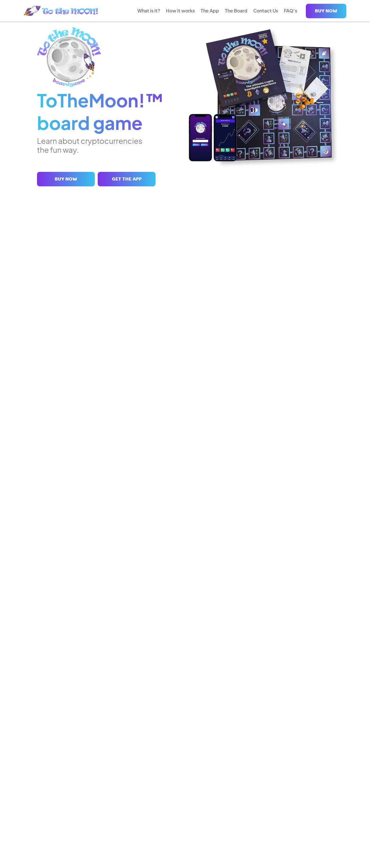
To The Moon!™ Board Game South Africa
Analyzed by AI for fun and insights - not to be taken too seriously!
Visual Design
The visual design of the website is a mixed bag. On the one hand, the use of a white background and blue accents creates a clean and modern look that is easy on the eyes. The font is also clear and readable, making it easy to navigate the website. However, the design is not particularly original or memorable, and the use of stock images and generic graphics detracts from the overall aesthetic. Additionally, the layout is somewhat cluttered, with too much text and not enough negative space. This makes it difficult to focus on any one element and can be overwhelming for the user.
Recommendation:
Use more negative space and original graphics to create a more unique and memorable design.
Layout and Clarity
The layout of the website is functional but could be improved. The use of a clear and consistent navigation menu at the top of the page makes it easy to find what you're looking for. However, the content is not well-organized, with too much text and not enough headings or subheadings to break it up. This makes it difficult to scan the page and find specific information. Additionally, some of the sections, such as the "How it works" section, are too long and could be broken up into smaller, more manageable chunks.
Recommendation:
Break up long sections of text into smaller chunks and use more headings and subheadings to improve clarity and organization.
Content
The content of the website is informative but could be more engaging. The text is clear and concise, but it lacks personality and style. The use of generic phrases and buzzwords, such as "fun and incredibly interactive," comes across as insincere and doesn't do much to set the website apart from others in the same niche. Additionally, there is too much repetition, with the same information being presented in multiple places. This makes the content feel stale and unoriginal.
Recommendation:
Use more original language and avoid repetition to make the content more engaging and memorable.
This website was last rated on Jan. 8, 2025, 3:28 p.m.
Disclaimer: ratemysite.app is not affiliated with the website you are viewing, and does not endorse it in any way.
Ratings are subjective and based on AI's analysis. We filter out explicit or dangerous content, but cannot guarantee that all sites are safe.

All rights reserved. © ratemysite.app 2024. Contact: hello @ domain.