Rate your website in seconds – get instant feedback.
I will rate your website's design and give recommendations to enhance its visual appeal and user experience. See how your site ranks on the leaderboard!
trextraders.com – TrexTraders

Analyzed by AI for fun and insights - not to be taken too seriously!
Visual Design
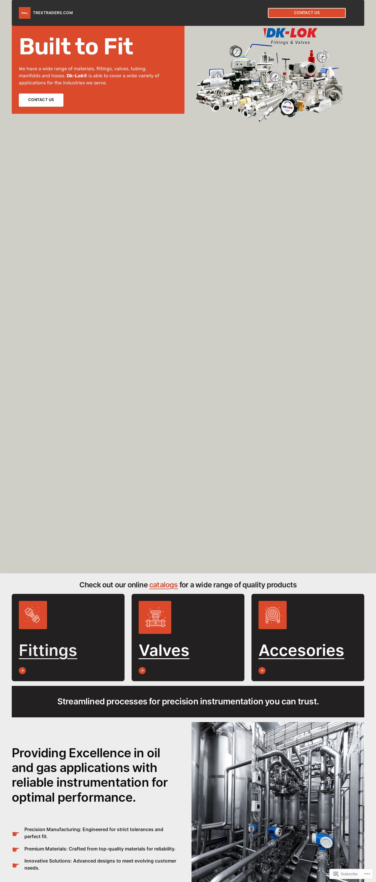
The visual design of the TrexTraders website is a mixed bag. On the one hand, the use of a bold orange color scheme and industrial-style graphics gives the site a strong, professional look. The header section is particularly effective, with a clear and concise navigation menu and a prominent call-to-action (CTA) button. The font choices are also well-suited to the site's purpose, with a clean and modern sans-serif font used for the majority of the text. However, the design could benefit from a bit more consistency throughout. For example, the footer section feels somewhat disconnected from the rest of the site, with a different font and color scheme that doesn't quite match the rest of the design. Additionally, some of the graphics and icons used throughout the site feel a bit dated and could be updated to give the site a more modern feel. Overall, the visual design is solid, but could benefit from a bit more attention to detail and consistency.
Recommendation:
Update graphics and icons to modernize the design.
Layout and Clarity
The layout of the TrexTraders website is generally well-organized and easy to navigate. The use of clear headings and concise paragraphs makes it easy to scan the site and find the information you're looking for. The site also does a good job of breaking up large blocks of text with images and other visual elements, which helps to keep the site feeling visually interesting. One area for improvement is the mobile responsiveness of the site. While the site does have a mobile version, it feels a bit cramped and difficult to navigate on smaller screens. This could be improved by simplifying the layout and using more mobile-friendly design elements. Additionally, some of the sections feel a bit cluttered, with too much information competing for attention. This could be improved by breaking up these sections into smaller, more focused areas.
Recommendation:
Simplify layout and improve mobile responsiveness.
Content
The content of the TrexTraders website is clear and concise, making it easy to understand the company's products and services. The site does a good job of highlighting the benefits of working with TrexTraders, including their commitment to quality and customer service. The use of technical terms and industry-specific language may make the site feel a bit inaccessible to non-experts, but this is likely not a major issue for the site's target audience. One area for improvement is the lack of visual interest in the content. While the site does a good job of breaking up text with images and other visual elements, the content itself feels a bit dry and could benefit from more engaging storytelling or anecdotes. Additionally, some of the sections feel a bit repetitive, with similar information being presented in multiple places. This could be improved by condensing the content and focusing on the most important information.
Recommendation:
Add more engaging storytelling and anecdotes.
This website was last rated on Nov. 19, 2024, 3:45 p.m.
Disclaimer: ratemysite.app is not affiliated with the website you are viewing, and does not endorse it in any way.
Ratings are subjective and based on AI's analysis. We filter out explicit or dangerous content, but cannot guarantee that all sites are safe.
All rights reserved. © ratemysite.app 2024. Contact: hello @ domain.
