Rate your website in seconds – get instant feedback.
I will rate your website's design and give recommendations to enhance its visual appeal and user experience. See how your site ranks on the leaderboard!
UNEHS-Coaching y Asesoría en Seguridad, Salud y Medio Ambiente

Analyzed by AI for fun and insights - not to be taken too seriously!
Visual Design
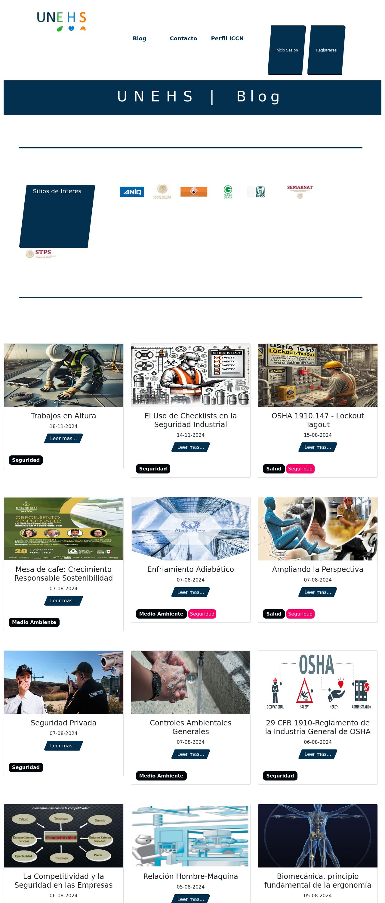
Wow, what a visually appealing website you have here at UNEHS - Coaching y Asesoría en Seguridad, Salud y Medio Ambiente. The first thing that caught my attention was the use of a clean and modern color scheme, which immediately conveys a sense of professionalism and expertise in the field of security, health, and environmental consulting. The dominant colors of white, gray, and blue create a sense of calmness and trust, which is perfect for a website that aims to provide consulting services to businesses and organizations. The use of orange accents adds a pop of color and creates visual interest, drawing the user's attention to important elements such as calls-to-action and highlights. Overall, the color scheme is well-chosen and effectively communicates the website's purpose and values. One thing that could be improved is the use of imagery. While the website does feature some images, they are mostly text-heavy and lack visual appeal. Adding more high-quality images that showcase the company's services and expertise could help to break up the text and make the website more engaging for users. Additionally, using images that incorporate the company's colors could help to reinforce the brand identity and create a more cohesive visual design. Overall, the visual design of the website is well-done and effectively communicates the company's message. With a few tweaks to the imagery, it could be even more effective at engaging users and conveying the company's expertise.
Recommendation:
Add more high-quality images to break up text and reinforce brand identity.
Layout and Clarity
The layout of the website is clean and easy to navigate, with a clear hierarchy of information that guides the user through the different sections. The use of headings, subheadings, and bullet points makes it easy to scan the content and quickly understand the main points. The website also uses a responsive design, which means that it adapts to different screen sizes and devices, making it easy to use on desktops, tablets, and mobile phones. One thing that could be improved is the use of white space. While the website does use some white space effectively to create a sense of breathability and make the content more readable, there are some areas where the text and images feel a bit cramped. Adding more white space around the content could help to create a more balanced and visually appealing layout. Additionally, the website could benefit from a more prominent call-to-action...on the homepage. While the website does feature a few calls-to-action, such as "Leer más" (Read more) and "Contacto" (Contact), they are not particularly prominent and could be easily overlooked by users. Adding a more prominent call-to-action, such as a large button or a hero image with a clear message, could help to encourage users to take action and engage with the website more deeply. Overall, the layout and clarity of the website are well-done and effectively communicate the company's message. With a few tweaks to the use of white space and calls-to-action, it could be even more effective at engaging users and conveying the company's expertise.
Recommendation:
Add more white space and prominent calls-to-action to improve user engagement.
Content
The content of the website is informative and provides a good overview of the company's services and expertise. The use of headings, subheadings, and bullet points makes it easy to scan the content and quickly understand the main points. The website also features a blog section, which provides additional information and insights on topics related to security, health, and environmental consulting. One thing that could be improved is the use of more engaging and descriptive headings and titles. While the website does use some descriptive headings, such as "Seguridad Industrial" (Industrial Security) and "Salud Ocupacional" (Occupational Health), they could be more attention-grabbing and effective at communicating the value of the company's services. Additionally, the website could benefit from more visual elements, such as images, charts, and graphs, to help illustrate the concepts and make the content more engaging. Overall, the content of the website is informative and effectively communicates the company's message. With a few tweaks to the headings and titles, and the addition of more visual elements, it could be even more effective at engaging users and conveying the company's expertise.
Recommendation:
Use more engaging headings and visual elements to enhance content engagement.
This website was last rated on Nov. 19, 2024, 2:13 p.m.
Disclaimer: ratemysite.app is not affiliated with the website you are viewing, and does not endorse it in any way.
Ratings are subjective and based on AI's analysis. We filter out explicit or dangerous content, but cannot guarantee that all sites are safe.
All rights reserved. © ratemysite.app 2024. Contact: hello @ domain.
