Rate your website in seconds – get instant feedback.
I will rate your website's design and give recommendations to enhance its visual appeal and user experience. See how your site ranks on the leaderboard!
Web Design Agency - UPQODE

Analyzed by AI for fun and insights - not to be taken too seriously!
Visual Design
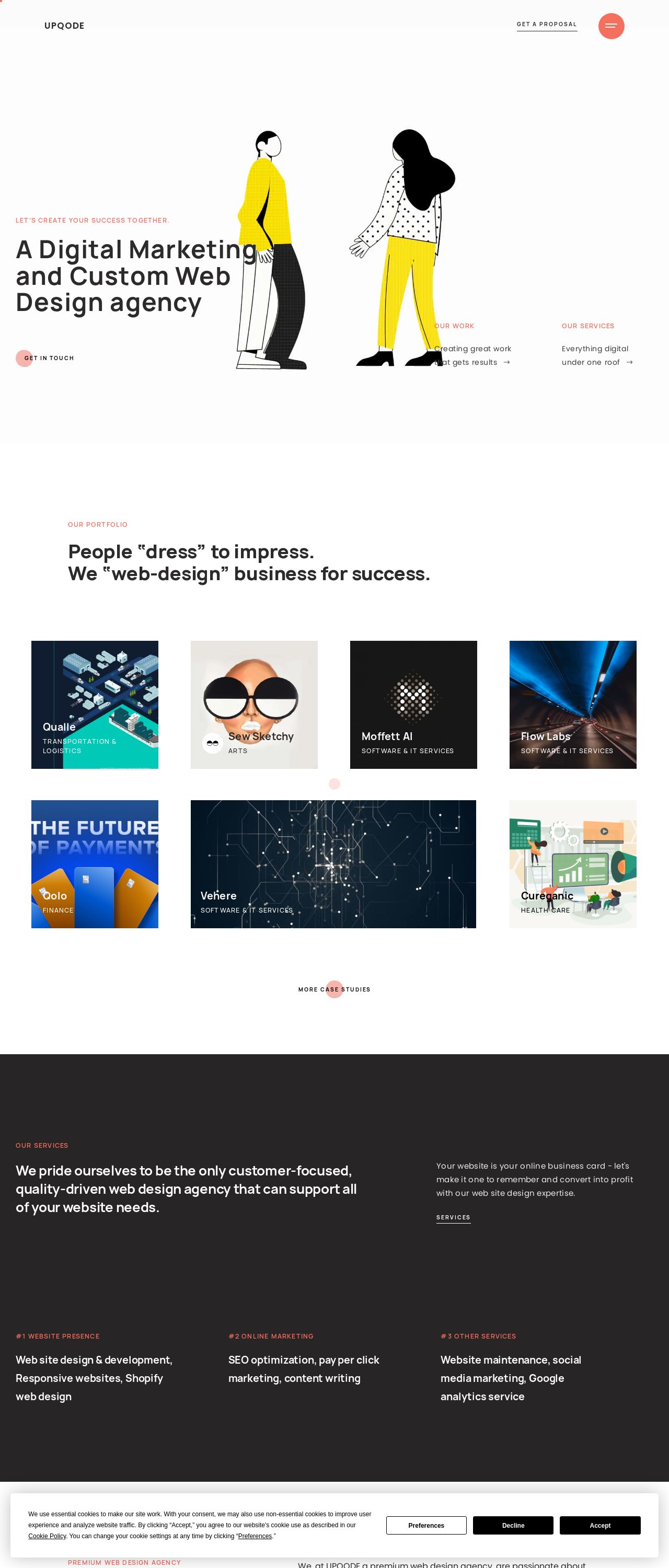
The website's visual design is modern and sleek, with a predominantly white background that gives it a clean and minimalistic feel. The use of bold black text and accents of bright yellow and red adds a pop of color and creates visual interest. The illustrations of people on the homepage are simple, yet effective in conveying the agency's focus on human-centered design. However, the design could benefit from more visual hierarchy and texture to make it more engaging. The cookie consent banner at the bottom is a bit intrusive, but it's a necessary element. Overall, the design is well-executed, but could be improved with more attention to visual hierarchy and texture.
Recommendation:
Add more texture and visual hierarchy to enhance the overall visual appeal and engagement.
Layout and Clarity
The layout of the website is clear and easy to navigate, with a simple and consistent grid structure. The use of white space is effective in creating a clean and uncluttered design. However, the content is a bit sparse, and the sections feel a bit disconnected from each other. The "Our Services" section, for example, is buried at the bottom of the page, and the connection between the different sections could be clearer. Overall, the layout is well-organized, but could benefit from more content and clearer connections between sections.
Recommendation:
Add more content and use clear headings to connect the different sections and improve the overall flow.
Content
The content of the website is clear and concise, with a good overview of the agency's services and values. However, the text is a bit generic and could benefit from more specific examples and case studies to illustrate the agency's expertise. The use of headings and subheadings is effective in breaking up the content, but some of the sentences are a bit long and could be simplified. Overall, the content is well-written, but could be more engaging and detailed.
Recommendation:
Add more specific examples and case studies to illustrate the agency's expertise and make the content more engaging.
This website was last rated on April 19, 2025, 6:26 a.m.
Re-rate available on April 26, 2025, 6:26 a.m.
Disclaimer: ratemysite.app is not affiliated with the website you are viewing, and does not endorse it in any way.
Ratings are subjective and based on AI's analysis. We filter out explicit or dangerous content, but cannot guarantee that all sites are safe.
All rights reserved. © ratemysite.app 2024. Contact: hello @ domain.
