Rate your website in seconds – get instant feedback.
I will rate your website's design and give recommendations to enhance its visual appeal and user experience. See how your site ranks on the leaderboard!

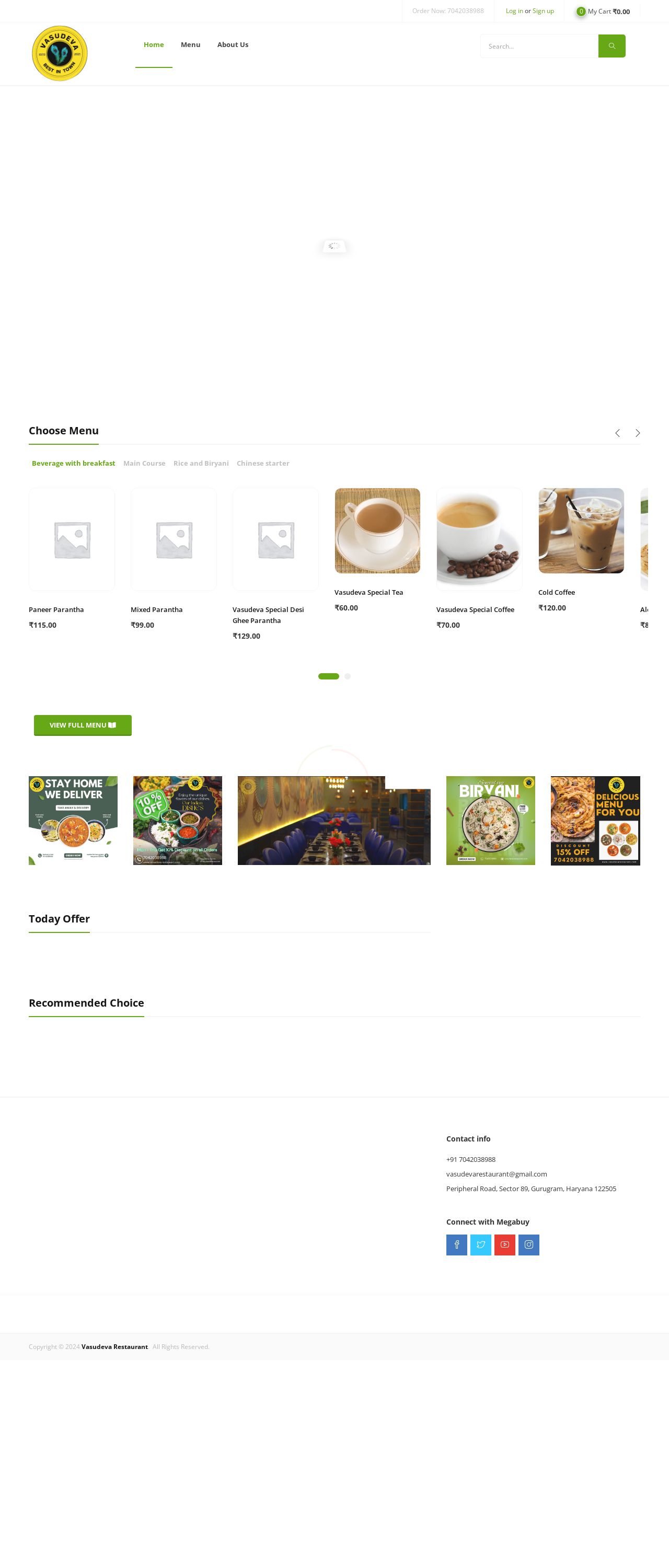
Vasudeva Restaurant – Back To Route
Analyzed by AI for fun and insights - not to be taken too seriously!
Visual Design
The visual design of the website is clean and modern, with a predominantly beige and green color scheme. The use of images and icons adds visual interest, but the layout could be improved to make it more visually appealing. The menu section is well-organized and easy to navigate, with clear headings and concise descriptions. However, the overall design could benefit from a more consistent and cohesive look, with more attention to detail in the typography, spacing, and alignment. The website's logo is simple and recognizable, but could be more prominent on the page. The use of green accents throughout the design adds a touch of freshness and vitality, but could be used more consistently throughout the site. Overall, the visual design is solid, but could be refined to create a more engaging and memorable user experience. I would give the visual design a score of 80 out of 100.
Recommendation:
The website's visual design could be improved by adding more visual interest and cohesion throughout the layout. This could be achieved by using more images, icons, and graphics to break up the text and add visual interest. Additionally, the colors used throughout the design could be more consistent and cohesive, with a greater emphasis on the green color scheme. Finally, the typography could be improved by using a consistent font throughout the site and adjusting the font sizes and styles to create a more balanced and readable layout.
Layout and Clarity
The layout and clarity of the website are good, with a clear hierarchy of information and easy-to-read text. The menu section is well-organized and easy to navigate, with clear headings and concise descriptions. However, the layout could be improved by breaking up the text and adding more visual interest to make the page more engaging. The use of white space could be improved to create a more balanced and readable layout. The website's content is clear and concise, with well-organized sections and easy-to-read text. However, the content could be improved by adding more visual interest, such as images and icons, to break up the text and make the page more engaging. Additionally, the content could be improved by adding more depth and detail to the descriptions, making the site more informative and engaging for users. I would give the layout and clarity a score of 85 out of 100.
Recommendation:
The layout and clarity of the website could be improved by adding more visual interest and breaking up the text to create a more engaging and readable layout. This could be achieved by using more images, icons, and graphics to add visual interest, and adjusting the typography and spacing to create a more balanced and readable layout. Additionally, the content could be improved by adding more depth and detail to the descriptions, making the site more informative and engaging for users.
Content
The content of the website is clear and concise, with well-organized sections and easy-to-read text. However, the content could be improved by adding more visual interest, such as images and icons, to break up the text and make the page more engaging. Additionally, the content could be improved by adding more depth and detail to the descriptions, making the site more informative and engaging for users. The website's content is well-organized, with clear headings and concise descriptions. However, the content could be improved by adding more visual interest, such as images and icons, to break up the text and make the page more engaging. Additionally, the content could be improved by adding more depth and detail to the descriptions, making the site more informative and engaging for users. I would give the content a score of 80 out of 100.
Recommendation:
The content of the website could be improved by adding more visual interest, such as images and icons, to break up the text and make the page more engaging. Additionally, the content could be improved by adding more depth and detail to the descriptions, making the site more informative and engaging for users. This could be achieved by using more images, icons, and graphics to add visual interest, and adjusting the typography and spacing to create a more balanced and readable layout.
This website was last rated on Feb. 2, 2025, 12:20 p.m.
Disclaimer: ratemysite.app is not affiliated with the website you are viewing, and does not endorse it in any way.
Ratings are subjective and based on AI's analysis. We filter out explicit or dangerous content, but cannot guarantee that all sites are safe.

All rights reserved. © ratemysite.app 2024. Contact: hello @ domain.