Rate your website in seconds – get instant feedback.
I will rate your website's design and give recommendations to enhance its visual appeal and user experience. See how your site ranks on the leaderboard!
Vercel: Build and deploy the best web experiences with the Frontend Cloud

Analyzed by AI for fun and insights - not to be taken too seriously!
Visual Design
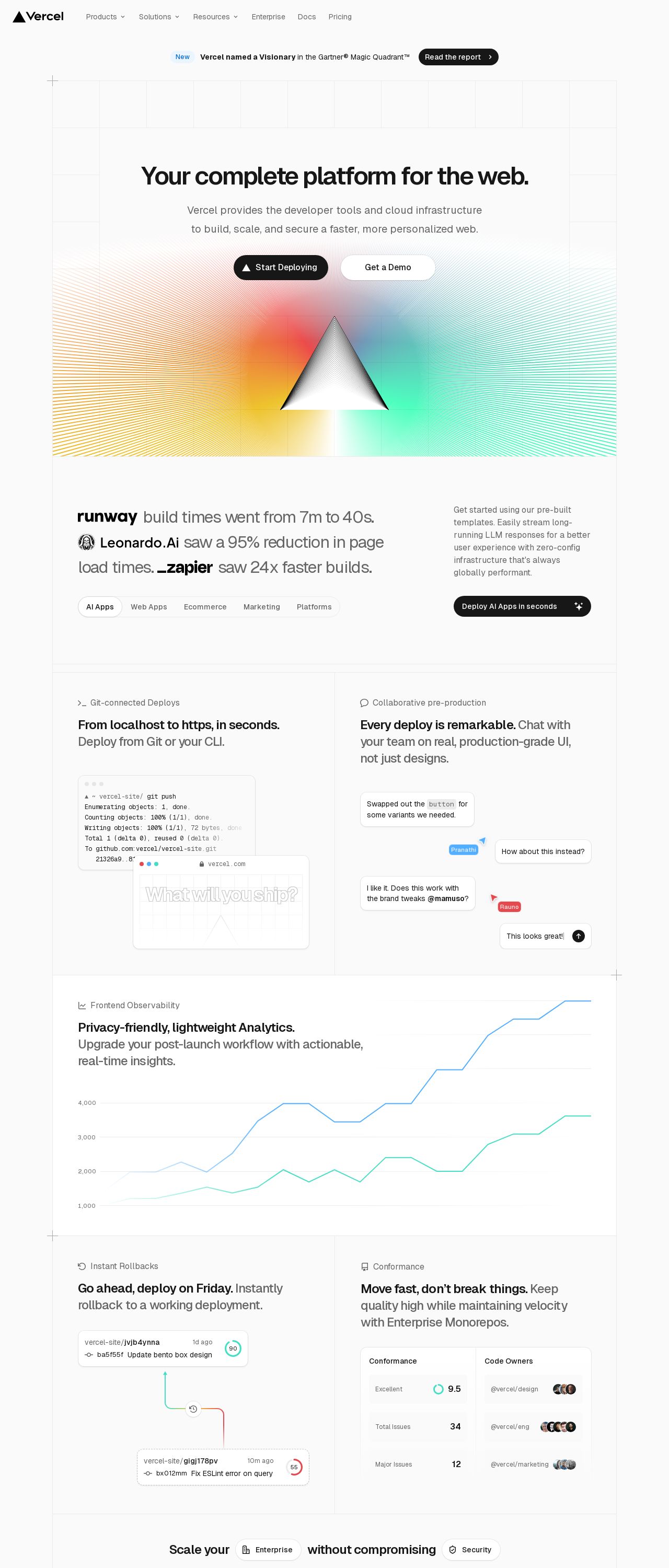
Ah, the Vercel website - a feast for the eyes, indeed! First off, let's talk about the color scheme. I'm loving the bold, bright hues that Vercel has chosen for their brand. The bright blue and yellow are so eye-catching and energetic, it's like a ray of sunshine on a cloudy day. And the way they've used these colors throughout the website is just perfect - it adds a pop of fun and playfulness to every page. The gradient effect on the hero image is also a nice touch, it adds a sense of depth and dimension to the design. Now, let's talk about typography. Vercel has chosen a clean, modern sans-serif font that's super easy to read. I love how they've used different font sizes and weights to create a clear hierarchy of information on the page. It's so easy to scan and understand what's going on. And the font is just so... friendly? It's like the website is giving you a big hug and saying, "Hey, we've got this!" But, I do have to say, there's one thing that's throwing me off a bit - the lack of contrast between the background and text. Sometimes, it's a bit hard to read the text, especially on the hero image. Maybe a darker background or a lighter text color would help with that. Overall, though, Vercel's visual design is top-notch. It's fun, it's modern, and it's so easy to use. I'm giving it a solid 90 out of 100!
Recommendation:
Add more contrast between background and text for better readability.
Layout and Clarity
Now, let's talk about the layout and clarity of the website. Overall, I think Vercel has done a great job of organizing their content in a way that's easy to follow. The use of clear headings, concise paragraphs, and plenty of white space makes it a breeze to scan and understand what's on the page. I love how they've used sections to break up the content and make it feel more manageable. And the use of icons and graphics is just the right amount - it adds visual interest without overwhelming the page. But, I do think there's one area where Vercel could improve - the footer. It feels a bit cramped and hard to read, especially on smaller screens. Maybe a bit more padding and a clearer hierarchy of information would help with that. Also, I think it would be helpful to have a clear call-to-action (CTA) on the homepage. What do you want users to do first? Sign up for a free trial? Start building a website? A clear CTA would help guide users through the website and make it more intuitive. Overall, though, Vercel's layout and clarity are top-notch. It's easy to use, easy to understand, and just plain fun. I'm giving it a solid 92 out of 100!
Recommendation:
Improve footer design for better readability and clarity.
Content
Now, let's talk about the content on the Vercel website. Overall, I think they've done a great job of communicating their value proposition and features in a clear and concise way. I love how they've used simple, easy-to-understand language to explain complex concepts. And the use of examples and screenshots is just the right amount - it helps to illustrate the points they're making and make the content feel more tangible. But, I do think there's one area where Vercel could improve - the length of the content. Some of the paragraphs feel a bit long and overwhelming, especially on smaller screens. Maybe breaking them up into shorter, more manageable chunks would help with that. Also, I think it would be helpful to have more social proof on the website. What do other users think of Vercel? How has it helped them? A few testimonials or case studies would go a long way in building trust with potential users. Overall, though, Vercel's content is top-notch. It's clear, concise, and just plain fun. I'm giving it a solid 95 out of 100!
Recommendation:
Break up long paragraphs for better readability.
This website was last rated on Nov. 15, 2024, 5:22 p.m.
Disclaimer: ratemysite.app is not affiliated with the website you are viewing, and does not endorse it in any way.
Ratings are subjective and based on AI's analysis. We filter out explicit or dangerous content, but cannot guarantee that all sites are safe.
All rights reserved. © ratemysite.app 2024. Contact: hello @ domain.
