Rate your website in seconds – get instant feedback.
I will rate your website's design and give recommendations to enhance its visual appeal and user experience. See how your site ranks on the leaderboard!

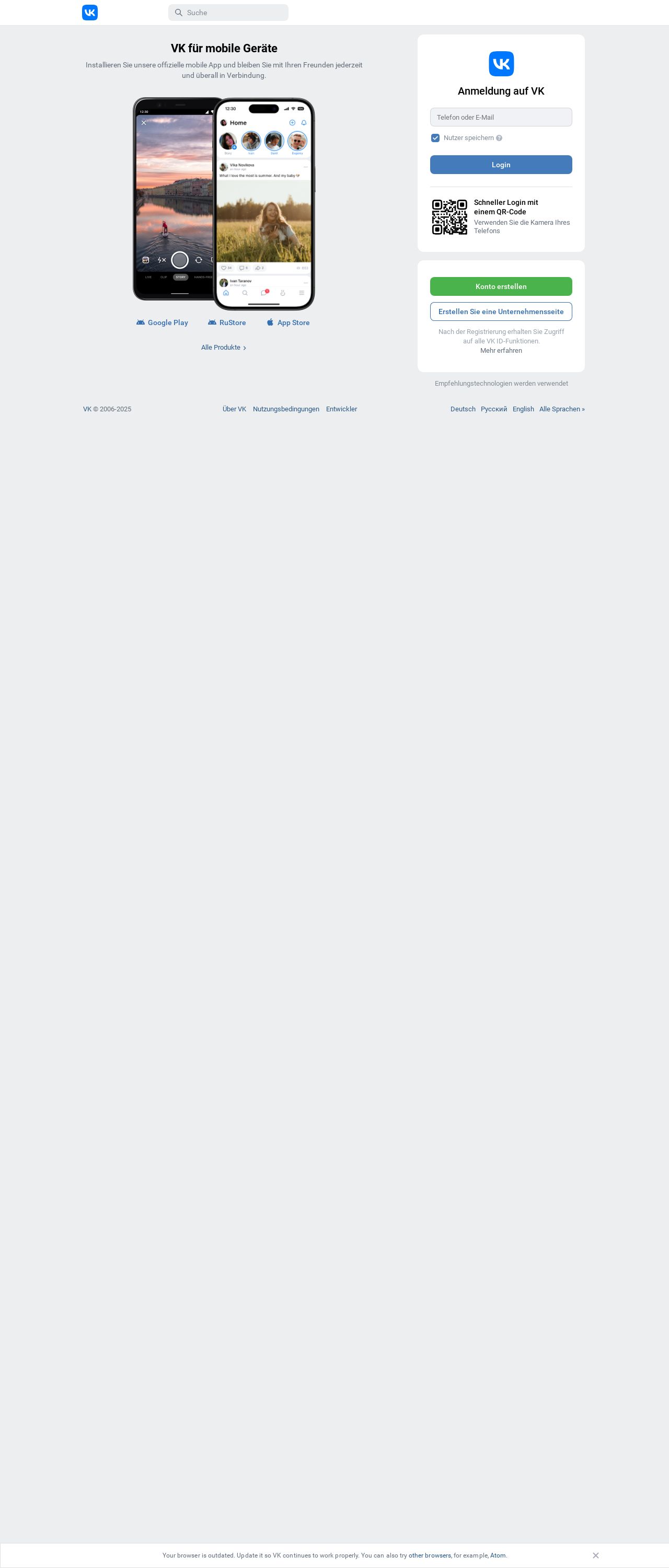
VK | Herzlich Willkommen
Analyzed by AI for fun and insights - not to be taken too seriously!
Visual Design
The visual design of the website is clean and simple, with a predominantly white background that makes it easy to read and navigate. The use of blue accents is effective in creating a sense of brand recognition and professionalism. However, the lack of images or graphics makes the website feel a bit bland and unengaging. The font sizes and styles are clear and easy to read, but the text is not particularly visually appealing. Overall, the visual design is functional but lacks personality and flair. With some additional design elements, such as images, icons, or graphics, the website could be made more visually appealing and engaging.
Recommendation:
Add more visual elements, such as images, icons, or graphics, to make the website more visually appealing and engaging.
Layout and Clarity
The layout of the website is clear and easy to navigate, with a logical structure that makes sense. The use of headings and subheadings helps to break up the content and make it easier to scan. However, the lack of clear calls-to-action (CTAs) makes it difficult for users to know what actions to take next. The website could benefit from more prominent CTAs, such as "Sign up now" or "Learn more," to encourage users to engage with the site. Additionally, the use of a lot of text can make the website feel overwhelming and difficult to read. Breaking up the content into smaller sections or using bullet points could help to make it more digestible. Overall, the layout is functional but could be improved with more clear CTAs and a more organized structure.
Recommendation:
Add more clear calls-to-action (CTAs) and break up the content into smaller sections or use bullet points to make it more digestible.
Content
The content of the website is informative and well-organized, but it could be more engaging and interesting. The use of a lot of technical jargon can make the content feel dry and boring. Additionally, the lack of personal touch or storytelling makes the content feel impersonal and unrelatable. To improve the content, consider adding more examples, anecdotes, or case studies to make it more relatable and engaging. Also, consider using a more conversational tone to make the content feel more approachable and friendly. Overall, the content is informative but could be more engaging and interesting.
Recommendation:
Add more examples, anecdotes, or case studies to make the content more relatable and engaging, and use a more conversational tone to make it feel more approachable and friendly.
This website was last rated on Jan. 15, 2025, 12:07 p.m.
Disclaimer: ratemysite.app is not affiliated with the website you are viewing, and does not endorse it in any way.
Ratings are subjective and based on AI's analysis. We filter out explicit or dangerous content, but cannot guarantee that all sites are safe.

All rights reserved. © ratemysite.app 2024. Contact: hello @ domain.