Rate your website in seconds – get instant feedback.
I will rate your website's design and give recommendations to enhance its visual appeal and user experience. See how your site ranks on the leaderboard!

Wikipedia
Analyzed by AI for fun and insights - not to be taken too seriously!
Visual Design
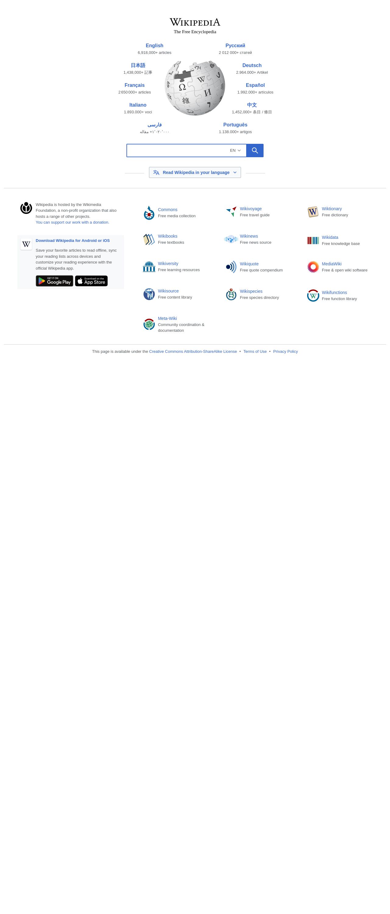
The visual design of Wikipedia's homepage is simple, yet effective. The color scheme is predominantly white, with black text and accents of blue for links and other highlights. The use of a large globe graphic with language labels adds a touch of visual interest and immediately conveys the site's global scope. The typography is clear and readable, with a clean sans-serif font used throughout. However, the design feels a bit dated and could benefit from a refresh to make it feel more modern and engaging. The logo is prominent and recognizable, but it's not particularly flashy or attention-grabbing. Overall, the design prioritizes function over form, which is fitting for an encyclopedia. The color palette is straightforward, with a primary focus on white (#FFFFFF) and black (#000000), with blue (#007FFF) used for links and highlights. This color scheme is easy on the eyes and makes it simple to focus on the content. However, it's not particularly unique or memorable.
Recommendation:
Consider a modernizing refresh to make the design feel more engaging and dynamic, while maintaining readability.
Layout and Clarity
The layout of Wikipedia's homepage is clean and well-organized. The top section features the logo, a search bar, and a list of languages, which is a clear and logical grouping. Below that, there's a section highlighting various sister projects, which is useful for users who want to explore related content. The footer contains links to important pages, such as terms of use and privacy policy, which is standard practice. The layout is very straightforward, with a clear hierarchy of information. The use of whitespace is generous, which helps to prevent the page from feeling cluttered or overwhelming. However, the design could benefit from a bit more visual separation between sections to make it easier to scan. The search bar is prominently featured, which makes sense given that search is likely a primary use case for most users. The list of languages is also front and center, which is helpful for users who prefer to read content in their native language.
Recommendation:
Consider adding more visual separation between sections to improve scannability.
Content
The content on Wikipedia's homepage is clear and concise. The list of languages is impressive, with over 50 languages represented. The numbers of articles in each language are also displayed, which gives users an idea of the scope of the site's content. The sister projects section is a great way to showcase related content and encourage users to explore other areas of the site. The links to important pages in the footer are standard and helpful. However, the content could benefit from a bit more context and explanation. For example, what are the sister projects, and why might users care about them? A brief introduction or explanation could help users understand the relevance and value of these projects. The text is written in a formal and neutral tone, which is fitting for an encyclopedia. However, it could benefit from a bit more personality and flair to make it more engaging.
Recommendation:
Consider adding more context and explanation to help users understand the relevance and value of sister projects.
This website was last rated on April 19, 2025, 6:35 a.m.
Re-rate available on April 26, 2025, 6:35 a.m.
Disclaimer: ratemysite.app is not affiliated with the website you are viewing, and does not endorse it in any way.
Ratings are subjective and based on AI's analysis. We filter out explicit or dangerous content, but cannot guarantee that all sites are safe.

All rights reserved. © ratemysite.app 2024. Contact: hello @ domain.