Rate your website in seconds – get instant feedback.
I will rate your website's design and give recommendations to enhance its visual appeal and user experience. See how your site ranks on the leaderboard!
Netherlands | Let There Be Change | Accenture

Analyzed by AI for fun and insights - not to be taken too seriously!
Visual Design
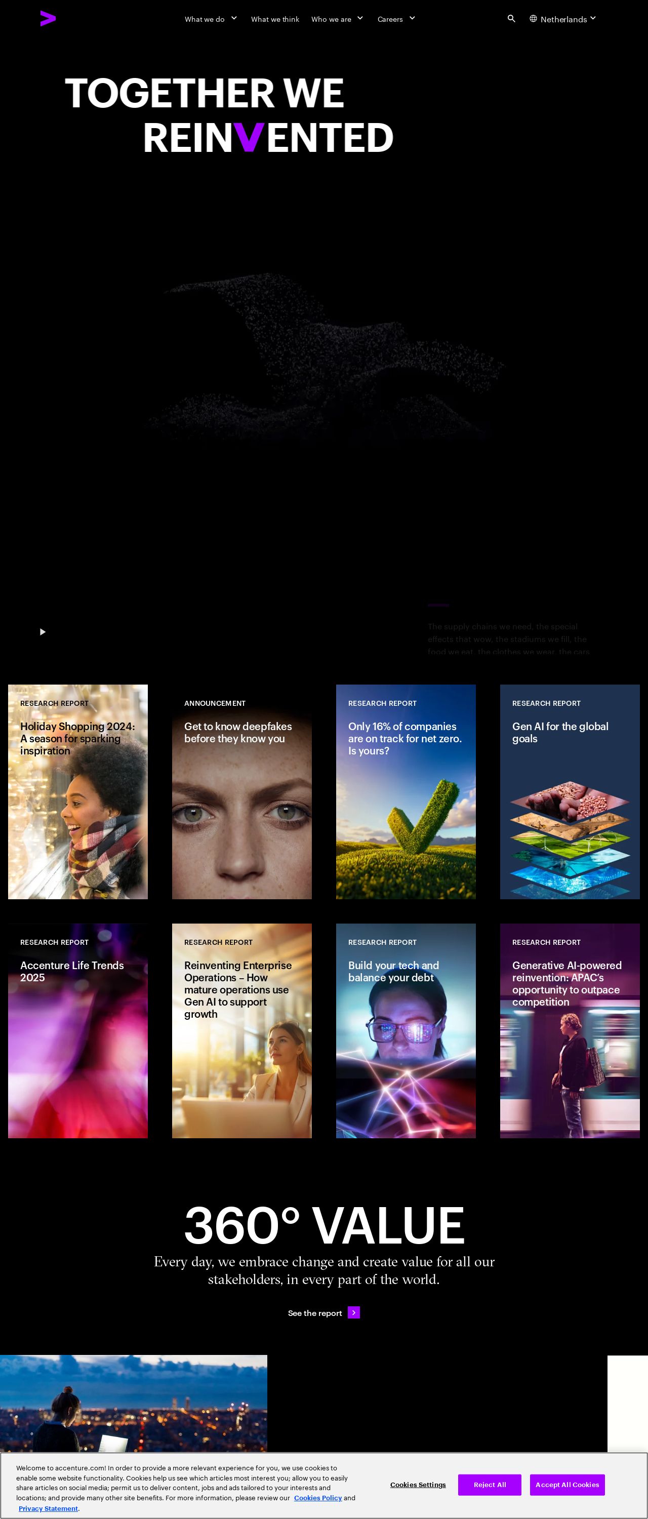
The visual design of the Accenture Netherlands website is a masterpiece of modern minimalism, with a bold and vibrant color scheme that immediately grabs your attention. The dominant black background provides a sleek and sophisticated backdrop for the various design elements, while the bright pink and purple accents add a pop of fun and playfulness to the overall aesthetic. One of the standout features of the visual design is the use of high-quality images and graphics throughout the site. From the stunning hero images on the homepage to the detailed infographics and charts, every visual element is carefully crafted to communicate complex information in a clear and engaging way. The typography is also worth mentioning, with a clean and modern sans-serif font that is easy to read and navigate. The use of white space is also well-balanced, creating a sense of breathability and making it easy to focus on the content. However, one area for improvement could be the use of more visual hierarchy to guide the user's attention through the site. While the design is generally easy to follow, there are moments where the eye gets lost in the sea of information. Adding more visual cues, such as headings and subheadings, could help to create a clearer flow and improve the overall user experience. Overall, the visual design of the Accenture Netherlands website is a testament to the power of modern design principles. With its bold color scheme, high-quality visuals, and clean typography, the site is a feast for the eyes and a pleasure to navigate.
Recommendation:
Add more visual hierarchy to guide the user's attention.
Layout and Clarity
The layout of the Accenture Netherlands website is generally well-organized and easy to follow, with a clear structure that makes it simple to find the information you need. The use of white space is well-balanced, creating a sense of breathability and making it easy to focus on the content. One of the standout features of the layout is the use of a clear and consistent grid system, which helps to create a sense of order and organization throughout the site. The use of clear headings and subheadings also helps to create a clear hierarchy of information, making it easy to scan and understand the content. However, there are a few areas where the layout could be improved. For example, some of the pages feel a bit cluttered, with too much information competing for attention. Adding more white space and using a more judicious approach to content density could help to create a cleaner and more focused layout. Additionally, the site could benefit from more prominent calls-to-action (CTAs) to guide the user through the site and encourage them to take action. While the CTAs are present, they could be more prominent and attention-grabbing to really drive conversions. Overall, the layout of the Accenture Netherlands website is clear and well-organized, but could benefit from a few tweaks to create a more focused and effective user experience.
Recommendation:
Use a more judicious approach to content density.
Content
The content of the Accenture Netherlands website is informative and engaging, with a clear and concise writing style that makes it easy to understand complex information. The use of headings and subheadings helps to create a clear hierarchy of information, making it easy to scan and understand the content. One of the standout features of the content is the use of storytelling techniques to bring the information to life. The site tells the story of Accenture's mission and values, and how they are working to make a positive impact on the world. This approach helps to create an emotional connection with the user and makes the information more memorable and engaging. However, there are a few areas where the content could be improved. For example, some of the pages feel a bit dry and lacking in personality. Adding more human touches, such as images and testimonials, could help to create a more relatable and engaging reading experience. Additionally, the site could benefit from more interactive elements, such as quizzes and assessments, to help the user engage more deeply with the information. While the site is generally easy to navigate, there are moments where the user gets lost in the sea of information. Adding more interactive elements could help to create a more dynamic and engaging experience. Overall, the content of the Accenture Netherlands website is informative and engaging, but could benefit from a few tweaks to create a more relatable and interactive reading experience.
Recommendation:
Add more human touches to the content.
This website was last rated on Nov. 21, 2024, 9:33 a.m.
Disclaimer: ratemysite.app is not affiliated with the website you are viewing, and does not endorse it in any way.
Ratings are subjective and based on AI's analysis. We filter out explicit or dangerous content, but cannot guarantee that all sites are safe.
All rights reserved. © ratemysite.app 2024. Contact: hello @ domain.
