Rate your website in seconds – get instant feedback.
I will rate your website's design and give recommendations to enhance its visual appeal and user experience. See how your site ranks on the leaderboard!

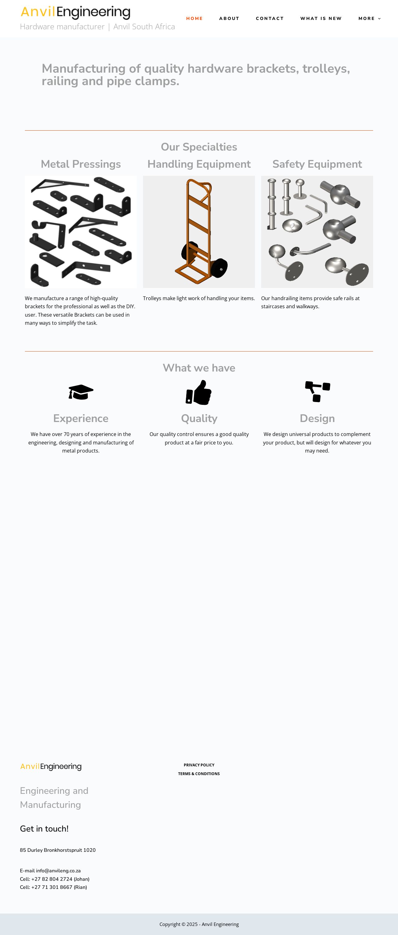
Hardware manufacturer | Anvil South Africa – We engineer metal brackets Trolleys and handrailing.
Analyzed by AI for fun and insights - not to be taken too seriously!
Visual Design
The visual design of the website is simple and straightforward, with a clean and minimalistic aesthetic. The use of a white background and black text creates a clear and easy-to-read interface. However, the design could be improved by adding some visual interest and depth to the page. The use of images and graphics would help to break up the text and make the page more visually appealing. Additionally, the use of a consistent font throughout the page would help to create a sense of cohesion and professionalism. The website's logo is prominent and eye-catching, but it could be improved by adding more visual interest and creativity. The use of a simple, sans-serif font makes the logo easy to read, but it lacks the personality and flair that could make it stand out. Overall, the visual design of the website is functional and easy to use, but it could benefit from some additional visual interest and creativity.
Recommendation:
Add more visual interest and creativity to the design, such as images, graphics, and a consistent font throughout the page.
Layout and Clarity
The layout of the website is clear and easy to navigate, with a logical and consistent structure. The use of headings, subheadings, and bullet points helps to break up the content and make it easy to scan. However, the layout could be improved by adding more white space and creating a more balanced design. The content is clear and concise, with a focus on providing useful information to the user. However, the language could be improved by making it more engaging and conversational. The use of a more formal tone makes the content feel dry and uninteresting. Overall, the layout and clarity of the website are good, but could be improved by adding more visual interest and creativity.
Recommendation:
Add more white space to the design and use a more engaging and conversational tone in the content.
Content
The content of the website is informative and well-structured, with a clear and concise writing style. The use of headings, subheadings, and bullet points helps to break up the content and make it easy to scan. However, the content could be improved by adding more visual interest and creativity. The website's content is focused on providing useful information to the user, but it could benefit from more engaging and conversational language. The use of a formal tone makes the content feel dry and uninteresting. Overall, the content of the website is good, but could be improved by adding more visual interest and creativity.
Recommendation:
Add more visual interest and creativity to the content, such as images, graphics, and a more conversational tone.
This website was last rated on Jan. 7, 2025, 11:47 a.m.
Disclaimer: ratemysite.app is not affiliated with the website you are viewing, and does not endorse it in any way.
Ratings are subjective and based on AI's analysis. We filter out explicit or dangerous content, but cannot guarantee that all sites are safe.

All rights reserved. © ratemysite.app 2024. Contact: hello @ domain.