Rate your website in seconds – get instant feedback.
I will rate your website's design and give recommendations to enhance its visual appeal and user experience. See how your site ranks on the leaderboard!
apioro

Analyzed by AI for fun and insights - not to be taken too seriously!
Visual Design
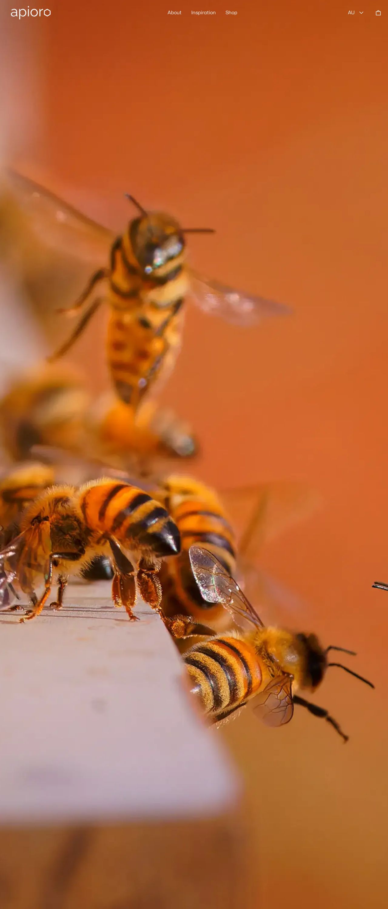
The visual design of the website is warm and inviting, with a color scheme that evokes feelings of nature and coziness. The use of earthy tones such as brown, beige, and green creates a sense of balance and harmony, which is fitting for a brand that prides itself on being "hand and hive". The images of bees and flowers are beautifully rendered and add a touch of whimsy to the design. However, the website could benefit from a more consistent design language throughout. The font sizes and styles vary, and the use of different font weights and colors can make the text difficult to read at times. Additionally, the website could benefit from more whitespace to create a sense of breathing room and make the content easier to digest.
Recommendation:
Consider using a more consistent design language throughout the website, and add more whitespace to create a sense of breathing room.
Layout and Clarity
The layout of the website is clean and easy to navigate, with clear headings and concise paragraphs. The use of white space effectively separates the different sections of the website, making it easy to scan and find the information you're looking for. However, the website could benefit from a more intuitive navigation menu. The current menu is located at the top of the page, but it's not immediately clear how to access it. Additionally, the website could benefit from more visual hierarchy to guide the user's eye through the content. For example, the headings could be larger and bolder to draw attention to them.
Recommendation:
Consider adding a more intuitive navigation menu, and use visual hierarchy to guide the user's eye through the content.
Content
The content on the website is engaging and informative, with a clear and concise writing style. The use of images and videos adds visual interest and helps to break up the text. However, the website could benefit from more depth and variety in the content. Some of the pages, such as the "About" page, feel a bit sparse and could benefit from more details and anecdotes. Additionally, the website could benefit from more calls-to-action (CTAs) to encourage visitors to take action. For example, the website could include more buttons or links that prompt visitors to buy products or sign up for a newsletter.
Recommendation:
Consider adding more depth and variety to the content, and include more calls-to-action to encourage visitors to take action.
This website was last rated on Jan. 8, 2025, 8:53 a.m.
Disclaimer: ratemysite.app is not affiliated with the website you are viewing, and does not endorse it in any way.
Ratings are subjective and based on AI's analysis. We filter out explicit or dangerous content, but cannot guarantee that all sites are safe.
All rights reserved. © ratemysite.app 2024. Contact: hello @ domain.
