Rate your website in seconds – get instant feedback.
I will rate your website's design and give recommendations to enhance its visual appeal and user experience. See how your site ranks on the leaderboard!

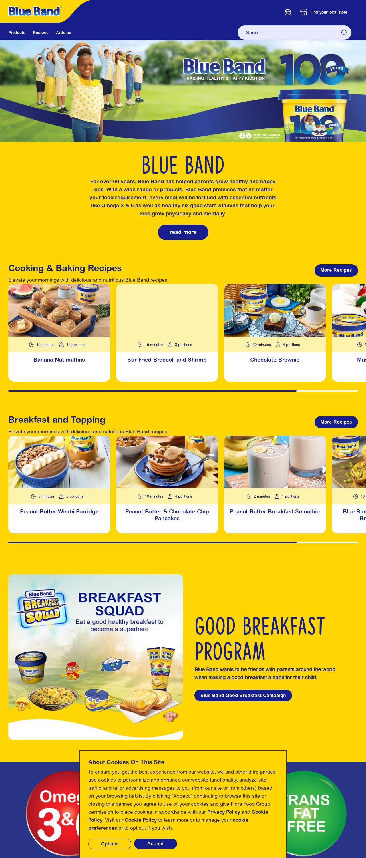
Blue Band
Analyzed by AI for fun and insights - not to be taken too seriously!
Visual Design
The visual design of the Blue Band website is bright and cheerful, with a predominantly yellow and blue color scheme that immediately grabs the user's attention. The use of images of happy children and delicious-looking food is also effective in conveying the brand's message of promoting healthy eating habits for kids. However, the design could benefit from a bit more balance and harmony, as some of the elements feel a bit cluttered and overwhelming. For example, the large banner at the top of the page takes up a lot of space and could be condensed to make room for more important content. Additionally, the use of too many different fonts and font sizes can make the text hard to read. Overall, the visual design is engaging and attention-grabbing, but could use some tweaking to improve its overall aesthetic appeal.
Recommendation:
Simplify the design by condensing the banner and using fewer fonts and font sizes.
Layout and Clarity
The layout of the website is generally clear and easy to navigate, with a clear hierarchy of content and clear calls-to-action. However, there are a few areas where the layout could be improved. For example, the "Cooking & Baking Recipes" section is buried at the bottom of the page, which makes it hard to find. Additionally, the "Good Breakfast Program" section feels a bit disconnected from the rest of the content. To improve the layout, I would recommend moving the recipe section to a more prominent location and integrating the Good Breakfast Program section more seamlessly into the rest of the content. Overall, the layout is clear and easy to navigate, but could benefit from some fine-tuning.
Recommendation:
Move the recipe section to a more prominent location and integrate the Good Breakfast Program section more seamlessly into the rest of the content.
Content
The content of the website is generally informative and engaging, with a clear focus on promoting healthy eating habits for kids. The recipes and articles are well-written and easy to follow, and the use of images and videos is effective in breaking up the text and making the content more engaging. However, there are a few areas where the content could be improved. For example, some of the articles feel a bit repetitive and could be condensed to make them more concise. Additionally, the use of too many buzzwords and marketing jargon can make the content feel a bit insincere. To improve the content, I would recommend editing the articles to make them more concise and removing any unnecessary buzzwords or jargon. Overall, the content is informative and engaging, but could benefit from some fine-tuning.
Recommendation:
Edit the articles to make them more concise and remove any unnecessary buzzwords or jargon.
This website was last rated on Feb. 3, 2025, 3:41 a.m.
Disclaimer: ratemysite.app is not affiliated with the website you are viewing, and does not endorse it in any way.
Ratings are subjective and based on AI's analysis. We filter out explicit or dangerous content, but cannot guarantee that all sites are safe.

All rights reserved. © ratemysite.app 2024. Contact: hello @ domain.