Rate your website in seconds – get instant feedback.
I will rate your website's design and give recommendations to enhance its visual appeal and user experience. See how your site ranks on the leaderboard!

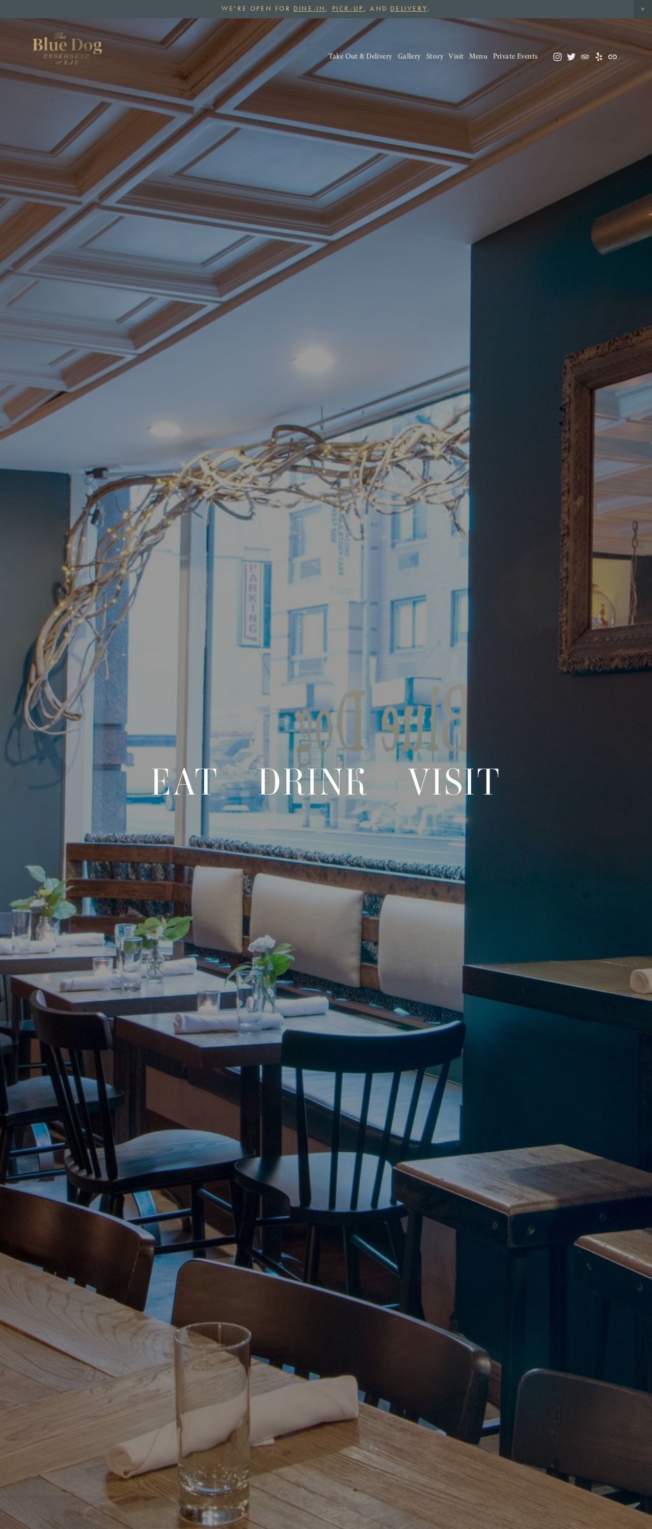
Blue Dog
Analyzed by AI for fun and insights - not to be taken too seriously!
Visual Design
The Blue Dog website's visual design is quite appealing, with a warm and inviting atmosphere that immediately makes you want to grab a bite to eat. The use of a high-quality image of a cozy restaurant interior sets the tone for a welcoming dining experience. The color palette is predominantly dark blues and whites, which creates a sense of calmness and serenity. However, the font used for the "EAT DRINK VISIT" text is a bit too large and overlaid on top of the image, making it feel somewhat forced. A more subtle approach to typography would enhance the overall visual appeal. The logo in the top-left corner is elegant and simple, but it could be more prominent. Overall, the visual design effectively communicates the restaurant's ambiance, but could benefit from some tweaks to make it more polished.
Recommendation:
Refine typography and logo placement for a more balanced look.
Layout and Clarity
The layout of the website is clean and easy to navigate, with a clear hierarchy of information. The top navigation bar provides quick access to essential sections like "Take Out & Delivery," "Gallery," "Story," "Visit," "Menu," and "Private Events." However, the hero section's image and text overlay feel a bit cluttered, making it hard to focus on either element. The use of whitespace could be more effective in creating a clear visual flow. Additionally, the hours of operation and other important details are not immediately visible, which might lead to users having to scroll or click around to find them. A more streamlined layout would improve clarity and user experience.
Recommendation:
Streamline the hero section and prioritize key information.
Content
The content on the Blue Dog website is concise and to the point, but could benefit from more context and storytelling. The hero section's text, "EAT DRINK VISIT," is short and catchy, but doesn't provide much information about the restaurant's unique offerings or value proposition. The top navigation bar's labels are clear, but could be more descriptive. For example, "Gallery" could become "Food Gallery" or "Restaurant Photos." The hours of operation and other essential details are present but feel somewhat buried. Overall, the content is easy to understand but could be more engaging and informative.
Recommendation:
Add more descriptive content and context to engage users.
This website was last rated on April 19, 2025, 11:42 a.m.
Re-rate available on April 26, 2025, 11:42 a.m.
Disclaimer: ratemysite.app is not affiliated with the website you are viewing, and does not endorse it in any way.
Ratings are subjective and based on AI's analysis. We filter out explicit or dangerous content, but cannot guarantee that all sites are safe.

All rights reserved. © ratemysite.app 2024. Contact: hello @ domain.