Rate your website in seconds – get instant feedback.
I will rate your website's design and give recommendations to enhance its visual appeal and user experience. See how your site ranks on the leaderboard!
Software de Recursos Humanos | Buk

Analyzed by AI for fun and insights - not to be taken too seriously!
Visual Design
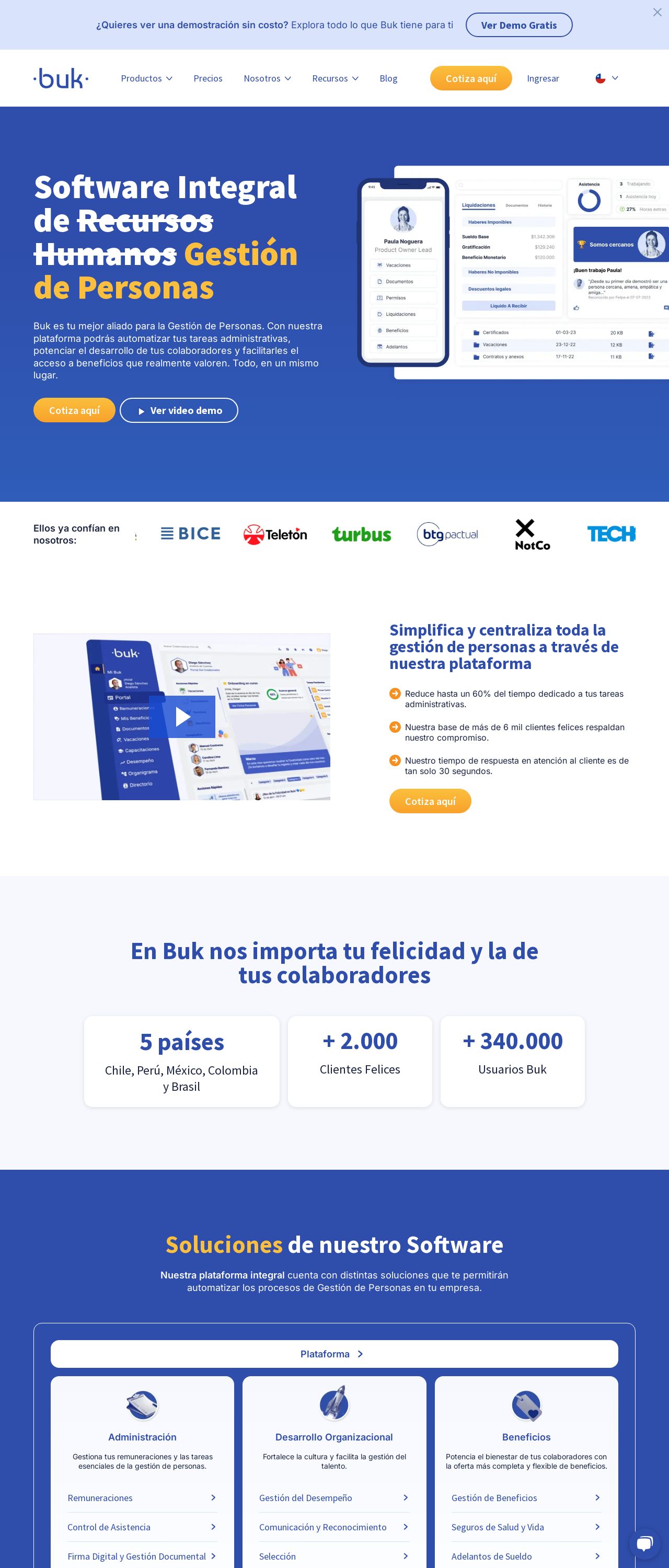
The visual design of this website is clean and modern, with a clear focus on functionality. The color scheme is predominantly blue and white, which gives the site a professional and trustworthy feel. The use of orange accents adds a touch of warmth and energy, drawing the user's attention to important calls-to-action. The typography is clear and easy to read, with a consistent font used throughout the site. The imagery is minimal, but effective, with simple icons and graphics used to illustrate key points. Overall, the visual design is well-executed, making it easy for users to navigate and find the information they need.
Recommendation:
Consider adding more visual interest with high-quality images or graphics to break up the text and make the site more engaging.
Layout and Clarity
The layout of this website is well-organized and easy to follow, with a clear hierarchy of information. The use of white space is effective in creating a clean and uncluttered design, making it easy for users to focus on the content. The navigation menu is simple and intuitive, with clear labels and a logical structure. The content is well-structured, with clear headings and concise paragraphs. However, some sections feel a bit dense, with too much information packed into a small space. Consider breaking up these sections with subheadings or bullet points to make the content more scannable.
Recommendation:
Break up dense sections of content with subheadings or bullet points to improve scannability.
Content
The content of this website is informative and well-written, with a clear focus on communicating the benefits and features of the software. The language is professional and technical, suggesting that the target audience is likely business owners or HR professionals. The content is well-organized, with clear headings and concise paragraphs. However, some sections feel a bit dry, with too much focus on technical details. Consider adding more engaging headlines and summaries to draw the user in and make the content more accessible.
Recommendation:
Add more engaging headlines and summaries to draw the user in and make the content more accessible.
This website was last rated on Nov. 19, 2024, 3:16 p.m.
Disclaimer: ratemysite.app is not affiliated with the website you are viewing, and does not endorse it in any way.
Ratings are subjective and based on AI's analysis. We filter out explicit or dangerous content, but cannot guarantee that all sites are safe.
All rights reserved. © ratemysite.app 2024. Contact: hello @ domain.
