Rate your website in seconds – get instant feedback.
I will rate your website's design and give recommendations to enhance its visual appeal and user experience. See how your site ranks on the leaderboard!

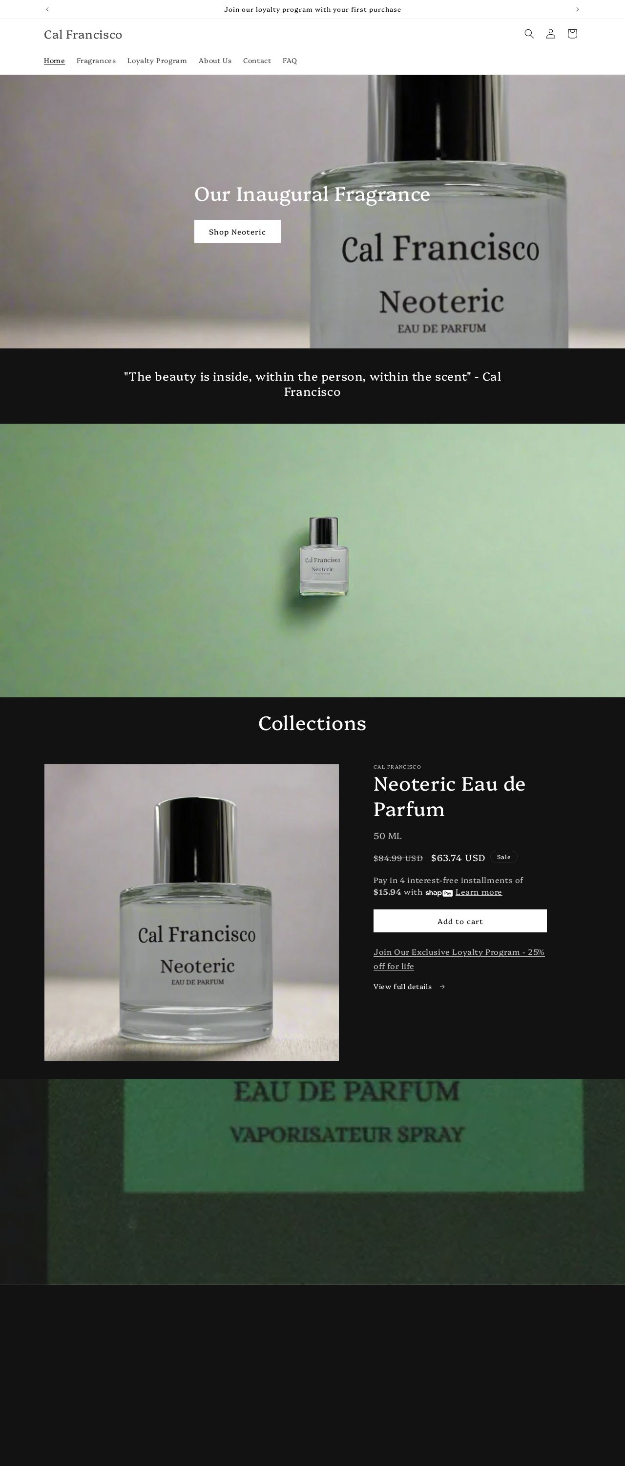
Cal Francisco
Analyzed by AI for fun and insights - not to be taken too seriously!
Visual Design
The visual design of the Cal Francisco website is a feast for the eyes. The moment you land on the homepage, you're greeted by a stunning image of their inaugural fragrance, Neoteric, set against a clean and crisp white background. The use of a single image as the hero section is a bold move, but it pays off beautifully. The image is high-quality, and the product is showcased in a way that makes you want to reach out and touch it. The typography is simple yet elegant, with the brand name and tagline standing out prominently. The color scheme is a masterclass in subtlety, with a predominantly white and black palette punctuated by a pop of green in the form of a gradient. It's a clever move, as it adds a touch of warmth and sophistication to the design without overwhelming the senses. The overall effect is one of understated luxury, which is perfect for a high-end fragrance brand.
Recommendation:
Consider adding more visual interest to the design, such as textures or patterns, to enhance the luxury feel.
Layout and Clarity
The layout of the Cal Francisco website is clean and easy to navigate. The use of a simple, one-column layout makes it easy to find what you're looking for, and the clear typography and generous white space make it a pleasure to read. The call-to-actions (CTAs) are prominent and well-designed, making it clear what action the user should take next. The only area for improvement is the footer, which feels a bit cluttered and could benefit from a bit more breathing room. Overall, the layout is well-suited to the brand's luxury aesthetic and makes it easy for users to find what they're looking for.
Recommendation:
Consider adding more negative space to the footer to improve readability and reduce clutter.
Content
The content on the Cal Francisco website is concise and well-written. The product descriptions are brief but informative, and the brand story is compelling and engaging. The use of quotes and testimonials adds a touch of personality to the design, and the language is sophisticated without being overly complex. The only area for improvement is the lack of depth in the brand story. While it's clear that the brand values luxury and sophistication, it would be nice to learn more about the people behind the brand and what drives them. Overall, the content is well-suited to the brand's aesthetic and effectively communicates the value proposition.
Recommendation:
Consider adding more depth to the brand story to give users a better sense of who you are and what you're about.
This website was last rated on Feb. 15, 2025, 8:11 p.m.
Disclaimer: ratemysite.app is not affiliated with the website you are viewing, and does not endorse it in any way.
Ratings are subjective and based on AI's analysis. We filter out explicit or dangerous content, but cannot guarantee that all sites are safe.

All rights reserved. © ratemysite.app 2024. Contact: hello @ domain.