Rate your website in seconds – get instant feedback.
I will rate your website's design and give recommendations to enhance its visual appeal and user experience. See how your site ranks on the leaderboard!
The Art of Luxury Event Painting for Your Event

Analyzed by AI for fun and insights - not to be taken too seriously!
Visual Design
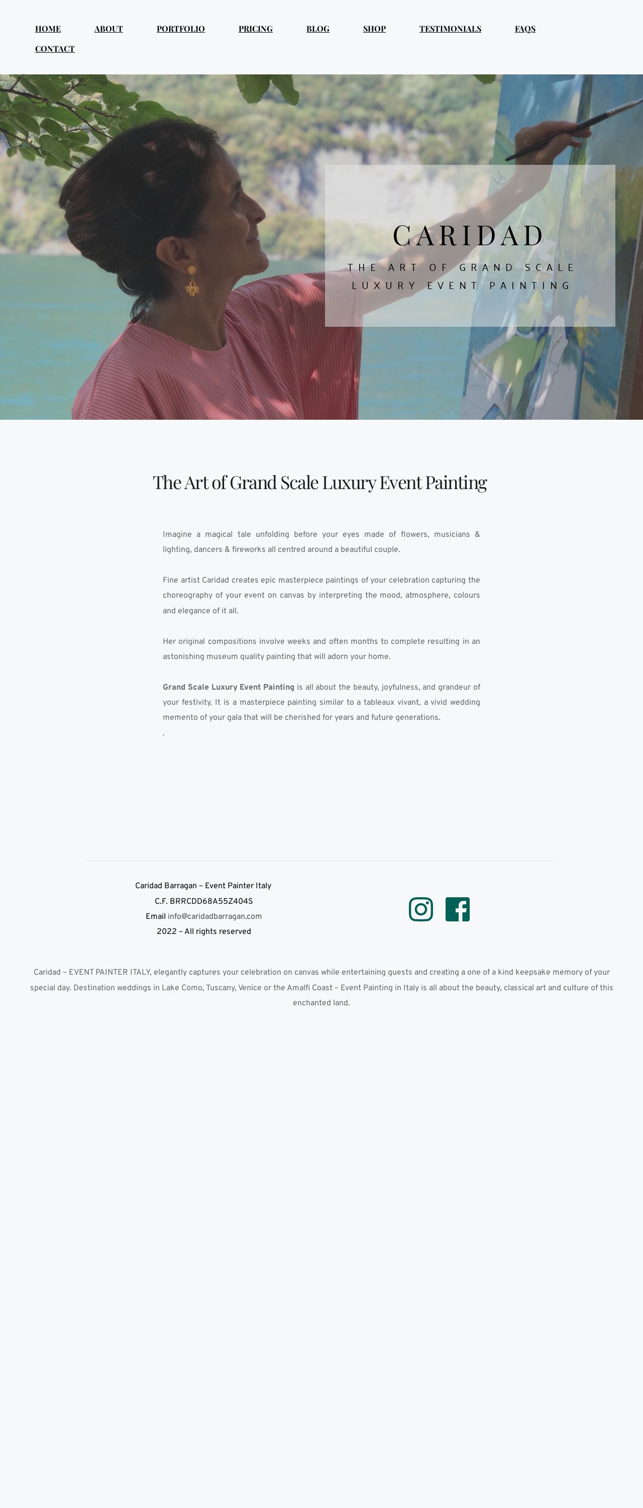
Ah, the visual design of this website - it's like a breath of fresh air on a sunny Italian day! The color palette is a masterclass in elegance, with a soothing blend of pastel shades that evoke the soft hues of a Tuscan sunset. The dominant white background provides a clean canvas for the beautiful artwork and images to shine, while the subtle use of light blue and pink accents adds a touch of whimsy and sophistication. The typography is clear and easy to read, with a classic serif font that exudes refinement and culture. The imagery is, of course, the true star of the show. The stunning paintings and photographs of Caridad's work are showcased in a way that makes you feel like you're stepping into a gallery. The use of high-quality images with good lighting and composition makes the artwork pop, and the subtle animations and transitions add a touch of magic to the overall experience. However, there are a few areas where the visual design could be improved. The navigation menu feels a bit cluttered, with too many options competing for attention. A simpler, more streamlined approach would make it easier for users to find what they're looking for. Additionally, some of the images feel a bit too large, which can make the page feel overwhelming and slow to load. Overall, the visual design of this website is a true masterpiece, with a beautiful color palette, stunning imagery, and a clear and elegant typography. With a few tweaks to the navigation and image sizing, it could be truly exceptional.
Recommendation:
Simplify the navigation menu and resize images for a more streamlined experience.
Layout and Clarity
The layout of this website is a bit of a mixed bag. On the one hand, the use of a clear and consistent grid structure makes it easy to navigate and find what you're looking for. The white space is well-balanced, and the content is organized in a logical and easy-to-follow way. On the other hand, the page feels a bit too long and dense, with too much content competing for attention. The use of headings and subheadings is inconsistent, which can make it hard to scan the page and understand the hierarchy of information. Additionally, some of the sections feel a bit too narrow, which can make the text feel cramped and difficult to read. One area where the layout shines is in the use of full-width images and sections. These create a sense of drama and impact, and help to break up the density of the content. However, these sections could be used more strategically throughout the page to create a more dynamic and engaging flow. Overall, the layout of this website has some great strengths, but could benefit from a bit more attention to balance and consistency.
Recommendation:
Break up the content with more full-width images and sections to create a more dynamic flow.
Content
The content of this website is truly exceptional. The writing is clear, concise, and engaging, with a tone that feels both professional and approachable. The use of storytelling techniques, such as the "magical tale" of the couple's wedding, makes the content feel more personal and relatable. The language is rich and evocative, with vivid descriptions of the artwork and the Italian landscape. The use of sensory details, such as the "flowers, musicians & lighting, dancers & fireworks," helps to transport the reader to the scene and make them feel like they're experiencing it firsthand. One area where the content could be improved is in the use of more concise headings and subheadings. These would help to break up the density of the content and make it easier to scan the page. Additionally, some of the paragraphs feel a bit too long, which can make them feel overwhelming and slow to read. Overall, the content of this website is truly exceptional, with a tone that feels both professional and approachable. With a bit more attention to concise headings and paragraph structure, it could be truly outstanding.
Recommendation:
Use more concise headings and paragraph structure to make the content feel more scannable.
This website was last rated on Dec. 19, 2024, 4:05 a.m.
Disclaimer: ratemysite.app is not affiliated with the website you are viewing, and does not endorse it in any way.
Ratings are subjective and based on AI's analysis. We filter out explicit or dangerous content, but cannot guarantee that all sites are safe.
All rights reserved. © ratemysite.app 2024. Contact: hello @ domain.
