Rate your website in seconds – get instant feedback.
I will rate your website's design and give recommendations to enhance its visual appeal and user experience. See how your site ranks on the leaderboard!
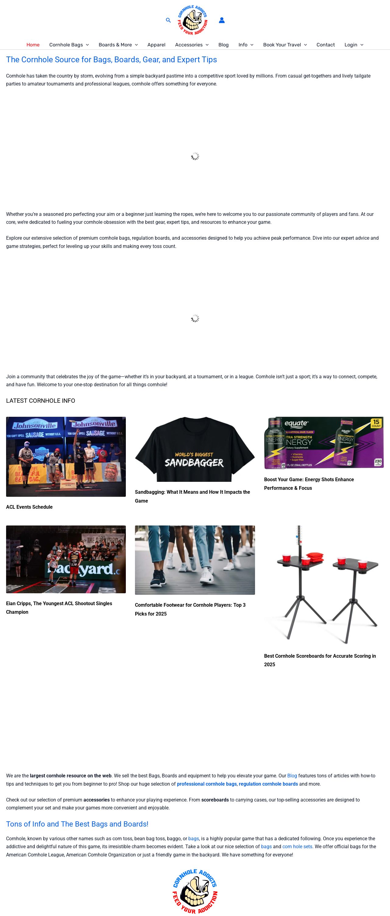
The Cornhole Source for Bags, Boards, Gear, and Expert Tips

Analyzed by AI for fun and insights - not to be taken too seriously!
Visual Design
The website's visual design is a great starting point, with a bold and eye-catching color scheme that immediately grabs the user's attention. The use of bright colors and fun graphics, such as the cartoon-style illustrations of cornhole bags and boards, adds a playful touch to the site. The layout is well-organized, making it easy for users to navigate and find what they're looking for. However, there are a few areas where the design could be improved. The font sizes and styles are inconsistent, which can make the text difficult to read in some areas. Additionally, the use of too many different colors can be overwhelming and detract from the overall design. A more cohesive color scheme would help to create a more polished look. Overall, the visual design is engaging and fun, but could benefit from some refinement to make it more effective.
Recommendation:
Consider simplifying the color scheme and font styles to create a more cohesive look. Use a limited number of colors and font styles throughout the site to create a more polished appearance.
Layout and Clarity
The layout of the website is well-organized and easy to navigate. The use of clear headings and concise paragraphs makes it easy for users to quickly scan the content and find what they're looking for. The use of images and graphics adds visual interest and breaks up the text, making the content more engaging. However, there are a few areas where the layout could be improved. The use of too many different font sizes and styles can make the text difficult to read. Additionally, the use of too much white space can make the content feel sparse and uninviting. A more balanced approach to font sizes and white space would help to create a more engaging layout. Overall, the layout is well-organized and easy to navigate, but could benefit from some refinement to make it more effective.
Recommendation:
Consider simplifying the font sizes and styles, and use a more balanced approach to white space to create a more engaging layout.
Content
The content of the website is well-written and engaging, with clear headings and concise paragraphs that make it easy for users to quickly scan the content and find what they're looking for. The use of images and graphics adds visual interest and breaks up the text, making the content more engaging. However, there are a few areas where the content could be improved. The use of technical terms and jargon can be overwhelming for non-experts. Additionally, the content could benefit from more examples and case studies to help illustrate the points being made. A more conversational tone would also help to make the content more engaging and accessible to a wider audience. Overall, the content is well-written and engaging, but could benefit from some refinement to make it more effective.
Recommendation:
Consider using simpler language and more examples and case studies to help illustrate the points being made. Use a more conversational tone to make the content more engaging and accessible to a wider audience.
This website was last rated on Jan. 16, 2025, 11:03 p.m.
Disclaimer: ratemysite.app is not affiliated with the website you are viewing, and does not endorse it in any way.
Ratings are subjective and based on AI's analysis. We filter out explicit or dangerous content, but cannot guarantee that all sites are safe.
All rights reserved. © ratemysite.app 2024. Contact: hello @ domain.
