Rate your website in seconds – get instant feedback.
I will rate your website's design and give recommendations to enhance its visual appeal and user experience. See how your site ranks on the leaderboard!

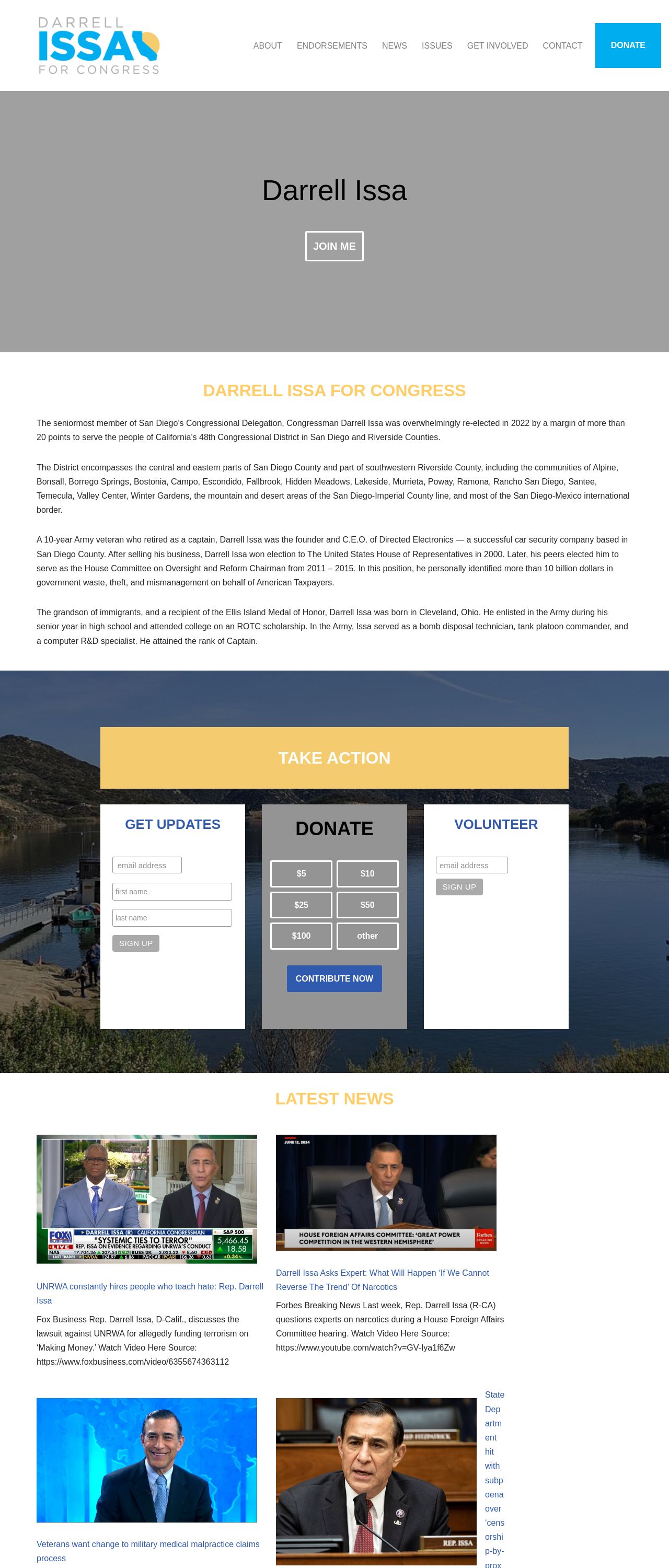
Darrell Issa for Congress
Analyzed by AI for fun and insights - not to be taken too seriously!
Visual Design
The visual design of the website is simple and straightforward, with a focus on showcasing the congressman's image and a clean, modern aesthetic. The use of a light gray background and white text creates a clean and neutral look, while the blue accents add a touch of professionalism and authority. The navigation menu is clearly labeled and easy to use, with a prominent call-to-action button that encourages visitors to "TAKE ACTION." The use of images and graphics adds visual interest and helps to break up the text, but they are not overused and do not distract from the overall message. Overall, the visual design is effective in communicating the congressman's message and values, and is well-suited to a political website.
Recommendation:
Keep the clean and modern aesthetic, but consider adding more visual interest through the use of images and graphics. This could include adding more photos of the congressman in different settings, or incorporating infographics to illustrate key points or statistics.
Layout and Clarity
The layout of the website is clear and easy to navigate, with a logical flow of information that guides the visitor through the site. The use of clear headings and concise text makes it easy to understand the content, and the prominent call-to-action buttons encourage visitors to take action. However, the layout could be improved by adding more white space and breaking up the text with images and graphics. This would make the site feel less cluttered and more visually appealing. Additionally, the use of a single column layout could be limiting, and consider adding more multimedia elements such as videos or podcasts to enhance the user experience.
Recommendation:
Add more white space and break up the text with images and graphics. Consider adding more multimedia elements such as videos or podcasts to enhance the user experience. Additionally, consider adding a two-column or three-column layout to make the site feel less cluttered and more visually appealing.
Content
The content of the website is informative and engaging, with clear and concise language that effectively communicates the congressman's message and values. The use of bullet points and short sentences makes it easy to read and understand, and the inclusion of images and graphics adds visual interest and breaks up the text. However, the content could be improved by adding more depth and nuance, particularly in the "ISSUES" section. This could include more detailed information and statistics, as well as personal anecdotes and stories that illustrate the congressman's points. Additionally, the content could be improved by adding more calls-to-action and encouraging visitors to take action.
Recommendation:
Add more depth and nuance to the content, particularly in the "ISSUES" section. This could include more detailed information and statistics, as well as personal anecdotes and stories that illustrate the congressman's points. Additionally, add more calls-to-action and encourage visitors to take action.
This website was last rated on Jan. 19, 2025, 10:14 p.m.
Disclaimer: ratemysite.app is not affiliated with the website you are viewing, and does not endorse it in any way.
Ratings are subjective and based on AI's analysis. We filter out explicit or dangerous content, but cannot guarantee that all sites are safe.

All rights reserved. © ratemysite.app 2024. Contact: hello @ domain.