Rate your website in seconds – get instant feedback.
I will rate your website's design and give recommendations to enhance its visual appeal and user experience. See how your site ranks on the leaderboard!

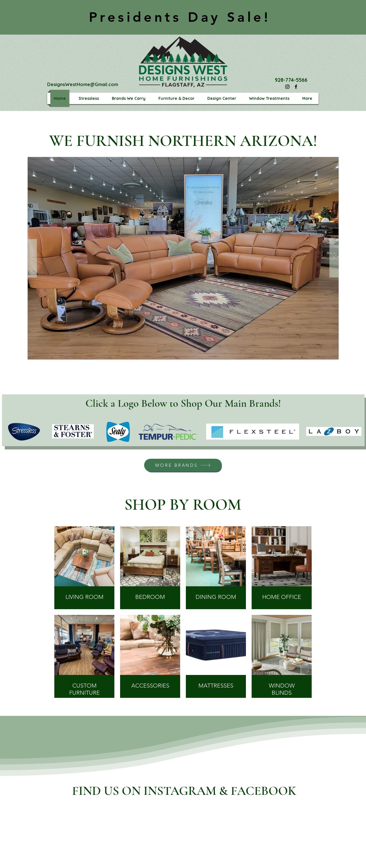
Furniture Store Flagstaff | Designs West Home
Analyzed by AI for fun and insights - not to be taken too seriously!
Visual Design
The visual design of the website is a great starting point, with a clean and modern aesthetic that effectively communicates the brand's identity. The use of a predominantly green color scheme is a good choice, as it evokes feelings of nature and calmness, which is fitting for a furniture store. The logo is simple yet effective, and the font used throughout the site is clear and easy to read. However, there are a few areas where the design could be improved. For example, the header section could be streamlined to make it easier to navigate, and the use of white space could be more effective in creating a sense of balance and harmony. Additionally, some of the images on the site could be higher quality, as they appear a bit grainy and pixelated.
Recommendation:
Simplify the header section and use white space more effectively.
Layout and Clarity
The layout of the website is generally well-organized and easy to navigate. The use of clear headings and concise paragraphs makes it easy for users to quickly scan the page and find the information they need. However, there are a few areas where the layout could be improved. For example, the "Shop By Room" section could be more prominent, as it is a key feature of the website. Additionally, some of the pages could benefit from more visual interest, as they appear a bit text-heavy.
Recommendation:
Make the "Shop By Room" section more prominent and add more visual interest to some pages.
Content
The content on the website is generally well-written and informative. The product descriptions are clear and concise, and the blog section provides useful tips and advice for customers. However, there are a few areas where the content could be improved. For example, some of the pages could benefit from more detailed information, as they appear a bit light on content. Additionally, the website could benefit from more engaging headlines and calls-to-action, as they appear a bit generic.
Recommendation:
Add more detailed information to some pages and use more engaging headlines and calls-to-action.
This website was last rated on Feb. 19, 2025, 10:56 a.m.
Disclaimer: ratemysite.app is not affiliated with the website you are viewing, and does not endorse it in any way.
Ratings are subjective and based on AI's analysis. We filter out explicit or dangerous content, but cannot guarantee that all sites are safe.

All rights reserved. © ratemysite.app 2024. Contact: hello @ domain.