Rate your website in seconds – get instant feedback.
I will rate your website's design and give recommendations to enhance its visual appeal and user experience. See how your site ranks on the leaderboard!
Edelsmid Doesburg - Edelsmederij Tobias - Handgemaakte Sieraden - Trouwringen - Horloges

Analyzed by AI for fun and insights - not to be taken too seriously!
Visual Design
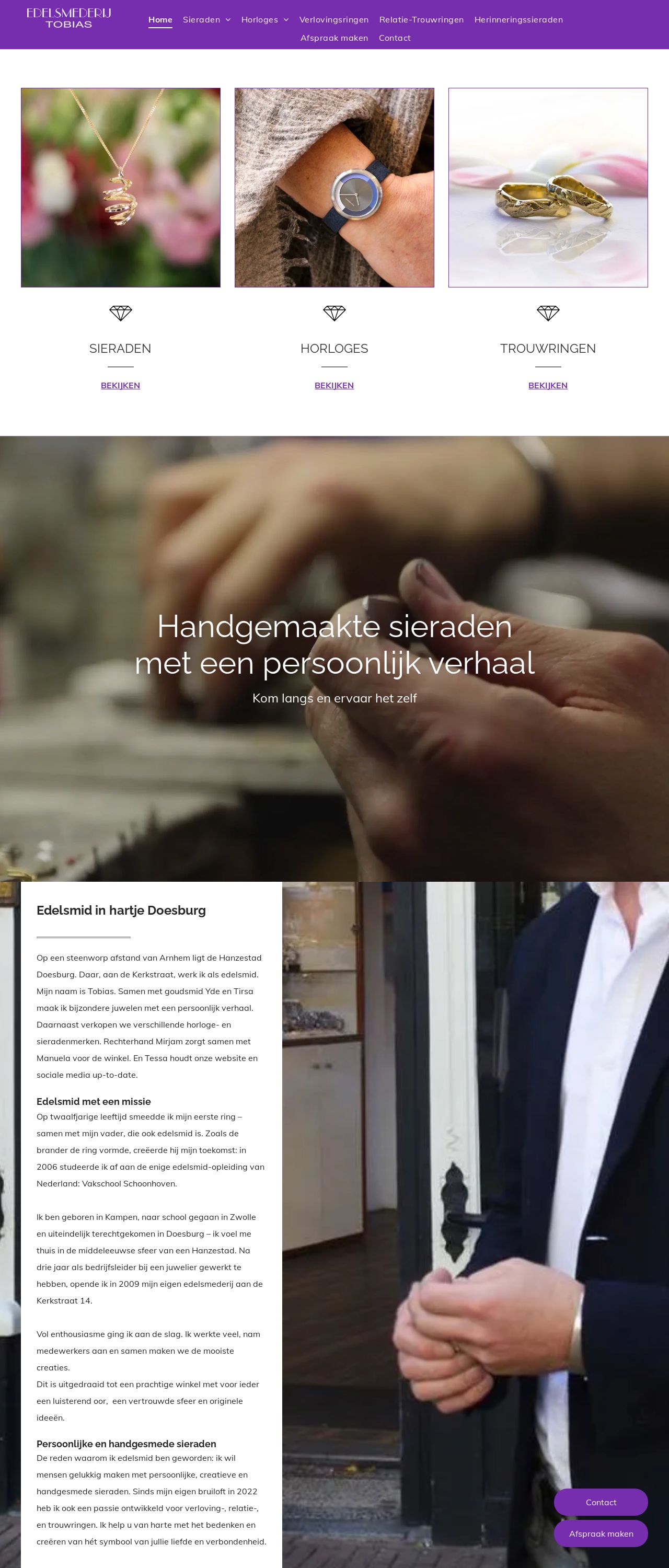
The visual design of the website is a feast for the eyes. The dominant color scheme is a soothing blend of whites, creams, and grays, which provides a clean and elegant backdrop for the beautiful jewelry pieces on display. The use of high-quality images showcasing the jewelry is a great way to grab the visitor's attention and make them feel like they're browsing through a physical store. The images are well-lit, and the details of the jewelry are clearly visible, which helps to build trust with potential customers. The font used is clear and easy to read, making it simple for visitors to navigate the website and find what they're looking for. Overall, the visual design is sophisticated and professional, making it perfect for a high-end jewelry store.
Recommendation:
Consider adding a bit more color to the design to make it more visually appealing.
Layout and Clarity
The layout of the website is well-organized and easy to follow. The navigation menu is simple and intuitive, making it easy for visitors to find what they're looking for. The use of white space is effective in creating a clean and uncluttered design that doesn't overwhelm the visitor. The images are well-placed and don't interfere with the text, making it easy to read and understand. The call-to-action buttons are prominent and stand out, encouraging visitors to take action. However, the layout could be improved by making the text more prominent and easier to read. The font size could be increased, and the line spacing could be adjusted to make the text more readable. Additionally, the use of headings and subheadings could be improved to make the content more scannable.
Recommendation:
Consider making the text more prominent and easier to read.
Content
The content of the website is informative and engaging. The about page tells the story of the jewelry store and its owner, Tobias, which helps to build a personal connection with the visitor. The use of storytelling is effective in creating an emotional connection with the visitor and making them more likely to trust the brand. The product pages are well-written and provide detailed information about each piece of jewelry, including the materials used, the design process, and the inspiration behind the piece. The use of keywords is effective in helping search engines understand the content of the website and improving its visibility. However, the content could be improved by making it more concise and easier to read. The paragraphs could be shorter, and the language could be simplified to make it more accessible to a wider audience.
Recommendation:
Consider making the content more concise and easier to read.
This website was last rated on Dec. 9, 2024, 5:06 p.m.
Disclaimer: ratemysite.app is not affiliated with the website you are viewing, and does not endorse it in any way.
Ratings are subjective and based on AI's analysis. We filter out explicit or dangerous content, but cannot guarantee that all sites are safe.
All rights reserved. © ratemysite.app 2024. Contact: hello @ domain.
