Rate your website in seconds – get instant feedback.
I will rate your website's design and give recommendations to enhance its visual appeal and user experience. See how your site ranks on the leaderboard!

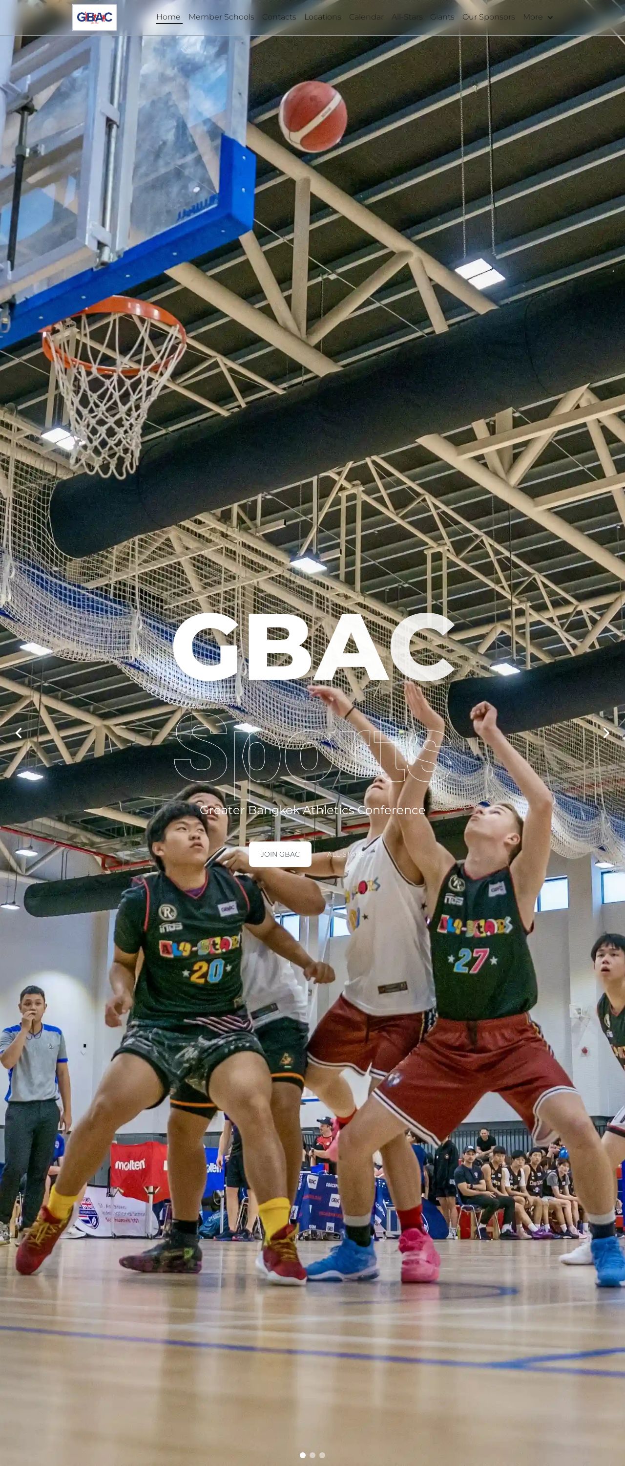
Home | GBAC Sports
Analyzed by AI for fun and insights - not to be taken too seriously!
Visual Design
The visual design of the GBAC Sports website is visually appealing and engaging. The use of a large image of a basketball game on the homepage effectively captures the attention of potential users and immediately conveys the website's focus on sports. The color scheme is predominantly blue and white, which is clean and modern, and the font used is clear and easy to read. The layout is well-organized, with clear headings and sections that make it easy to navigate. The use of images and graphics throughout the website adds visual interest and helps to break up the text. However, there are a few areas where the visual design could be improved. The background image on the homepage is quite busy, which may make it difficult for some users to focus on the content. Additionally, the use of different fonts and font sizes throughout the website may make it difficult for some users to read. Overall, the visual design of the website is strong, but there are a few areas that could be improved.
Recommendation:
Consider using a simpler background image on the homepage and using a consistent font throughout the website to improve readability.
Layout and Clarity
The layout of the GBAC Sports website is clear and easy to navigate. The use of clear headings and sections makes it easy for users to find the information they are looking for. The website is well-organized, with a clear hierarchy of information that makes it easy to understand the different sections of the website. The use of images and graphics throughout the website adds visual interest and helps to break up the text. However, there are a few areas where the layout could be improved. The use of different font sizes and styles throughout the website may make it difficult for some users to read. Additionally, the use of too many images and graphics may make the website feel cluttered. Overall, the layout of the website is strong, but there are a few areas that could be improved.
Recommendation:
Consider using a consistent font throughout the website and limiting the number of images and graphics to improve readability and visual interest.
Content
The content of the GBAC Sports website is informative and engaging. The website provides a wealth of information about the organization, including its mission, values, and programs. The use of clear headings and sections makes it easy to find the information that users are looking for. The content is well-written and easy to understand, making it accessible to a wide range of users. However, there are a few areas where the content could be improved. The use of too much jargon and technical language may make the content difficult for some users to understand. Additionally, the lack of images and graphics throughout the website may make the content feel dry and unengaging. Overall, the content of the website is strong, but there are a few areas that could be improved.
Recommendation:
Consider using simpler language and adding more images and graphics to improve engagement and accessibility.
This website was last rated on Jan. 23, 2025, 4:26 a.m.
Disclaimer: ratemysite.app is not affiliated with the website you are viewing, and does not endorse it in any way.
Ratings are subjective and based on AI's analysis. We filter out explicit or dangerous content, but cannot guarantee that all sites are safe.

All rights reserved. © ratemysite.app 2024. Contact: hello @ domain.