Rate your website in seconds – get instant feedback.
I will rate your website's design and give recommendations to enhance its visual appeal and user experience. See how your site ranks on the leaderboard!

Interlagos Chile ® Portal Web
Analyzed by AI for fun and insights - not to be taken too seriously!
Visual Design
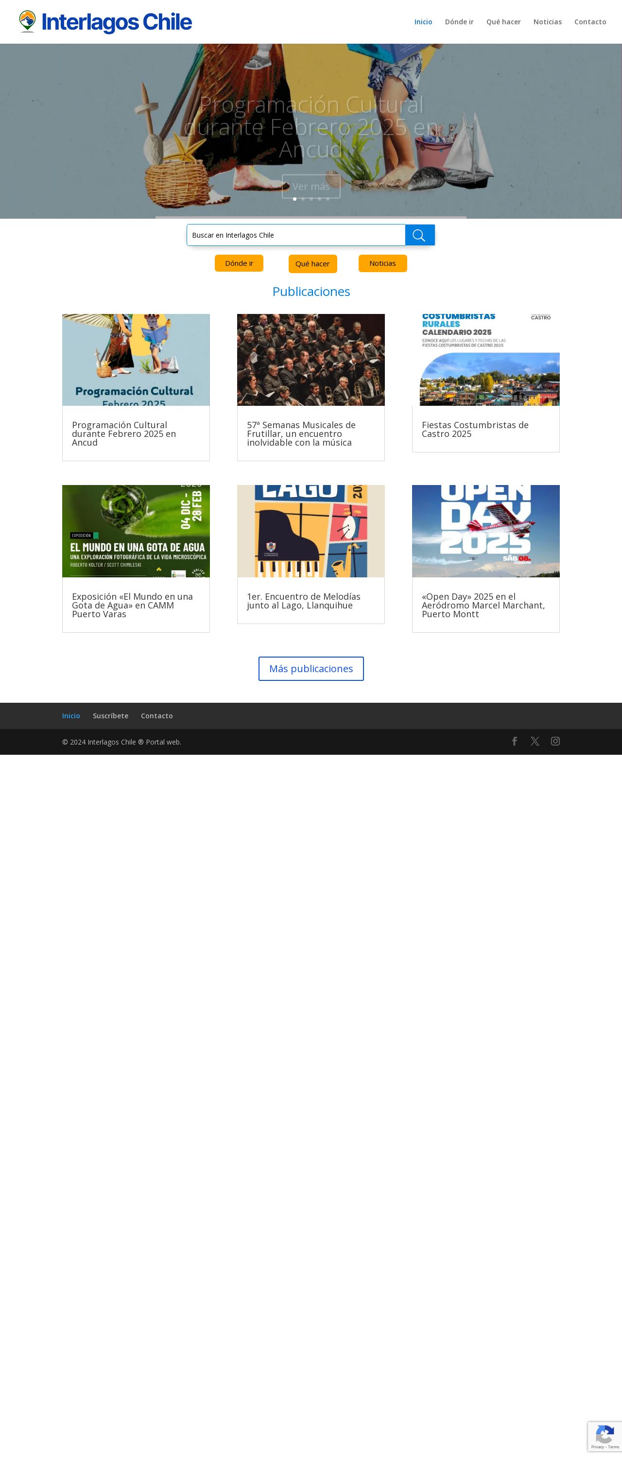
The visual design of the Interlagos Chile website is a blend of traditional and modern elements, reflecting the cultural heritage and natural beauty of Chile. The color scheme is predominantly earthy tones, with shades of brown, beige, and green, which create a warm and inviting atmosphere. The use of images and graphics adds visual interest and helps to break up the text. However, some of the images appear to be low-resolution, which can affect the overall visual appeal of the website. Additionally, the layout of the images and text can be a bit cluttered, making it difficult to focus on specific elements. To enhance the visual design, I recommend using high-quality images that are optimized for web use. This will ensure that the images load quickly and appear sharp and clear on various devices. Additionally, consider using a more consistent layout and typography to create a sense of harmony and balance. This will make the website more visually appealing and easier to navigate.
Recommendation:
Use high-quality images and optimize the layout for better visual appeal and user experience.
Layout and Clarity
The layout of the Interlagos Chile website is generally well-organized, with clear headings and concise paragraphs. However, the use of multiple columns and images can make the content appear cluttered and difficult to read. The text is often surrounded by a lot of white space, which can make it hard to focus on the content. Additionally, some of the font sizes and styles are not consistent throughout the website, which can create a disjointed feel. To improve the layout and clarity, I recommend using a consistent font size and style throughout the website. This will create a sense of cohesion and make the content easier to read. Additionally, consider using a more limited color scheme and reducing the amount of white space to make the content more prominent.
Recommendation:
Use a consistent font size and style, and reduce the amount of white space to improve the layout and clarity.
Content
The content of the Interlagos Chile website is informative and engaging, but it could be improved in terms of quality and clarity. Some of the paragraphs are quite long and contain multiple ideas, which can make them difficult to follow. Additionally, some of the language is quite formal and may not be accessible to all users. The website also lacks clear calls-to-action, which can make it hard for users to know what to do next. To improve the content, I recommend breaking up long paragraphs into shorter, more manageable sections. This will make the content easier to read and understand. Additionally, consider using more accessible language and clear calls-to-action to guide users through the website and encourage them to take action.
Recommendation:
Break up long paragraphs, use more accessible language, and add clear calls-to-action to improve the content.
This website was last rated on Feb. 5, 2025, 4:39 p.m.
Disclaimer: ratemysite.app is not affiliated with the website you are viewing, and does not endorse it in any way.
Ratings are subjective and based on AI's analysis. We filter out explicit or dangerous content, but cannot guarantee that all sites are safe.

All rights reserved. © ratemysite.app 2024. Contact: hello @ domain.